the deep dive
The History of the Gotham Typeface
For as long as I’ve been noticing letters, I’ve been obsessed with a species of alphabet that’s forthright, unassuming, and confident — and whose style no font had ever captured. I desperately wanted to summon these letters from my keyboard, which is how I became a typeface designer.
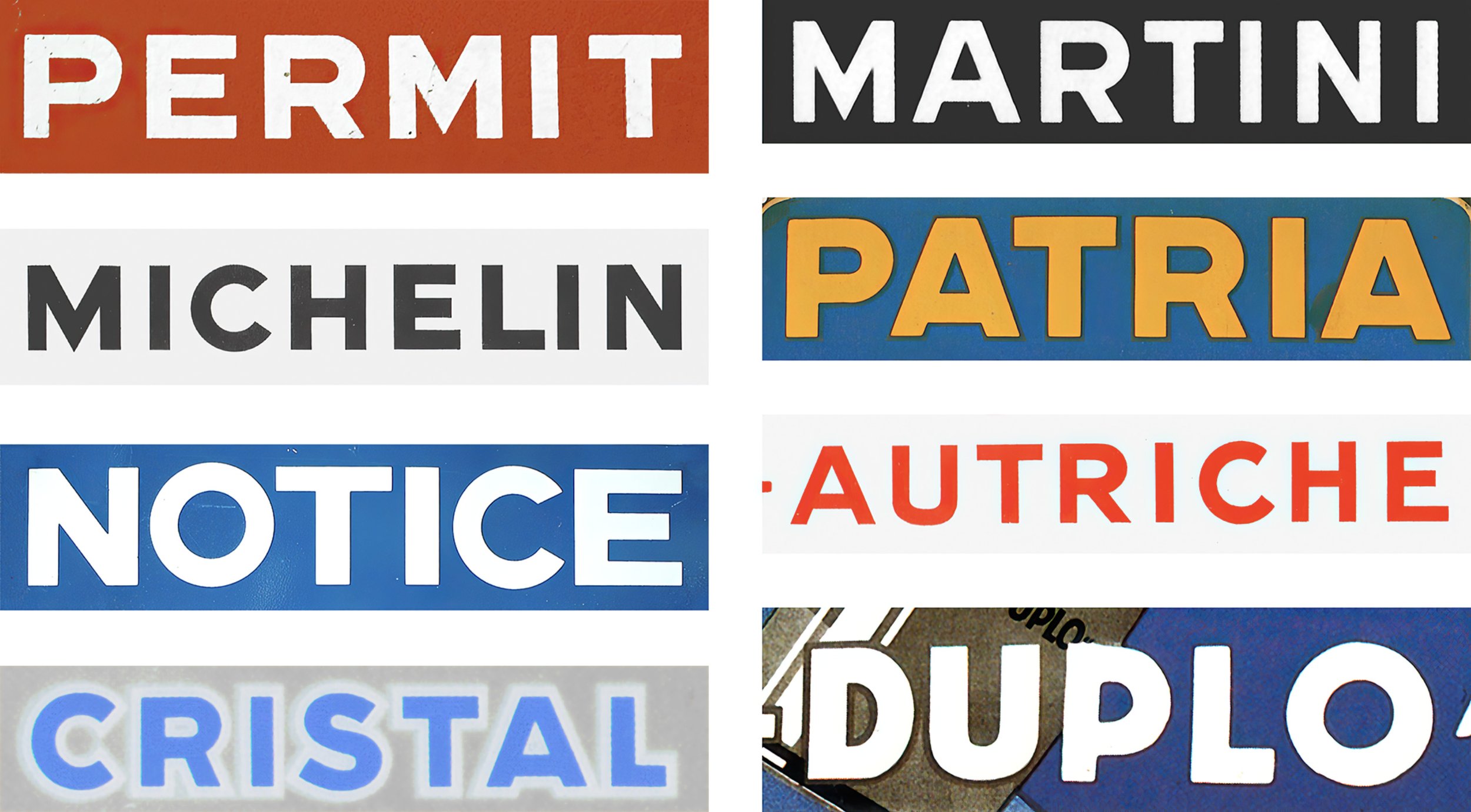
The roots of Gotham. These excerpts of early twentieth century posters, signs, pamphlets, and maps were the work of different hands, all created in different media and at different sizes, yet they seem to orbit a single, shared idea of what letters should look like. Collection of the author.
The strange thing was that they didn’t have a name. They seemed to have existed forever: I’d seen their likeness painted on glass, cast in metal, and carved in stone, printed on urgent wartime bulletins and effervescent posters for aperitifs. They animated Art Deco perfume bottles, and the occasional Modernist logo for industry, but mostly they were habitués of the mundane: they announced liquor stores and barber shops and florists, and hid in plain sight inside shop windows and elevator cars. Judging from their absence in the literature of design, I seemed to be alone in my affection for them, which was bewildering given how widespread and long-lived they were. Fashions in design had come and gone, like so many hairstyles or hemlines, but these elemental shapes endured, always managing to look current, relevant, and right. I simply loved them.
Like many designers, I learned typography backwards, starting from the material at my fingertips and working my way deeper into the past. When I started, what seemed like an abundance of typefaces on the early Macintosh — more than a hundred fonts! — was put into sharp relief in 1988, when I got a job at a small studio that was the sub-subtenant of The PushPin Group, the legendary design practice run by Seymour Chwast, and founded by Chwast, Milton Glaser, and Edward Sorel in 1954. PushPin’s offices were dominated by an immense reference library that included an entire wall of type specimen books, a fossil record of the tens of thousands of typefaces that had perished in the mass extinctions of foundry type, hot metal, and photo type. In my evenings, I lingered over these books, searching for the typeface that was my dream sans serif. I never found it, of course, because its shapes had come not from type, but from lettering.
Supporting roles. Like so much advertising of the Works Progress Administration, this poster by Alexander Dux features a headline lettered with moderne exuberance. But below it, the unmannered line ‘united states travel bureau’ is rendered in a straightforward and arresting style of lettering that recurs throughout modern design history. It’s in unguarded moments like these that lettering artists often reveal their idea of what an ‘unstyled alphabet’ looks like.
Type vs. Lettering
While ‘type’ is the product of individual, pre-made, combinable letterforms, ‘lettering’ describes a unique and handmade composition, a one-off created to render a specific message in a specific place. (Technically speaking, ‘typography’ refers only to the impression of ‘printing types,’ but this definition is woefully overdue for an update: fonts on the web are typography, and fonts on the iPhone are typography; fonts are typography.) A century ago, only a book’s interior featured typography: whatever words appeared on its cover, spine, or illustrations were lettering, produced not by assembling letters, but by drawing them. Because lettering existed separately from type, it had evolved its own unique styles and traditions: lithographed posters, engraved banknotes, gilded store windows, and chiseled gravestones were lettered, not typeset, and each exhibited shapes that reflected the qualities of its medium, and the tendencies of its artists. Though type and lettering have cross-pollinated for centuries (Gutenberg’s types, after all, were modeled on lettering), it seemed possible that no typeface designer had ever attempted to capture the lettered sans serif style I’d begun to admire. Perhaps more than anything, it was this challenge that turned me into a typeface designer, this irresistible opportunity to map out unexplored territory, and to fill what felt to me like a pronounced absence in the designer’s palette.
Grotesques and Geometrics. ‘Grotesque’ typefaces are built on the ellipse, ‘Geometrics’ on the circle. These two milestones are Fette Accidenz-Grotesk, an ancestor of Helvetica, and Futura Medium, a masterwork in the Geometric style. Reproduced from the type specimen book of H. Berthold, Berlin, 1924–6 (above), and Futura: The Type of Today and Tomorrow, The Bauer Type Foundry, New York, 1930 (below.) Collection of the author.
Foundations
Taxonomically, the letters I admired embodied the best qualities of two different typographic genres — the Geometric and the Grotesque — without suffering the shortcomings of either. Like Paul Renner’s Futura (1927), these letters had a clarity of purpose, at first glance suggesting the same circles, squares, and triangles of Renner’s quintessential Geometric sans. But the lettering I admired managed to avoid the rigidity that gives so many Geometrics an astringent sting, and instead, it felt warm and personable. Where Futura subjugated the alphabet to the dogma of rule and compass, adjusting letterforms to suit the grid, the lettering to which I was drawn had both a practicality and a materiality about it, as if the geometry had been adjusted to serve the design. To me, this made the lettering look somehow more believable: not a product of some theory about what the alphabet should look like, it instead felt like a memory of what the alphabet does look like.
In their warmth, they reminded me of the bolder sans serifs of the Grotesque genre, faces like Akzidenz-Grotesk (1898) that are the direct ancestors of Helvetica (1957). In their details, these faces shared some of the qualities of the lettering I was starting to collect — an R whose leg meets the bowl rather than the stem, an S whose sophisticated shape transcends circles and lines. But where the lettering always looked unmannered, these typographic relatives looked slick. If the lettering employed any of the clever tricks that typeface designers use to compensate for optical illusions, it did so with a light touch: where Helvetica felt like the consummate product of an organized industrial design process, the lettering I’d been chasing felt less consciously planned. To me, this gave it a special kind of credibility: instead of looking designed, these letters simply looked made.
New Deal alphabets. Left: hand lettering adorns the blue eagle of the National Recovery Administration, attributed to Charles T. Coiner. Right: the Eagle Bold typeface of Morris Fuller Benton, produced by the American Type Founders Company in 1933.
One noteworthy moment in which type and lettering intersected was during the foundation of the National Recovery Administration, Roosevelt’s New Deal initiative to jump start the American economy out of the Great Depression. Communicating through shop windows, product tags, and lapel buttons, the agency used a consistent visual language for its communications: an iconic blue eagle, a controlled palette of red, white, blue and black, and sans serif lettering in a straightforward, modern style.¹ In 1933, this lettering was interpreted in type by Morris Fuller Benton, head of design for the American Type Founders company, in the production of the Eagle Bold typeface. In Benton’s hands, the Art Deco qualities of the agency’s lettering were amplified to create a distinctive and identifiable typographic novelty. Where letters like M and W were often blunted in the original lettering (an aid to legibility borrowed from the Grotesque tradition²), in Benton’s typeface these letters were sharpened, echoing the sparkling points of the N, R, and A that formed the agency’s initials.
Eagle Bold is a study in contradictory goals. A typeface that reinforces its geometric themes by assertively applying angles to even unexpected places (an idiosyncratic spur on the G, a triangular tail on the Q), it also relaxes the rules of geometry to produce warmer and more genial letterforms (a non-circular D; everything about the S.) Even if the results weren’t exactly to my taste, I respected the effort and admired the approach, which I felt left adequate room for me to explore other places on the Geometric–Grotesque border in a new typeface of my own. In the summer of 1992, with the hope of creating an anonymous, versatile, clear, and non-negotiable sans serif like the ones I’d admired in posters and signs, I set to work creating the design I variously called Zero-Grade Variant Font³ and Typeface X.
A first crack at the style. Typeface X by Jonathan Hoefler, 1992.
The First Prototype
Typeface X would begin as a set of capitals that evoked these hand-lettered sans serifs as I remembered them. It would also end there.
Like Benton, I wanted to borrow from both the Geometric and Grotesque traditions, but with the goal of creating a typeface that was more resolute than flashy. Where Eagle Bold had the syncopation of a Geometric, its letters alternately wide and narrow like the inscriptions of antiquity, Typeface X would have the more even stride of an industrial typeface, its letters approaching a more uniform width, its text having a more consistent rhythm.⁴ In my design, like the lettering that had inspired it, the S would follow the wider, elliptical pattern found in Grotesque faces like Akzidenz, but the near-circular O would be steadfastly Geometric, like Futura. I wanted the design to give the appearance of using simple Euclidean shapes, while secretly employing subtler geometries, to replace the doctrine of the Geometric with something warmer.
But unlike Benton’s typeface, I wanted my letters to try to exist outside of history, to have the versatility of my treasured sans serif lettering that had endured for so many decades. Having seen these kinds of letterforms everywhere, from lithographed posters to cast bronze plaques, I was hopeful that whatever typeface finally captured the style could be designed to outlive changes in fashion. While the capitals that I drew in 1992 have all the hallmarks of a journeyman effort — the leg of the R is a little undernourished; the burrs inside the C need filing down — they wholly captured the flavor of what I was going for. But their details mask the design decision that would lead me to shelve the design, and to return to its foundations only a decade later, with a new perspective, some new ideas, and a new collaborator.
A typographic intermission. The final proof of Typeface X, 1993. Drawings and comments by Jonathan Hoefler.
At the time, it hadn’t seemed significant that Benton’s typeface was produced at sizes no smaller than eighteen point. This turned out to be a telling decision: Benton had adroitly sidestepped an inherent limitation of the design — and the whole Geometic genre — which would have been revealed had he adapted the design for text sizes.
Working with scalable digital outlines, it can be easy to overlook the effects of ‘optical size,’ the visual conditions imposed by the physical scale of a letter on its underlying design. My earlier work on the htf Didot typeface had presented both challenges and opportunities for controlling hairline weights at different sizes — in six point type, a hairline serif is proportionally larger than the same serif on 96 point type — and from this, at the age of twenty-two, I’d concluded that only typefaces with subtle details need be designed with a target size in mind. I imagined that Typeface X, with its explicit gestures and ample weight, could afford to be indifferent to the effects of scale, a position supported by my earliest proofs on my state-of-the-art 300 dpi laser printer. In 1993, the arrival of a higher resolution 600 dpi printer dramatically overturned this assumption.
At low resolution, subtleties are lost when shapes are expressed on a coarse pixel grid, and even faint gestures become more emphatic. But at higher resolutions, it immediately becomes apparent which details are too subtle. In Typeface X, sharp corners pointing up and down (like the exteriors of the M and N) became vanishingly small at text sizes, and these letters appeared to shrink from the cap height and baseline. The vacuum formed above the M, and below the W, punched holes in the text, a problem exacerbated in the A and V, whose sharp apexes required widely sloped sides that surrounded these letters with an unresolvable gulf of space. In a proof designed to identify opportunities for kerning — generally one of the later stages in developing a typeface — my note-to-self is instead about the underlying design, and records the font’s cause of death in a casual note in the margin: ‘sharp letters too sharp/too light: see VA.’
An obvious solution would have been to blunt these sharp corners, but I felt at the time that this would diminish the unique character of the design. Paul Renner and his contemporaries had recognized this sixty years earlier, and had paired their pointy sans serifs with sluggish bold weights whose points were necessarily blunted in the service of legibility. While this accommodation would undoubtedly help at small sizes and in heavier weights, I imagined it would come at the expense of large-size typography, where I wanted the letterforms to sparkle. In any event, further explorations would have to wait, since the new year brought two immense and irresistible commissions that would occupy me for the foreseeable future. Sports Illustrated was inquiring about a lighter version of the Champion Gothic typeface I’d designed for them in 1991, and The New York Times Magazine had asked me to propose a Grotesque sans serif for small sizes. Together, these projects defined the opposite ends of the Knockout family, an extensive collection of thirty-two sans serifs that absorbed most of 1994. It was during that year, on one of my visits to the Times in their offices on West 43rd Street, that a walk around the corner brought me face to face with the lettering that would change this project forever.
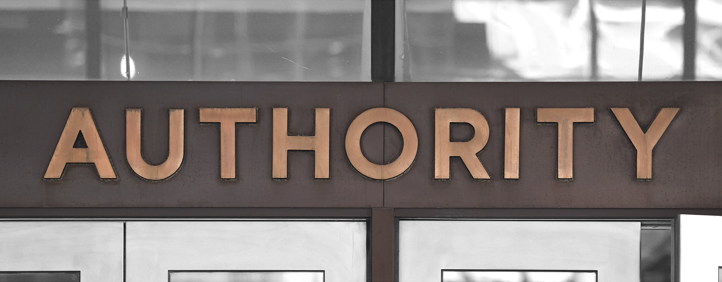
A diamond in the rough. Lettering from the facade of the Port Authority Bus Terminal, 625 Eighth Avenue, New York. An anonymous letter by an unknown maker, it expertly captured the spirit of the unnamed species of lettering that I’d been chasing for years. Author’s photograph.
New Inspiration
In the middle of New York’s theatre district, one block west of Times Square, there sits the Port Authority Bus Terminal. It is the city’s busiest transportation hub, and one of its cleverest feats of municipal engineering. It is also, hands down, the grodiest place in Gotham, and nowhere to linger. Don’t go.
But above its doors, there stands a set of foot-high letters declaring ‘port authority bus terminal’, rendered in a style that is the absolute apex of the lettering I’d long been hunting. The sign appears to have been part of the original building that opened in 1950, having been preserved when the entrance was relocated during a 1979 expansion. (It’s even possible that these letters were part of a broader design program adopted by the organization as far back as the forties: almost twenty years after finishing Gotham, I’d learn that this style of lettering was consistent with other publicity materials associated with the Port Authority, including the painted sign erected on its construction site in 1949, and the architectural lettering of their heliport at the 1964 World’s Fair.)
The sublime plainness of these letters almost defies imagining that there was ever a hand behind them: to me they are simply what letters look like. But they are expertly crafted, and even their most challenging characters, such as S and B, are undeniably the product of a learned eye. For me, this sign forever answered the question of points vs. flats on the capital A, which has received an attractive and unambiguously flat top. I decided that the Port Authority lettering should be the definitive model for the new typeface, and earmarked this for future development.
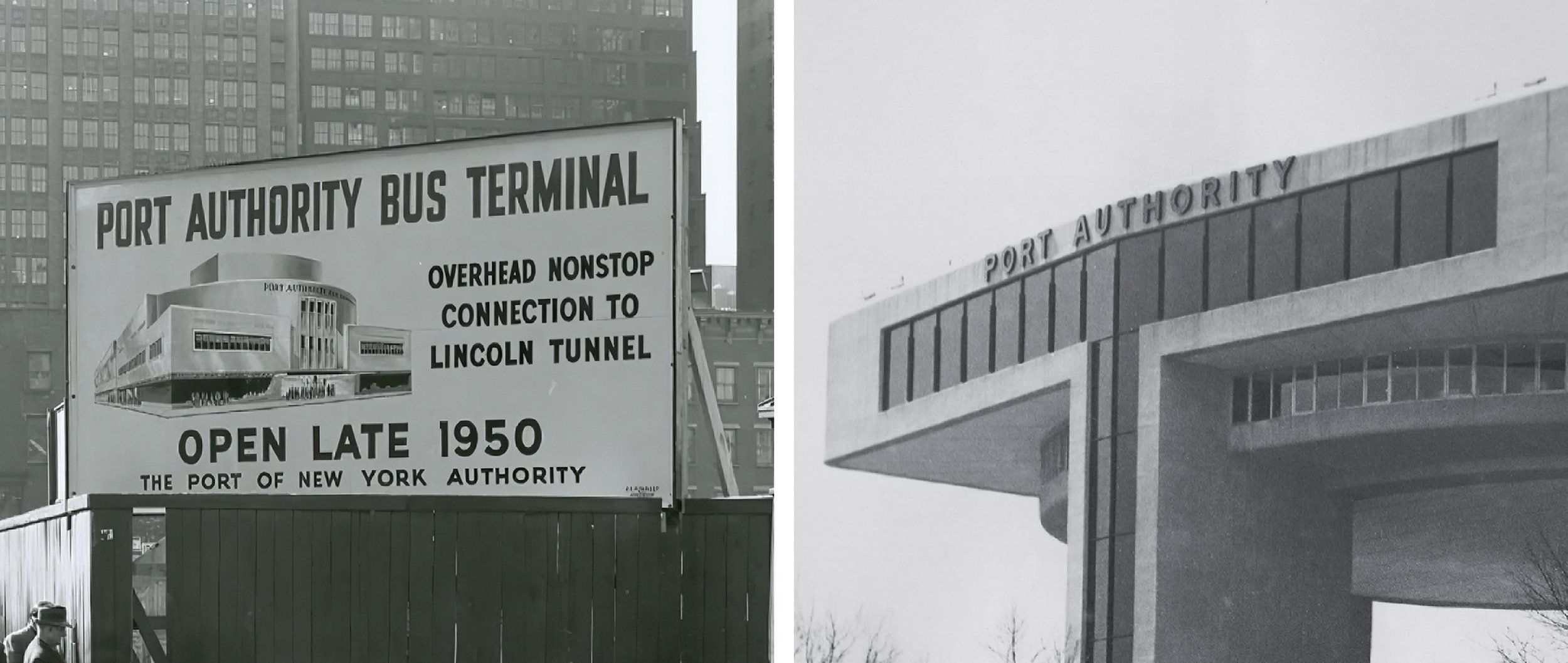
A Port Authority style? Left: a 1949 billboard announcing construction of the Port Authority Bus Terminal, whose final line uncannily echoes the style that would later appear on the building itself. Right: architectural letters on the heliport at the 1964 New York World’s Fair, again in a style strikingly similar to the signage of the Terminal itself. Left: The Port Authority of New York and New Jersey. Right: collection of the author.

Clients versus lettering artists. From the archives of the Port Authority, an engineering drawing for the sign on the Eighth Avenue facade, prepared by the office of chief engineer John M. Kyle. Like many diagrams submitted to contractors, this one is detailed in its specifications for size and material, but merely suggestive of the lettering. The shapes of letters like M and S differ dramatically from the forms ultimately supplied (and later preserved in Gotham); throughout, the weight, fit, and kerning indicated by these drawings have wisely been ignored by the sign shop. That the drawing shows ‘channels’ connecting the insides and outsides of letterforms points to this being the product of a commercial lettering stencil, rather than the hand of a skilled draftsman concerned with the minutiae of typography — specialties beyond the purview of architecture and engineering. This document is dated October 29, 1952, nearly two years after the Terminal’s opening on December 15, 1950. Courtesy The Port Authority of New York and New Jersey.
The prospect of returning to this project remained distant during what continued to be a busy time for my small studio. The Knockout project was followed by commissions to design the Hoefler Titling, Verlag, and Mercury families, projects that were increasingly interesting, and ever more complex. These were also the years I devoted to ramping up my studio’s retail font business, which required designing, writing, and producing our first website, our first catalog, our first type specimen, and our first marketing campaigns, while hiring new full-time designers and support staff. In the background, I kept an eye open for opportunities to revisit the project in earnest, and had just such an occasion in 2000, with the arrival of a new collaborator.
A colleague who shared my fondness for anonymous, industrial letterforms was Tobias Frere-Jones, who I hired in the autumn of 1999. Tobias and I had both devoted our earliest years to exploring and illuminating the kinds of vernacular letterforms that had been extinguished by the Swiss International Style: he’d spent the early nineties creating Interstate, an adaptation of the Standard Alphabets for Highway Signs originally designed by Theodore Forbes in 1948, and I’d spent these years designing first Champion Gothic and then Knockout, families that interpret and celebrate the anonymous gothic wood types that had shaped American typography around the turn of the century. When we began working together, we had the chance to collaborate for the first time on the design of a new typeface, when Michael Bierut at Pentagram commissioned a custom font for the renovation of Gordon Bunshaft’s pioneering Park Avenue skyscraper, Lever House. That project had begun with a survey of extant lettering on the site — the mere eight letters on the building’s east facade — from which Tobias and I abstracted hundreds of new glyphs to create the Landmark typeface. The following year, a commission from Arem Duplessis and Paul Martinez at GQ to create a ‘modern, streamlined typeface’ for the magazine was an irresistible chance to try this same approach again, once again inspired by the lettering on an east-facing facade: this time, at last, the Port Authority.
Take two. The first prototype of Gotham (then called GQ Sans), August 2000. Drawings by Tobias Frere-Jones, comments by Jonathan Hoefler.
A Fresh Start
With a new commission from GQ, and new source material that better resolved some of the questions that had led me to abandon Typeface X, we set about creating a new typeface from scratch. In the summer of 2000, I asked Tobias to draw a set of prototype characters based on the Port Authority sign, adding the letters D, F, G, and V to round out the ‘hamburgevonstifd’ character set used by type designers to prototype new faces. My notes on the proof, and adjustments to the outlines, echoed some of the themes I’d encountered in considering Benton’s work — how geometric is too geometric? what’s the balance of ‘engineered’ and ‘typographic?’ — as well as the pitfalls I’d discovered working on Typeface X. (An ominous note by the sharp point of the M reads ‘I’ll ask you at lunch.’)
Inventing a lowercase. An early draft of the Gotham lowercase, August 2000. At right, the text proof demonstrates how a small lowercase, tall ascenders, and loose spacing combine to create an unwanted air of nostalgia, which we’d quickly eliminate in the following round. Drawings by Tobias Frere-Jones, comments by Jonathan Hoefler.
A novel part of our typeface, and ultimately one of the things that most distinguishes Gotham from the lettering that came before (and indicts the many copycats that followed) is the Gotham lowercase. Rarely were any lowercase letters to be found on the artifacts we were studying — originally posters, signs, and printed ephemera, but more and more, the letters of paint, plaster, neon, and steel that define the streets of New York. In the absence of any historical model, Gotham’s lowercase would instead be a complete invention, designed to imbue the lowercase alphabet with the same spirit of ‘basic draftsman’s lettering’ that suffuses the caps. A seemingly straightforward exercise, Gotham’s lowercase was one of the hardest things to get right, not only because so many of the recurring shapes that define the lowercase have no analog in the caps, but because its proportions so dramatically affect its personality⁵. In the first draft, a small lowercase with tall ascenders echoed the early geometrics of the Bauhaus period, faces such as Erbar (1922), Kabel (1927), and Nobel (1929). Having already designed Verlag for the Guggenheim Museum in 1995, I’d already had a chance to work with low x-height sans serifs, so I was eager to steer Gotham in a different and more contemporary direction. (I also felt strongly that like the lettering that inspired it, Gotham should look forward and not back, and a small lowercase often carries an overwhelming air of nostalgia.) Adjustments that gave the font a larger lowercase, shorter ascenders, and a tighter fit immediately changed the timbre of the design, and changes to key letters such as e, f, and g helped establish new design policies that would inform the rest of the character set. As the lowercase developed and took on the authority and alertness of the caps, and the character set unfolded to include numbers, punctuation, symbols, and accents, we began to expand the family into new weights, with the help of a growing design team. Tobias’s splendid drawings for Gotham Light preserved all the virtues of the boldface, while adding an indispensably different voice to the family. Still straightforward and non-negotiable, the new Light weight could be elevated, hip, hushed, clever, and even arch. In transcending the fifteen capital letters that had inspired the typeface, the Gotham family had come into its own.
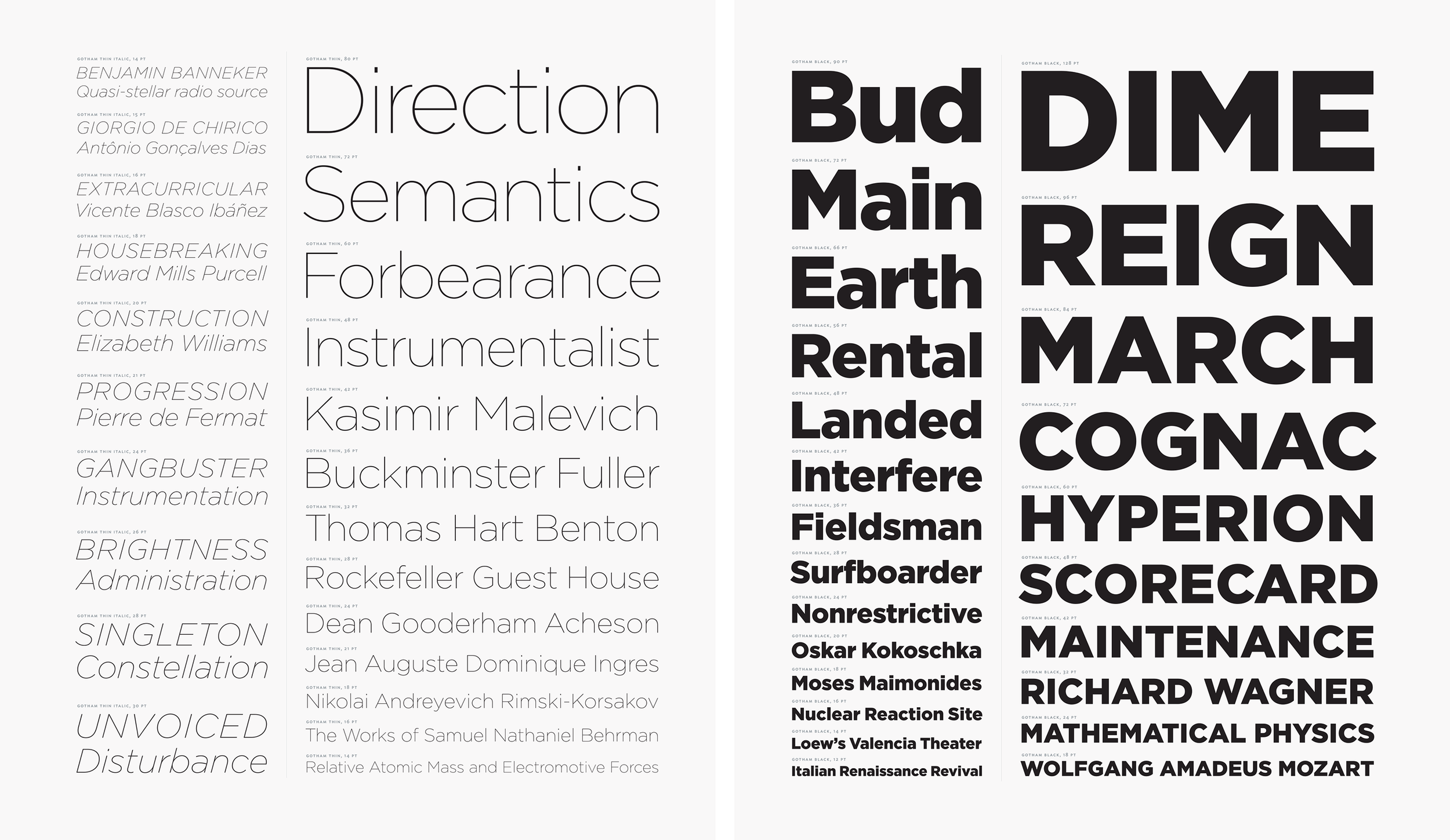
New weights. Gotham Thin and Gotham Black, as they appeared in The Hoefler Type Foundry’s Catalog No. 7, 2003. Type specimen by Jonathan Hoefler.
Though GQ had commissioned a small family of fonts, I felt from the outset that Gotham could express its personality over a much bigger range of styles. The initial request had been satisfied by just two sets of drawings, a Light and Bold (along with the interpolated weights Book and Medium), to which we quickly added matching italics, and a parallel set of condensed faces. Tobias had proposed giving Gotham Condensed a ‘stadium-shaped’ O, with flat sides, making the compelling case that a more regimented construction could echo the idea of the ‘engineered letter’ that we saw in Gotham. But I advocated instead for letters based on the ellipse, in part because I’d had my fill of flat-sided sans serifs with both Champion Gothic and Knockout, and in part because stadium-shaped letters were so strongly associated with the din typefaces of the Deutsches Institut für Normung, which had enjoyed a comeback in the nineties. (A residual trace of this discussion can still be found in Gotham’s outline data, where the sides of letters like O are defined not by a single extremum, but by a pair of points with a one-unit flat segment between them, an effort to make their coordinate data compatible with whichever construction won out.) Having settled on the elliptical model, we began to expand the fonts into still lighter and heavier weights with the help of designer Jesse Ragan, who joined the studio in 2001. With the addition of a new Thin and Ultra, the four styles of Gotham Condensed were enlarged to nine. And with Gotham’s design space now delimited by both wide and condensed styles, we set to work filling in the middle.
The Growing Family
Throughout the early 2000s, we’d created various intermediate widths of Gotham on a custom basis for a number of clients, many of them magazines and newspapers who’d committed to Gotham, but were on the prowl for a more space-efficient variant for narrow columns. As requests for customizations began to mount, we decided to definitively divide Gotham’s design space in two locations, creating the compact Gotham Narrow and the even more slender Gotham Extra Narrow. Some of the morphological differences we’d introduced between the regular and Condensed widths were making these faces difficult to digitally blend — letters like C are sheared diagonally in Gotham, but vertically in Gotham Condensed — and these difficulties began to escalate as we approached the italics.⁶ The demanding work of rationalizing these thirty-two intermediate styles would fall to designer Sara Soskolne, who joined the studio in 2005, ultimately becoming the senior typeface designer who would shoulder some of our most ambitious design projects. Working with Tobias, Sara’s initial project of drawing extended numerics for Gotham’s many italics quickly grew into taking on all thirty-two styles of the new Gotham Narrow and Extra Narrow, kerning most of the growing family, and supervising the expansion of all sixty-six styles into Greek and Cyrillic.
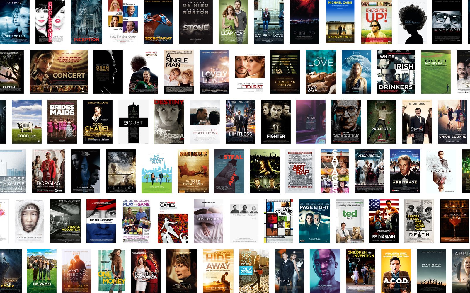
Our first type specimen to include Gotham was distributed in the spring of 2002, and the fonts immediately returned to become a part of the city that had inspired them. Newsstands and bookshop windows were full of Gotham by the summer, along with websites, grocery store shelves, and advertising in every medium in the season to follow. Hollywood took a special liking to Gotham, just as Broadway had embraced Knockout, and the typefaces became a fixture of both movie posters and opening titles. By 2013, after the Motion Picture Association adopted Gotham Bold as the standard typeface for the ‘trailer tag’ announcing a film’s mpaa rating, the trailer for every movie in wide release would begin with a five second hold on a screen full of Gotham.
As lifelong New Yorkers who’d lived through September 11, an especially poignant moment for us came on July 4, 2004, when the foundation was laid for Freedom Tower on the site of the former World Trade Center. At the dedication ceremony, Mayor Michael Bloomberg and Governor George Pataki unveiled the cornerstone of the new building, whose memorial had been designed by Michael Gericke of Pentagram, and set in Gotham. ‘Gotham didn’t look like something that was created yesterday and would be gone tomorrow,’ Gericke told The New York Times, a moving description befitting not only our typeface, but our indomitable city.
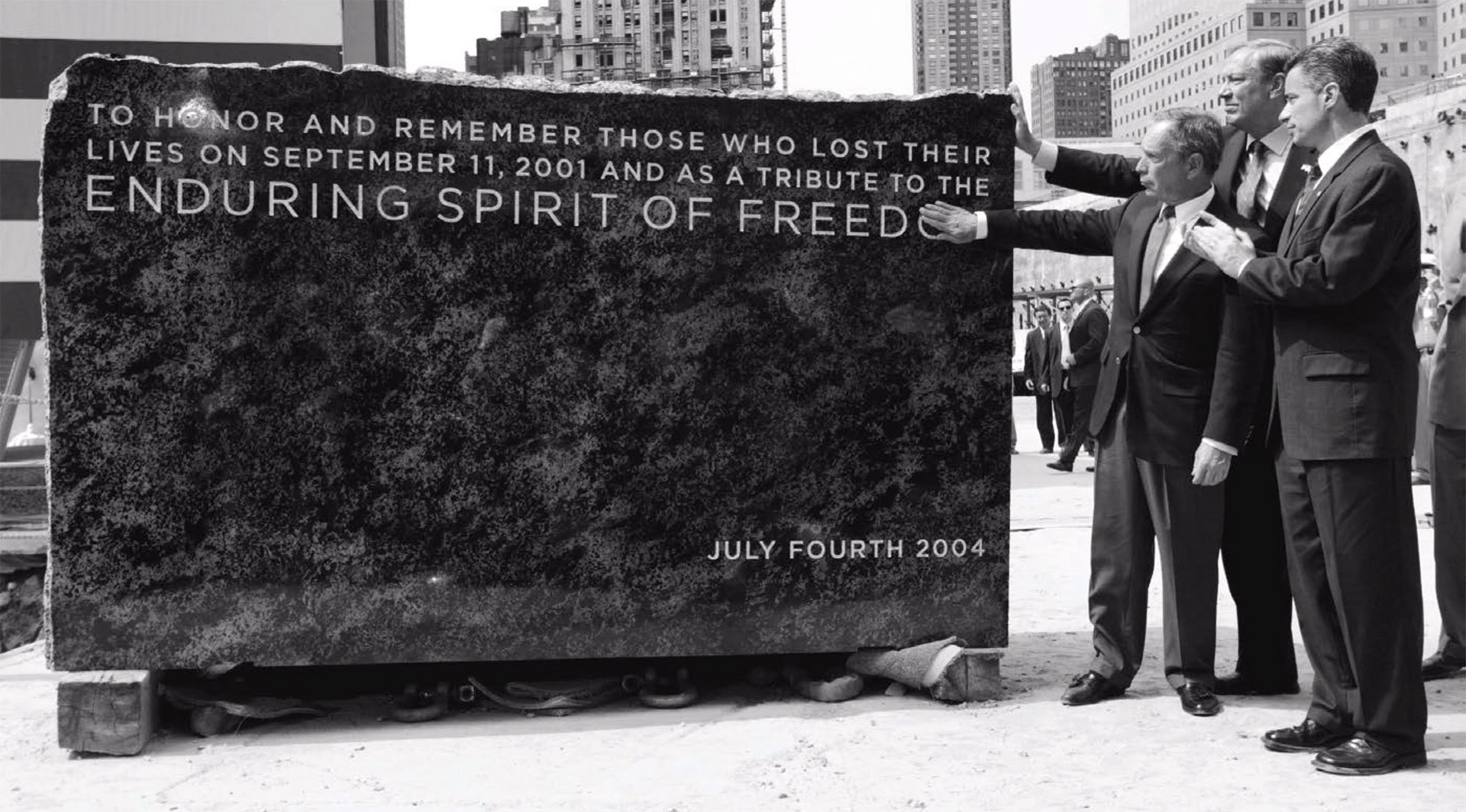
A typeface of the city, for the city. New York City Mayor Michael Bloomberg, New York Governor George Pataki, and New Jersey Governor James McGreevey unveil the cornerstone for the Freedom Tower on the site of the former World Trade Center in New York. Photo: Reuters
The Presidency
In 2007, Gotham rose to international prominence when it was adopted by the presidential campaign of the junior senator from Illinois. Designers Scott Thomas and John Slabyk had selected Gotham as Obama’s signature typeface, which, along with Sol Sender’s ‘rising sun’ logo, became the centerpiece of a groundbreaking visual design system. Their comprehensive design guidelines, which ensured that the candidate spoke in a consistent, unwavering voice, came to define the 2008 election as the start of a new era in political communications, in which graphic design would forever be central to its mission, and critical to its success. ‘Gotham is one of the most visible choices Senator Barack Obama has made,’ wrote the Los Angeles Times.
After the election, Gotham became a mainstay of the Obama White House, whose communications office became the very first beta tester of our cloud.typography web font service. One morning, more than a year before the service would launch, I received a harrowing alert from our content delivery network, notifying me that eleven million font requests had been satisfied in the past sixty seconds — an unlikely, near-vertical uptick in traffic for a product still on the drawing board. It was reassuring to learn not only that the service had performed as designed, but that the activity was legitimate, the result of a new website launched by our first beta user, to formally announce the president’s campaign for re-election.
Gotham continued its service as the typeface of Obama 2012, this time supplemented by a logo that Matt Ipcar at Blue State Digital asked me to draw, which evolved the iconic 2008 identity through the addition of serifs to Gotham for the new ‘Obama-Biden’ wordmark. The typeface remained the voice of the second Obama administration, and went on to become the typeface of the Obama Foundation when it was founded in 2014. Since then, Gotham has remained a dominant force in political typography, an irresistible choice for office-seekers everywhere — nationally and locally, both at home and abroad — and representing every part of the political spectrum. In the 2018 midterm elections, nearly fifty candidates, from both sides of the aisle, used Gotham for their identities. The Associated Press declared Gotham ‘the font of the decade.’
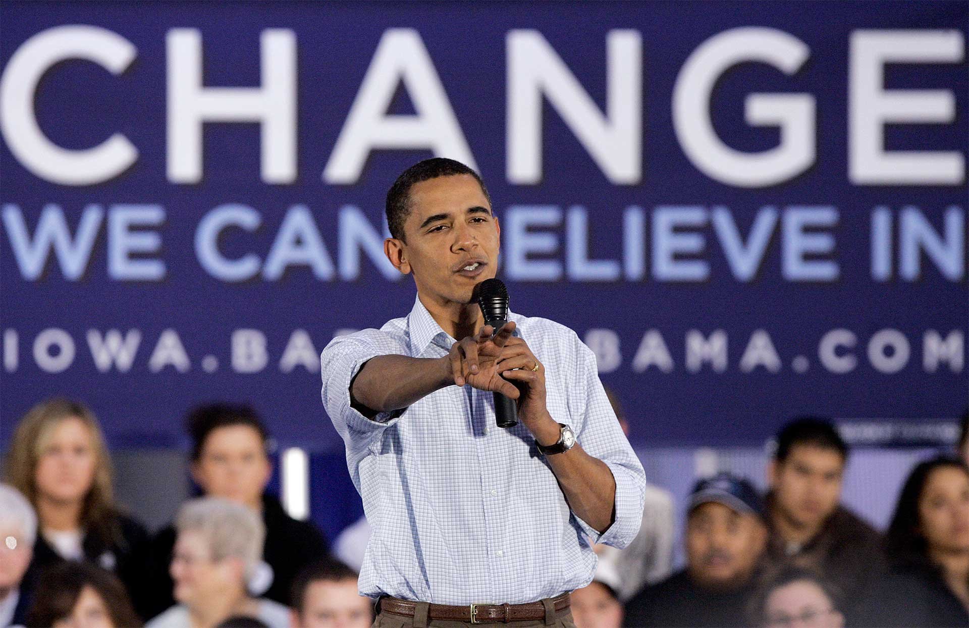
Gotham on the international stage. Amidst a sea of Gotham, a young Democratic presidential hopeful makes a campaign stop in Cedar Rapids, Iowa, November 6, 2007. Photo: Associated Press/Paul Sancya

The new face of politics. Gotham became the de facto typeface of American politics after Obama 2008, as seen in this deluge of Gotham logos from the 2018 and 2022 midterm elections. Where candidates had once used design only superficially, adopting a color scheme (and only sometimes a logo!) for bumper stickers and yard signs, the Obama campaign demonstrated for the first time how a coherent design system could streamline and transform political messaging. A standards manual for typography and a prepared collection of digital assets not only ensured the consistency of the campaign’s communications, but accelerated the work of local field offices and volunteers by supplying guidelines and templates in advance. ‘Sophisticated clients,’ wrote Pentagram’s Michael Bierut, ‘have trouble getting everything set in the same typeface. [Obama] seems to be able to do it in Cleveland and Cincinnati and Houston and San Antonio. Every time you look, all those signs are perfect.’
In 2011, Gotham was inducted into the permanent collection of the Museum of Modern Art in New York, as part of the expansion of MoMA’s design collection of historically significant artifacts. Alongside Frank Lloyd Wright’s model for Fallingwater, and the original Macintosh computer, Gotham was one of four typefaces designed at H&Co that were chosen by Senior Curator Paola Antonelli for inclusion in the museum’s permanent collection. ‘Type design is an essential dimension of the history of modern art and design,’ wrote Antonelli. ‘The best typefaces belong in MoMA’s collection.’
Every typeface designer hopes that their work will achieve success in the hands of the caring and capable designers who love typography as much as we do. I never doubted that there were designers out there with whom these letterforms would resonate as strongly as they did with me, but their sheer numbers have been overwhelming. Not a day goes by that I don’t read something in Gotham. And while it’s the bittersweet curse of the type designer to forever register the typeface before reading the words, I never mind this interlude, any more than I can really object to the many typefaces that Gotham has inspired. Together, all of these things speak to Gotham’s continuing appeal, and its enduring influence.
As much as Gotham is a typeface, it’s also the expression of a very personal philosophy that has animated my career: the belief that type design can identify and celebrate the unexamined, and through explication, interpretation, and improvement, can raise these things up into the design canon. Newsweek succinctly described Gotham as ‘a modern classic,’ a testament to not only the typeface that Gotham is, but the legacy that it carries forward, and the typography it continues to bring about. —JH
Notes
A better illustration would be the famous ‘blue eagle’ poster, but it comes emblazoned with the initials of the National Recovery Administration. In twenty-first-century America, the letters ‘nra’ have come to symbolize something else, and many who live in the shadow of gun violence do not welcome seeing these initials displayed. If you’re interested in the original artifact, you can Google it here; it makes plainer the relationship between Coiner’s lettering and Benton’s typeface.
Arguably, Grotesque typefaces have the potential to be more legible than strictly Geometric ones. Where the Geometric letter A is essentially a triangle, the Grotesque’s is a trapezoid, which not only admits more air into the inside of the shape, but makes for a less challenging silhouette, because its slightly more upright sides can better scooch closer to their neighbors. As mentioned, even some of the most doctrinaire Geometrics take necessary liberties with their geometry, under the exigent circumstances of extreme weight or diminutive size. In the large sizes of Futura Light, the letter A may feature a sharp point, but in versions of the typeface designed for small sizes, it widens into a blunter plateau. It’s wider still in Futura Bold, and by the Extra Bold weight, it’s become a veritable mesa.
In the late nineteen eighties, the dialectic of graphic design became deeply influenced by linguistic theory, notably the semiotics of Saussure and the post-structuralism of Derrida. Much of it was exhausting. But it gave me a reason to learn more about philology, which was not only fascinating, but has many concepts that, for me, resonated with the practice of typeface design. During the design of my anonymous sans serif, I was reading about Proto-Indo-European, the reconstructed Bronze Age tongue that linguists have extrapolated as a common ancestor to languages as distant as English and Sanskrit. From its literature, I was introduced to the idea of ‘zero-grade’ forms, the ancient, vowel-less roots that evolved into modern words. The zero-grade d- and tr- and kw- had given rise to dos, tres, cuatro in Spanish, and do, teen, char in Hindi, as well as the recognizable prefixes in English words such as dioxide, trimester, and quadrangle. Since my typeface was meant to be similarly elemental, and to find its ultimate expression only in the hands of the different designers that would come to use it, I thought ‘zero grade variant’ was an interesting name for the project. But I found it cumbersome, even when shortened to the cryptic ‘zgv,’ so I switched to the similarly incognito ‘Typeface X,’ which had the benefit of an alluring mystique.
Typography lacks a standard vocabulary to describe this phenomenon, but it’s a useful concept to understand for any discussion of the proportions of capital letters. In Roman inscriptions, typified by the one on the pedestal of Trajan’s Column, letters have modulated widths: letters like the capital E and S are roughly half as wide as they are tall, letters like H and O are squarer, and the M is wider than it is high (the W would follow suit, when it finally joined the alphabet more than a thousand years later.) Because the first roman printing types were produced in the late fifteenth century by Renaissance humanists who venerated antiquity, this inscriptional mannerism was preserved in their typefaces, and the alphabet retained the varied cadence of wide and narrow letters. This had been an invaluable asset when communicating only with capitals (as the Romans had), where it introduced a welcome and engaging rhythm to the text. Over the course of centuries, as the alphabet began to admit other influences beyond stonecutting and calligraphy — and the capitals fully receded into a client state of the more dominant lowercase — letters began to take on more rationalist tendencies. By the end of the eighteenth century, when typefaces overwhelmingly reflected the reasoning of the mathematician (and only vestigially the customs of the calligrapher and stonemason), the widths of the capital letters began to normalize, resulting in styles such as the Modern, Scotch, and Antique in which letters like S and O were often indistinguishable in width. (The ultimate manifestation of this tendency would be the monospace alphabets of the typewriter, which imposed a fixed width on every letter, irrespective of its native shape.) I often use the terms ‘humanist widths’ and ‘industrial widths’ to describe these two different policies of shaping capital letters. In this context, Benton’s Eagle Bold follows the pattern of Futura and the other Geometrics, taking the humanist approach of varying the widths of letters. In contrast, Typeface X (and later, Gotham) hew more closely to the industrial approach, allowing letters to achieve a more equal footing.
The ‘branch’ of the lowercase n, where the left stem grows into the curve that unites the two sides of the letter, is a foundational gesture in the lowercase alphabet, but has no analog among the capitals. It is repeated intact in the h, m, r, and u, quoted directly in the a, and strongly influences (or even dictates) the design of the b, d, p, q, and sometimes g — eleven letters in all, including six of the most common ones in English, making it a high-stakes decision in every typeface. As for Gotham’s policy of widths, while we allowed the capitals to approach a more consistent industrial rhythm (see note 4, above), the lowercase was necessarily more varied, with letters like i, l, f, j, t, and r more naturally narrow, as they are in most sans serif typefaces. Resolving these two different ideas about character widths — industrial in the caps, humanist in the lowercase — was one of the bloodier challenges in the design of Gotham, which we were especially pleased to have subdued. It returned with a vengeance in the creation of Gotham’s interpolated ‘Narrow’ and ‘Extra Narrow’ widths, which inherit the traits of not only Gotham but Gotham Condensed, two faces that follow an entirely different system of character widths:
In reviewing the first proofs of these interpolated widths of Gotham, I’d become concerned that the two different approaches followed by its wide and condensed parents might be fundamentally incompatible. In the full width Gotham, the relationship between the H and n is akin to that of a large and small square, but in Gotham Condensed, their proportions are closer to a tall rectangle and a shorter one. Each approach was delivering beautiful results at the extreme ends of the family, but in the middle, a blend of the two simply looked weird, like the vague and nameless color that can come from combining two pre-mixed house paints. I proposed that we interpolate the upper- and lowercase alphabets using two different values, to better control the relationship of their widths, and was relieved that Tobias, who shared my taste for typographic rabbit holes, was up for the challenge. It wasn’t until after we’d committed to this direction that we realized its implications for the fonts’ italics: Gotham Italic is sloped by 15°, and Gotham Condensed Italic by just 11°. Varying the mixture of these two ingredients resulted in intermediate italics whose upper- and lowercase alphabets were slanted at different angles, a problem that can’t be reliably corrected by machine. Typeface designer Sara Soskolne took on the formidable project of correcting every glyph by hand, a process that often required redrawing things from scratch, and revisiting their attendant fit and kerning. In total, this process affected almost four thousand drawings, and would require an additional two thousand drawings when the entire Gotham family was expanded to include the Greek and Cyrillic alphabets.
Gotham
Designed by
Jonathan Hoefler and Tobias Frere-Jones
With contributions from
Jesse Ragan; Sara Soskolne, Andy Clymer
Additional contributions
Kevin Dresser, Wendy Ellerton, Malou Verlomme, Ksenya Samarskaya, Aoife Mooney, Erin McLaughlin, Colin M. Ford
Special thanks to Arem Duplessis and Paul Martinez, Gerry Leonidas, Maxim Zhukov, and Ilya Ruderman


