Typefaces
Jonathan Hoefler’s body of work includes forty-seven published families of typefaces, comprising 1,114 font styles.
-
Acropolis (1992), Archer (2001), Cesium (2020), Champion Gothic (1991), Chronicle (2002), Chronicle Text (2002), Cyclone (1999), Decimal (2019), HTF Didot (1991), Forza (2006), Giant (1996), Gotham (2000), Gotham Rounded (2004), The Historical Allsorts (1992), Hoefler Text (1991), Hoefler Titling (1994), Ideal Sans (1991), Idlewild (2004), Inkwell (2004), Isotope (2018), Knockout (1994), Knox (1993), Landmark (1999), Leviathan (1992), Mercury (1996), Mercury Text (2000), Nitro & Turbo (2001), Numbers (2006), Obsidian (2015), Operator (2016), Parliament (1995), Peristyle (2017), The Proteus Project (1991), Quarto (2007), Requiem (1991), Ringside (2016), Sagittarius (2021), Saracen (1992), Sentinel (2004), Shades (2004), Surveyor (2001), Topaz (1997), Tungsten (2003), Tungsten Rounded (2013), Verlag (1995), Vitesse (2000), Whitney (2000), and Ziggurat (1991).
-
1991: Champion Gothic, Hoefler Text, HTF Didot, Ideal Sans, Requiem, Ziggurat 1992: Acropolis, Leviathan, Saracen, The Historical Allsorts 1993: Knox 1994: Hoefler Titling, Knockout 1995: Parliament, Verlag 1996: Giant, Mercury 1997: Topaz 1999: Cyclone, Landmark 2000: Gotham, Mercury Text, Vitesse, Whitney 2001: Archer, Nitro & Turbo, Surveyor 2002: Chronicle, Chronicle Text 2003: Tungsten 2004: Gotham Rounded, Idlewild, Inkwell, Sentinel 2006: Forza, Numbers 2007: Quarto 2013: Tungsten Rounded 2015: Obsidian 2016: Operator, Ringside 2017: Peristyle 2018: Isotope 2019: Decimal 2020: Cesium 2021: Sagittarius
A list of contributors to these projects appears below, shown in order of appearance.
Acropolis
Designed by
Jonathan Hoefler
With contributions from
Eric Siry
Special thanks to Gail Anderson
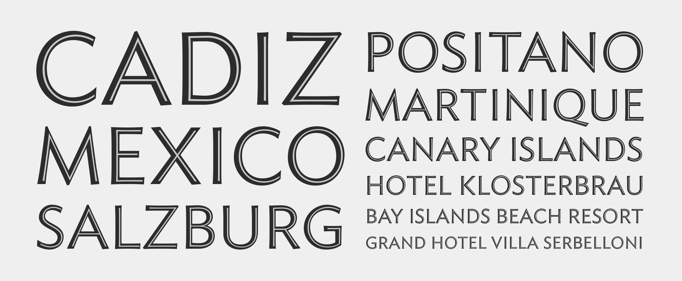
The Acropolis typeface was designed by Jonathan Hoefler in 1992. Acropolis is a design in the ‘grecian’ style, a genus of slab serif characterized by chamfered corners, which emerged in the late Georgian period and flourished in the United States of the mid-nineteenth century. A part of The Proteus Project, the typographic theme-and-variations based on related Regency styles, Acropolis was the first grecian type family to include a companion cursive italic. Acropolis was created for Rolling Stone, in whose pages the typeface first appeared in 1993.
Acropolis is available from the Hoefler&Co website, typography.com.
Archer
Designed by
Jonathan Hoefler
With contributions from
Tobias Frere-Jones, Jesse Ragan
Additional material by
Jordan Bell, Andy Clymer
Special thanks to Gael Towey and Barbara de Wilde
The Archer typeface was designed by Jonathan Hoefler in 2001. While rooted in the ‘geometric slab serif’ style that emerged in the early nineteenth century (and reached full flower a century later), Archer’s many liberties with the style include its uncharacteristic application of ‘ball terminals’ to capital letters such as ‘C’ and ‘S,’ a detail traditionally found only in the lowercase alphabet. Archer was created for Martha Stewart Living, in whose pages the typeface first appeared in 2001.
Advance copies of Archer were circulated under the working title msl Archer.
Archer is available from the Hoefler&Co website, typography.com.
Cesium
Designed by
Jonathan Hoefler
Based on
Vitesse by Hoefler&Co.
With contributions from
Sara Soskolne, Colin M. Ford, Troy Leinster
The Cesium typeface was designed by Jonathan Hoefler in 2020. An energetic inline adaptation of Hoefler’s broad-shouldered Vitesse Black typeface (2000), Cesium is named for the fifty-fifth member of the periodic table of the elements, a volatile liquid metal that presents as a scintillating quicksilver.
Cesium is available from the Hoefler&Co website, typography.com.
Champion Gothic
Designed by
Jonathan Hoefler
Special thanks to Steve Hoffman and Peter Herbert
The Champion Gothic typeface was designed by Jonathan Hoefler in 1991. A collection of six sans serifs related by width instead of weight, Champion was inspired by the sundry American wood types that were once used indiscriminately by nineteenth century poster printers, creating the riotous aesthetic that is identified with Americana. Champion Gothic was created for Sports Illustrated, in whose pages the typeface first appeared in 1991.
Advance copies of Champion Gothic were circulated under the working title S. I. Gothic.
Champion Gothic is available from the Hoefler&Co website, typography.com.
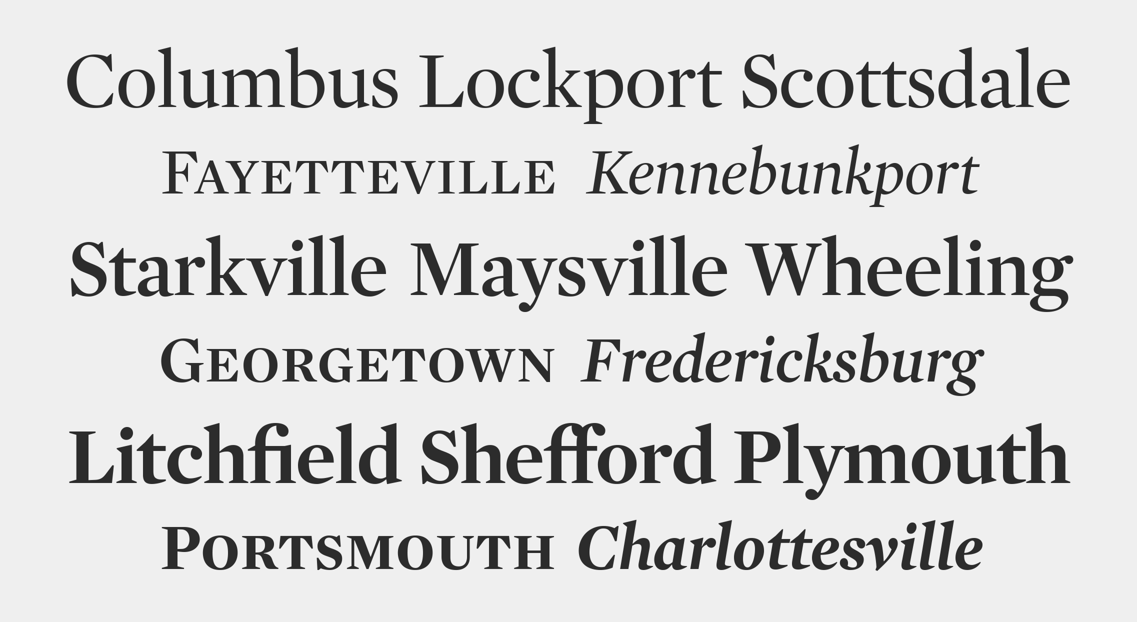
Chronicle
Designed by
Jonathan Hoefler
Based on
Chronicle Text by Hoefler&Co.
With contributions from
Tobias Frere-Jones, Jesse Ragan; Sara Soskolne
Additional material by
Colin M. Ford
Special thanks to Lucie Lacava
The Chronicle Display typeface was designed by Jonathan Hoefler in 2002, as a display-size counterpart to Chronicle Text. Chronicle is an update to the ‘scotch’ genre of typefaces, which emerged at the end of the eighteenth century, and remains one of typography’s most enduring and serviceable styles of letter. Chronicle Text was created for The Toronto Star, in whose pages the typeface first appeared in 2002.
Advance copies of Chronicle were circulated under the working title Torstar.
Chronicle is available from the Hoefler&Co website, typography.com.
Chronicle Text
Designed by
Jonathan Hoefler
With contributions from
Tobias Frere-Jones, Jesse Ragan; Sara Soskolne
Special thanks to Lucie Lacava
The Chronicle Text typeface was designed by Jonathan Hoefler in 2002, as a text-size counterpart to Chronicle Display. Chronicle is an update to the ‘scotch’ genre of typefaces, which emerged at the end of the eighteenth century, and remains one of typography’s most enduring and serviceable styles of letter. Chronicle Text was created for The Toronto Star, in whose pages the typeface first appeared in 2002.
Advance copies of Chronicle Text were circulated under the working title Torstar Text.
Chronicle Text is available from the Hoefler&Co website, typography.com.
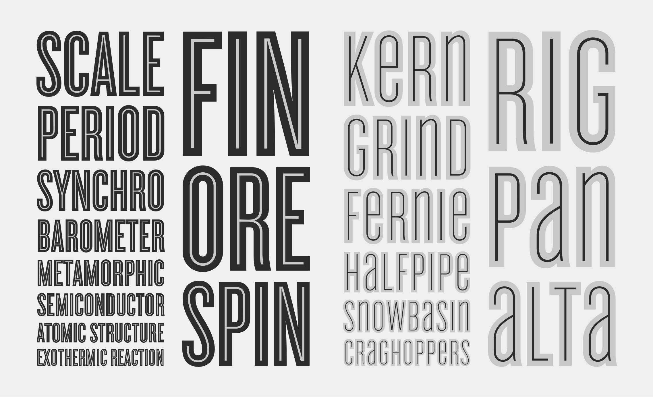
Cyclone
Designed by
Jonathan Hoefler
Based on
Knockout by Hoefler&Co.
With contributions from
Joshua Darden
The Cyclone typeface was designed by Jonathan Hoefler in 1999. A decorative inline face, adapted from Hoefler’s Knockout No. 67 (1994), Cyclone is a ‘biform’ alphabet featuring lowercase letters drawn to the height of the capitals. A ‘chromatic’ typeface, Cyclone includes the two styles Background and Inline, designed to be set in different colors and superimposed in register.
Cyclone is available from the Hoefler&Co website, typography.com.
Decimal
Designed by
Jonathan Hoefler and Sara Soskolne
With contributions from
Jordan Bell, Colin M. Ford, Troy Leinster
The Decimal typeface was designed by Jonathan Hoefler and Sara Soskolne in 2019. Inspired by the markings on wristwatches, whose open gestures and dilated corners help create clear shapes at small sizes, Decimal was designed to preserve a vanishing and recognizable quality of horology driven nearly to extinction by digital fonts. Decimal first appeared in 2019, in an episode of the Netflix documentary ‘Abstract: The Art of Design’ devoted to Hoefler and his work, and in 2020 became the signature typeface of both the Biden–Harris campaign and the Biden White House.
Decimal is available from the Hoefler&Co website, typography.com.
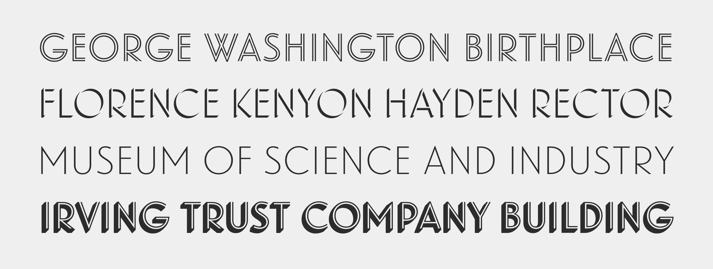
htf Didot
Designed by
Jonathan Hoefler
Special thanks to Fabien Baron and Liz Tilberis
The htf Didot typeface was designed by Jonathan Hoefler in 1991. A design in the ‘modern’ genus, whose rationality and precision suggests engineering rather than penmanship, htf Didot pays homage to the French neoclassical typefounder Firmin Didot (1764–1836) whose work epitomizes the style. Designed for Harper’s Bazaar, in whose pages the typeface first appeared in September 1992, htf Didot was one of the first digital typefaces designed with a schedule of ‘optical sizes’ that preserve the fonts’ delicate hairlines at any size. htf Didot is in the permanent collection of the Museum of Modern Art in New York.
Advance copies of htf Didot were circulated under the working titles Bazaar Didot, Baron Didot, Jacquard, and Parisienne.
htf Didot is available from the Hoefler&Co website, typography.com.
Forza
Designed by
Jonathan Hoefler
Based on
Vitesse by Hoefler&Co.
With contributions from
Tobias Frere-Jones, Andy Clymer, Sara Soskolne
Special thanks to Scott Dadich
The Forza typeface was designed by Jonathan Hoefler in 2006. A sans serif adaptation of Hoefler’s Vitesse typeface (2000), the central motif of both typefaces is a soft-cornered barrel shape, which affords opportunities for both long straightaways and quick turns. Forza was created for Wired magazine, in whose pages the typeface first appeared in 2006.
Advance copies of Forza were circulated under the working title Vitesse Sans.
Forza is available from the Hoefler&Co website, typography.com.
Giant
Designed by
Jonathan Hoefler
Special thanks to Barbara Glauber
The Giant typeface was designed by Jonathan Hoefler in 1996. A sly mashup of different industrial idioms, including spray-painted stencils, feltboard office directories, and surface-gilt window letters, Giant was commissioned by Barbara Glauber on behalf of the iconic rock duo They Might Be Giants. A ‘chromatic’ typeface, Giant includes the two styles Background and Highlight, designed to be set in different colors and superimposed in register. Originally known as They Might Be Gothic, the Giant typeface first appeared on the band’s 1996 album Factory Showroom.
Advance copies of Giant were circulated under the working title They Might Be Gothic.
Giant is available from the Hoefler&Co website, typography.com.
Gotham
Designed by
Jonathan Hoefler and Tobias Frere-Jones
With contributions from
Jesse Ragan; Sara Soskolne, Andy Clymer
Additional material by
Kevin Dresser, Wendy Ellerton, Malou Verlomme, Ksenya Samarskaya, Aoife Mooney, Erin McLaughlin, Colin M. Ford
Gotham Variable (Monotype, 2026)
Lead Designer
Sara Soskolne
With contributions from
Jordan Bell, Fernando Mello
Special thanks to Arem Duplessis and Paul Martinez, Gerry Leonidas, Maxim Zhukov, and Ilya Ruderman
The Gotham typeface was designed by Jonathan Hoefler and Tobias Frere-Jones in 2000. A sans serif that shares many attributes of typography’s ‘geometric’ genus, Gotham was inspired by a style of bold capital letters that evolved outside the typographic tradition in the early twentieth century, common to lithographed posters, enamel signs, and commercial facades throughout New York City. First appearing in the pages of GQ magazine in 2001, Gotham gained international attention in 2007 when it was adopted by the presidential campaign of Barack Obama. One of the most popular and influential typefaces of our time, Gotham is in the permanent collection of the Museum of Modern Art in New York.
Advance copies of Gotham were circulated under the working title GQ Sans.
Gotham is available from the Hoefler&Co website, typography.com.
Gotham Rounded
Designed by
Jonathan Hoefler and Tobias Frere-Jones
Based on
Gotham by Hoefler&Co.
With contributions from
Jesse Ragan; Sara Soskolne, Kevin Dresser, Andy Clymer, Erin McLaughlin
Special thanks to Abbott Miller
The Gotham Rounded typeface was designed by Jonathan Hoefler and Tobias Frere-Jones in 2004. An adaptation of the Gotham typeface (2000), whose geometric forms were inspired by early twentieth century lettering, Gotham Rounded exchanges crisp angles for soft corners in order to evoke the rounded alphabets native to lettering templates, blueprints, and the machined markings on precision instruments. Gotham Rounded first appeared in the pages of Print magazine in 2004.
Gotham Rounded is available from the Hoefler&Co website, typography.com.
The Historical Allsorts
Designed by
Jonathan Hoefler
With contributions from
Eric Siry; Kevin Dresser
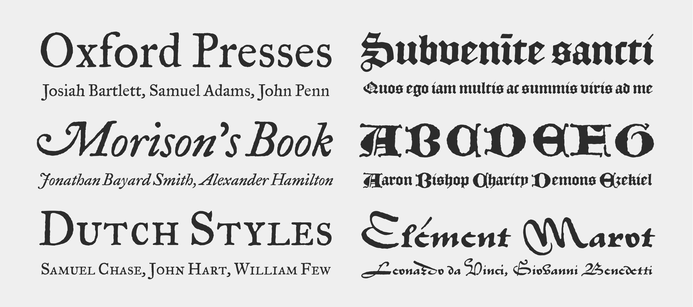
The Historical Allsorts were designed by Jonathan Hoefler in 1992. An experiment to digitally record the shapes of typographic artifacts, rather than interpret them through new drawings, the collection salutes three milestones in early typography: a textura, a civilité, and a set of ‘old style’ book faces from collection known as The Fell Types. The Historical Allsorts first appeared in the pages of Rolling Stone in 1994.
English Textura. The English Textura records the blackletter and uncial capitals cut by Henric Pieterszoon Lettersnijder some time before 1492. The original textura was made in the ‘English’ size, roughly equivalent to a modern 14 point; the uncials were created in the ‘great primer’ size, akin to 18 point.
Civilité. The Civilité is the St. Augustin Lettre Francoise of around 1562, a splendid interpretation of a French secretary hand cut in type by Robert Granjon, the greatest virtuoso of typography’s golden age. The original type was made in the ‘St. Augustin’ size, about 14 point.
The Fell Types. ‘The Fell Types’ are a collection of typographic materials assembled for the Oxford University Press in the late seventeenth century by Dr. John Fell. These typefaces record the ‘Great Primer’ book faces (roughly 14 point) in roman and italic, cut by Peter de Walpergen before 1693. The Fell Types connect the seventeenth century ‘old style’ types created on the European continent, and English old styles of the Enlightenment.
The Historical Allsorts are available from the Hoefler&Co website, typography.com.
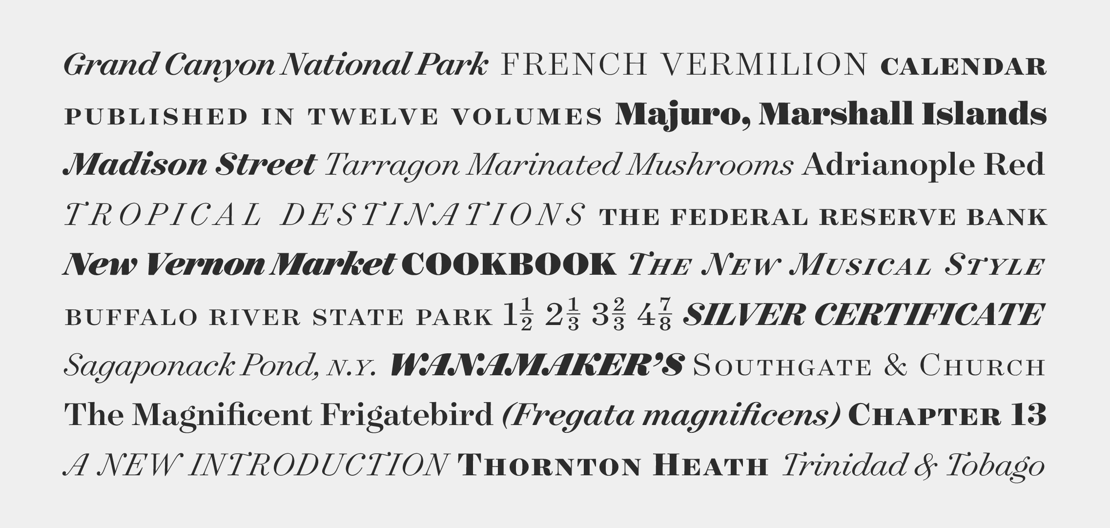
Hoefler Text
Designed by
Jonathan Hoefler
With contributions from
Eric Siry
Special thanks to Lynn Bekkala and Dave Opstad
The Hoefler Text typeface was designed by Jonathan Hoefler in 1991. Created for Apple Computer, it was one of the first digital typefaces to restore many of the vanished traditions once central to fine typography such as extended ligatures, small capitals, engraved initials, and arabesque borders. Not explicitly a historical revival, Hoefler Text is instead a typographic omnibus of seventeenth century styles, paying special tribute to the work of Jean Jannon (1580-1658), whose work was long misattributed to Claude Garamond, and Miklós Kis (1650-1702), the creator of the typefaces commonly ascribed to Anton Janson.
Hoefler Text is available from the Hoefler&Co website, typography.com.
Hoefler Titling
Designed by
Jonathan Hoefler
With contributions from
Jesse Ragan
Additional material by
Sara Soskolne, Aoife Mooney, Andy Clymer
Special thanks to Robert Priest
The Hoefler Titling typeface was designed by Jonathan Hoefler in 1994. A family of elegant display faces in the baroque style, Hoefler Titling shares many mannerisms with the various ‘Garamond’ typefaces of the early twentieth century — nearly all of which revive not the types of sixteenth century punchcutter Claude Garamond, but those of seventeenth century typefounder Jean Jannon. Hoefler Titling was created for House & Garden magazine, in whose pages the typeface first appeared in 1996.
Advance copies of Hoefler Titling were known by the name Wysterius.
Hoefler Titling is available from the Hoefler&Co website, typography.com.
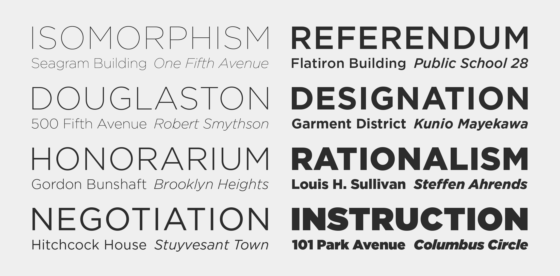
Ideal Sans
Designed by
Jonathan Hoefler
With contributions from
Andy Clymer, Sara Soskolne, Ksenya Samarskaya
Special thanks to Abbott Miller
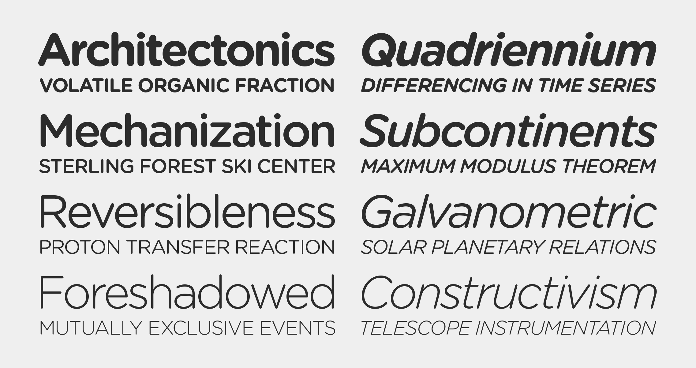
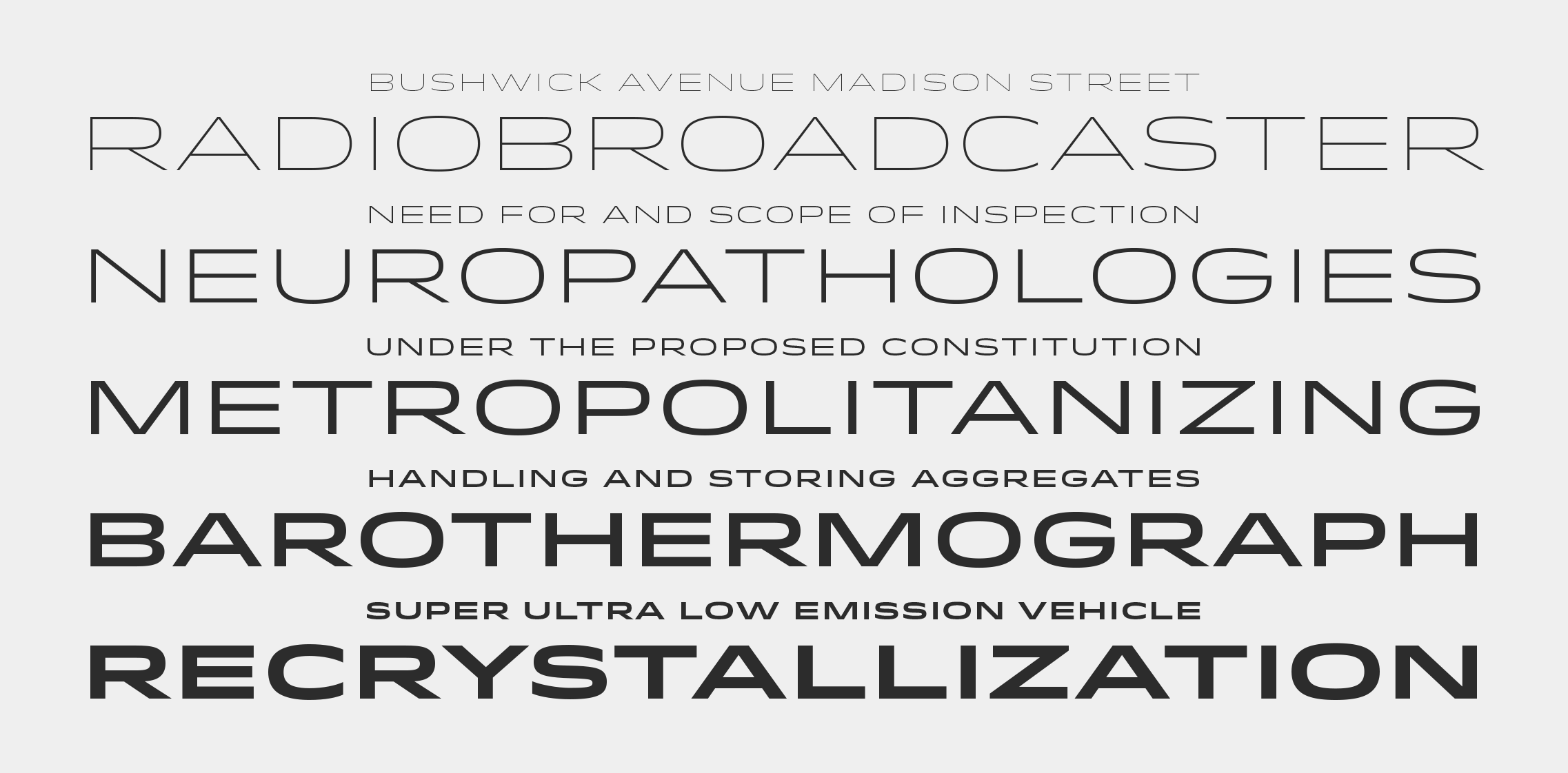
The Ideal Sans typeface was designed by Jonathan Hoefler beginning in 1991. A sans serif in the ‘humanist’ style, its capital letters reference the proportions of classical inscriptions, and its lowercase reveals vestiges of the calligraphic pen. Unlike most sans serifs, it avoids symmetry, repeated shapes, and even straight lines, instead using subtly bowed curves and delicate shifts in stress to achieve a warm and handmade feeling. First appearing in the pages of Entertainment Weekly in 1999, Ideal Sans was expanded into a larger family of typefaces for the Art Institute of Chicago in 2006, and was published by Hoefler&Co in 2011.
Ideal Sans is available from the Hoefler&Co website, typography.com.
Idlewild
Designed by
Tobias Frere-Jones with Jonathan Hoefler
With contributions from
Sara Soskolne, Aoife Mooney
The Idlewild typeface was designed by Tobias Frere-Jones with Jonathan Hoefler in 2004. A wide sans serif with extroverted gestures and serpentine curves, Idlewild recalls the hopeful and ambitious lettering of cruise ships and airplanes from America’s golden age of travel. Idlewild is named for the New York City airport that opened in 1948, known today as John F. Kennedy International Airport.
Idlewild is available from the Hoefler&Co website, typography.com.
Inkwell
Designed by
Jonathan Hoefler
With contributions from
Jordan Bell, Andy Clymer, Colin M. Ford
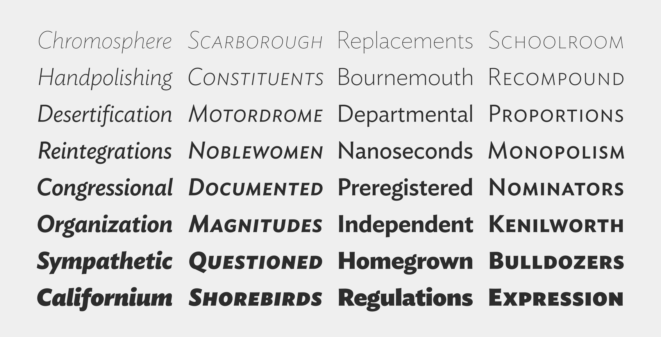
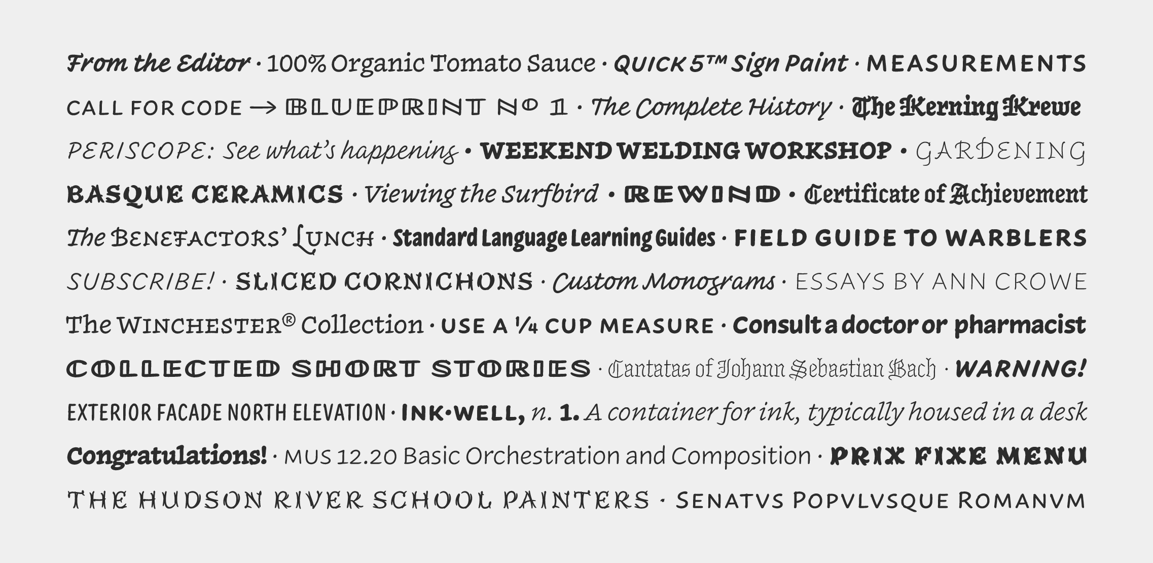
The Inkwell family of typefaces was designed by Jonathan Hoefler beginning in 2004. Designed to combine the informality of handwriting, the expressiveness of lettering, and the versatility of type, Inkwell was the first typeface to interpret a broad range of typographic styles using the aesthetic of handwriting. A family of families, Inkwell includes both serif and sans serif, a connecting script, a blackletter, a decorative ‘tuscan’ alphabet, a set of open capitals evoking draftsman’s lettering, and a condensed sans serif. Inkwell was expanded and completed with the help of Jordan Bell, and published by Hoefler&Co in 2017.
Inkwell is available from the Hoefler&Co website, typography.com.
Isotope
Designed by
Jonathan Hoefler
With contributions from
Sara Soskolne, Troy Leinster
The Isotope typeface was designed by Jonathan Hoefler in 2018. A functionalist sans serif, in which large sweeping curves and subtle small ones are used in counterpoint to the design’s compact, brutalist construction, Isotope was inspired by a style of lettering popularized by the manufacturers of consumer goods in postwar Germany.
Isotope is available from the Hoefler&Co website, typography.com.
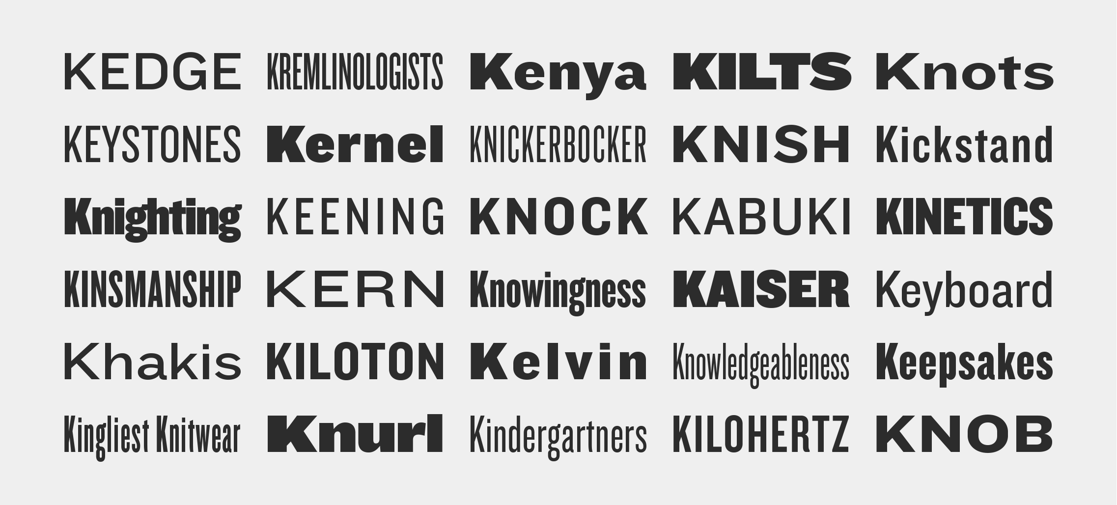
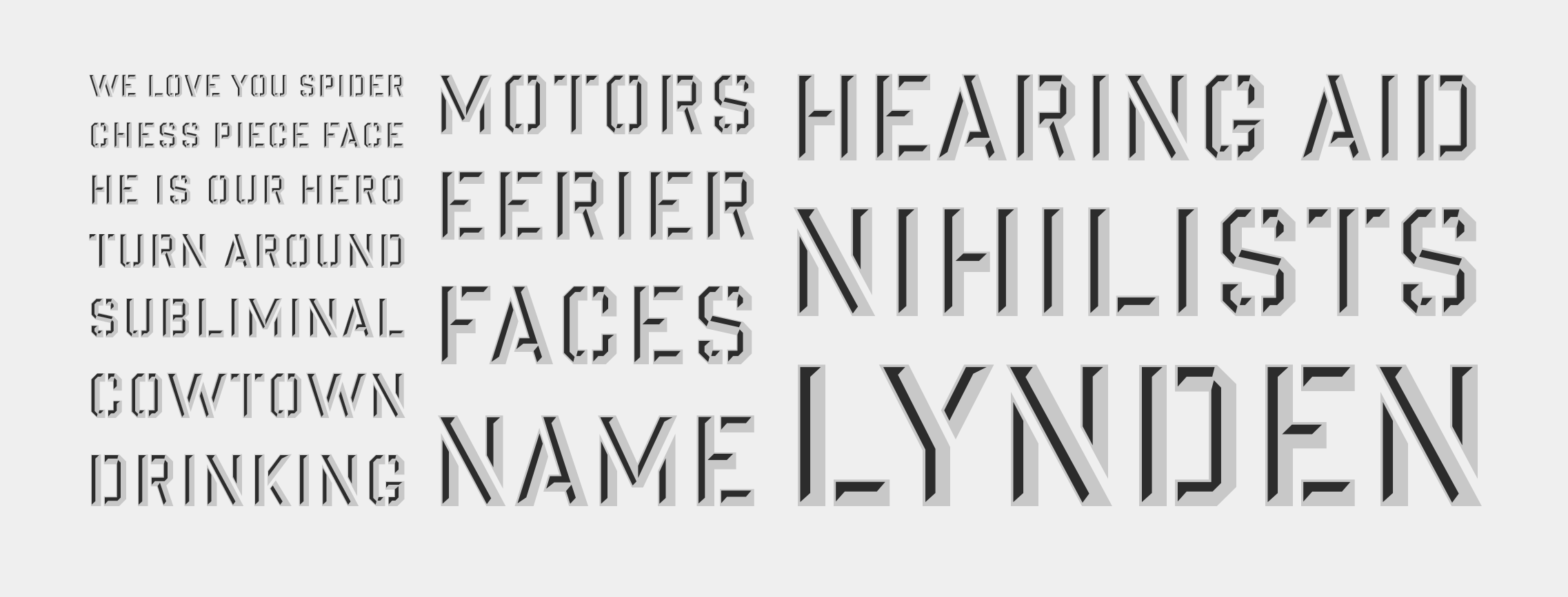
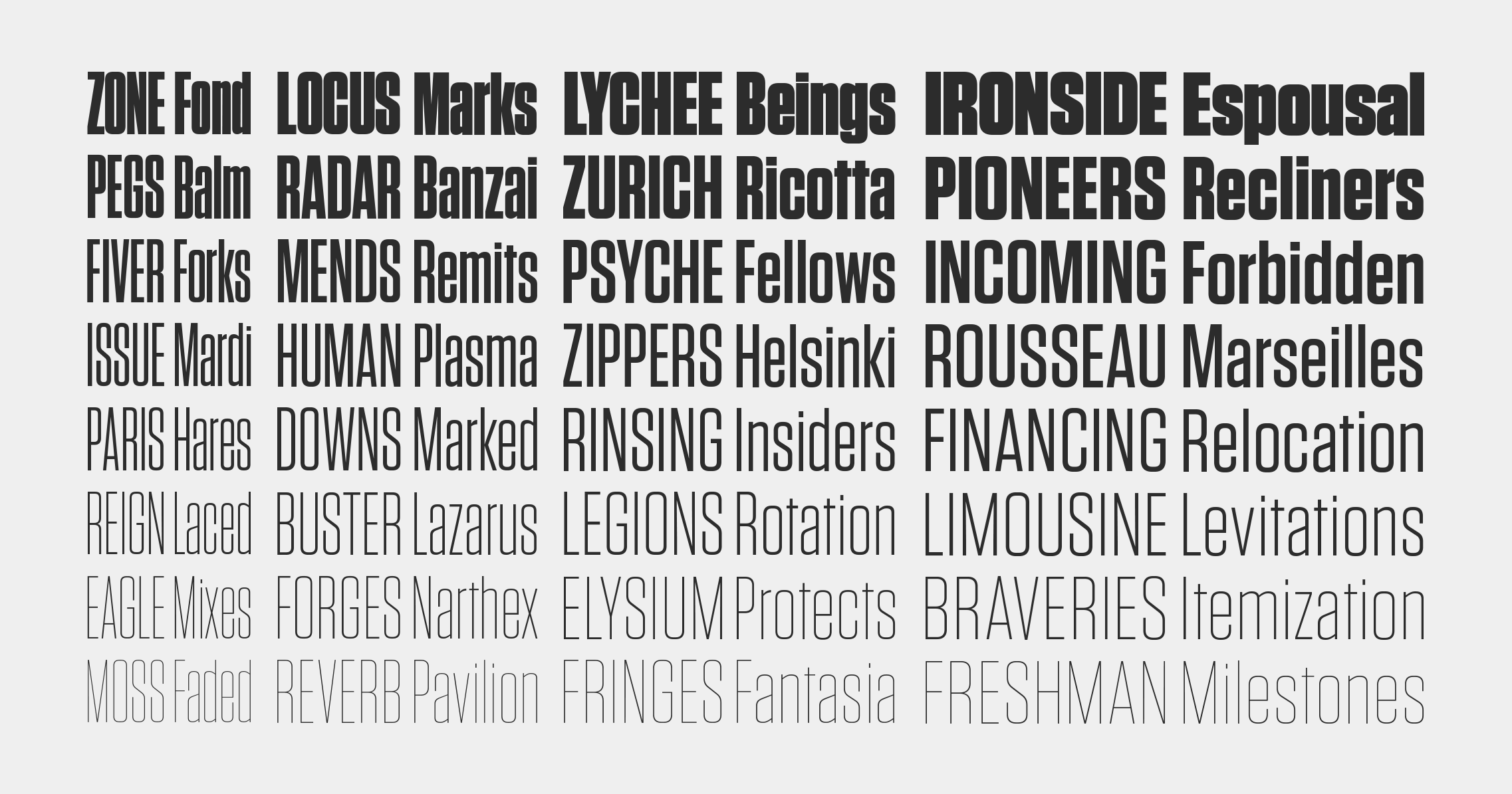
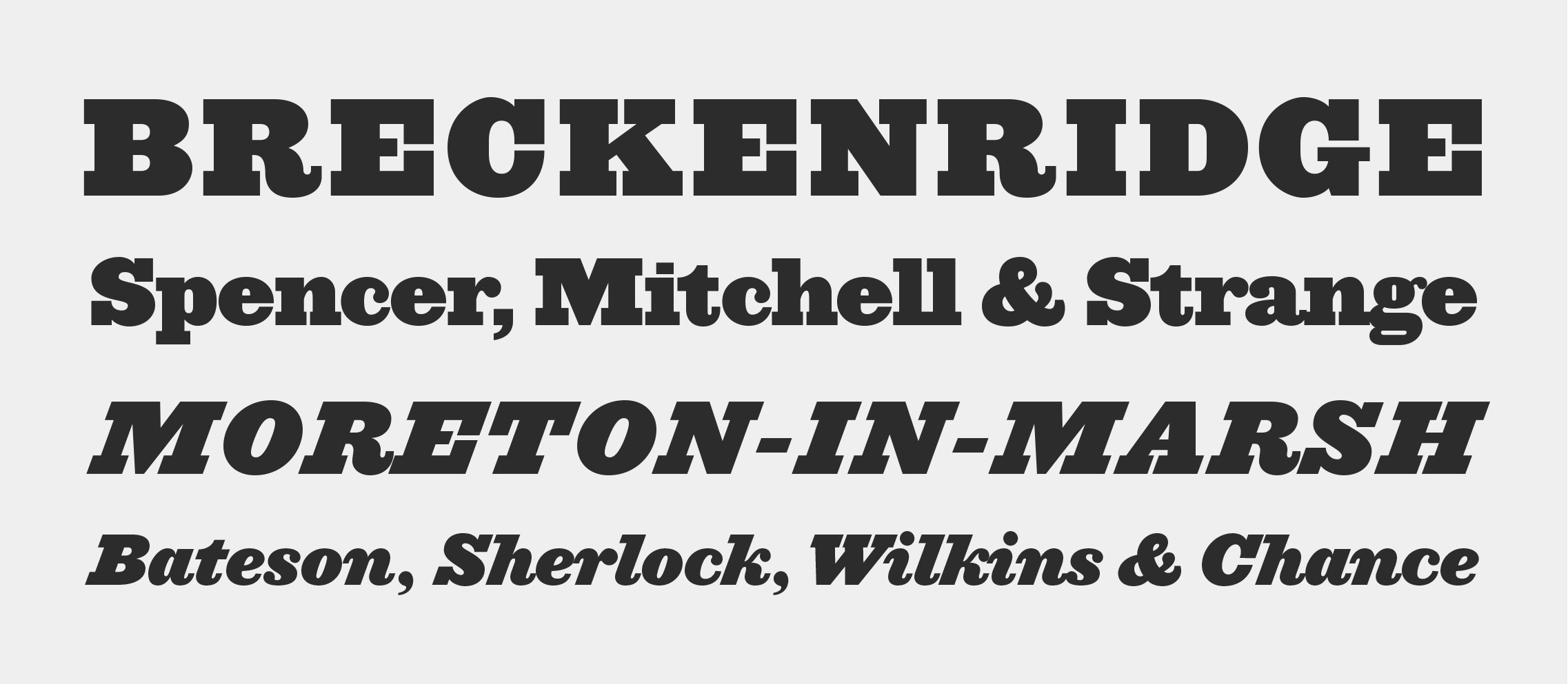
Knockout
Designed by
Jonathan Hoefler
Based on
Champion Gothic by Hoefler&Co.
With contributions from
Kevin Dresser
Special thanks to Janet Froelich, Steve Hoffman, Gail Anderson, and Deb Bishop
The Knockout typeface was designed by Jonathan Hoefler in 1994. A reimagining of Hoefler’s earlier Champion Gothic headline series (1991), Knockout is an interpretation of the motley sans serifs that supplied American job printers starting in the late nineteenth century. Its thirty-two styles reference both the tall, condensed wood types used for posters, and the miniature ‘engraver’s faces’ once used for stationery. A prominent effort in the preservation of American vernacular typography, Knockout first appeared in the pages of The New York Times Magazine in 1994.
Advance copies of Knockout were circulated under the working title Champion Junior.
Knockout is available from the Hoefler&Co website, typography.com.
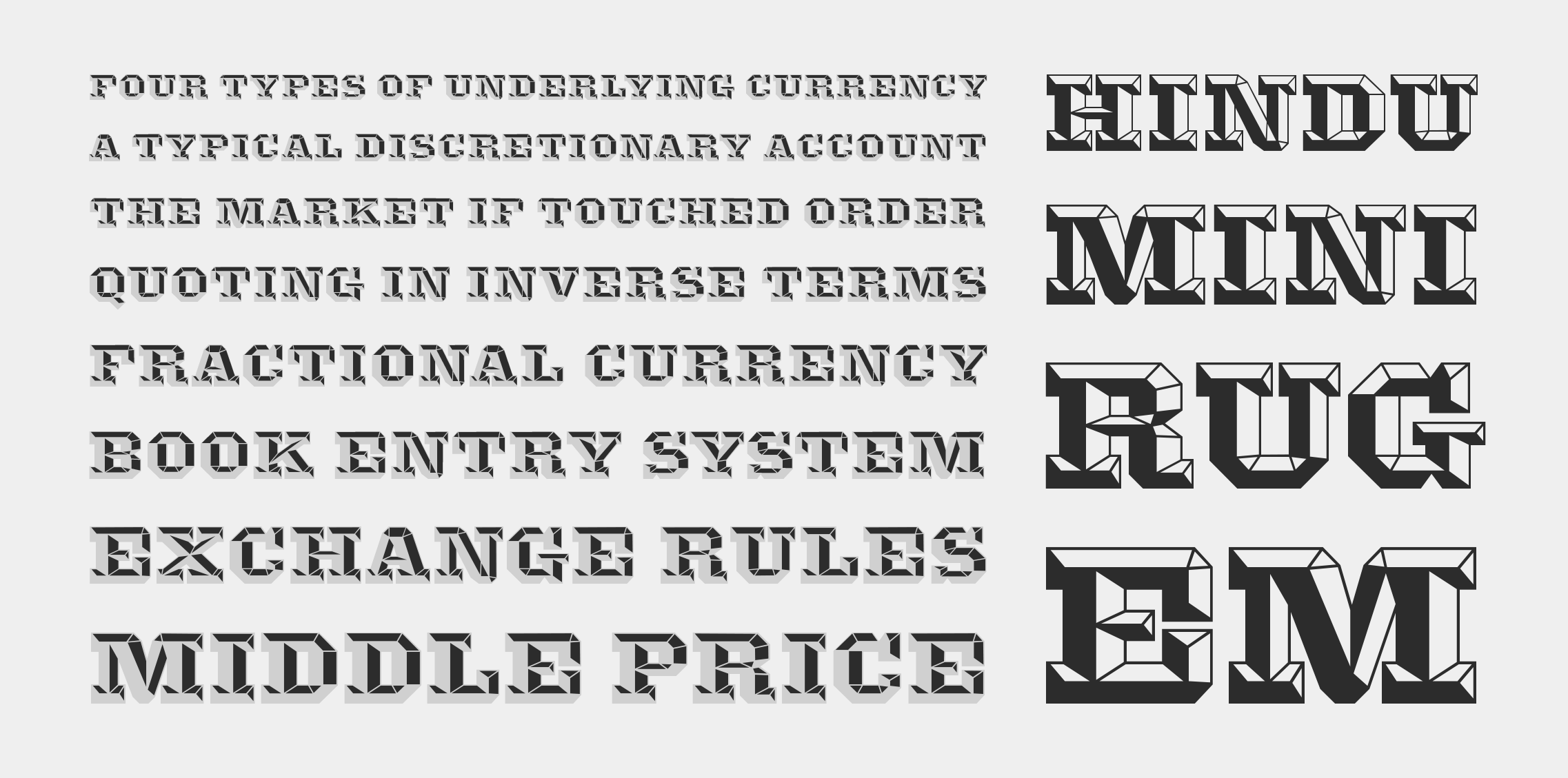
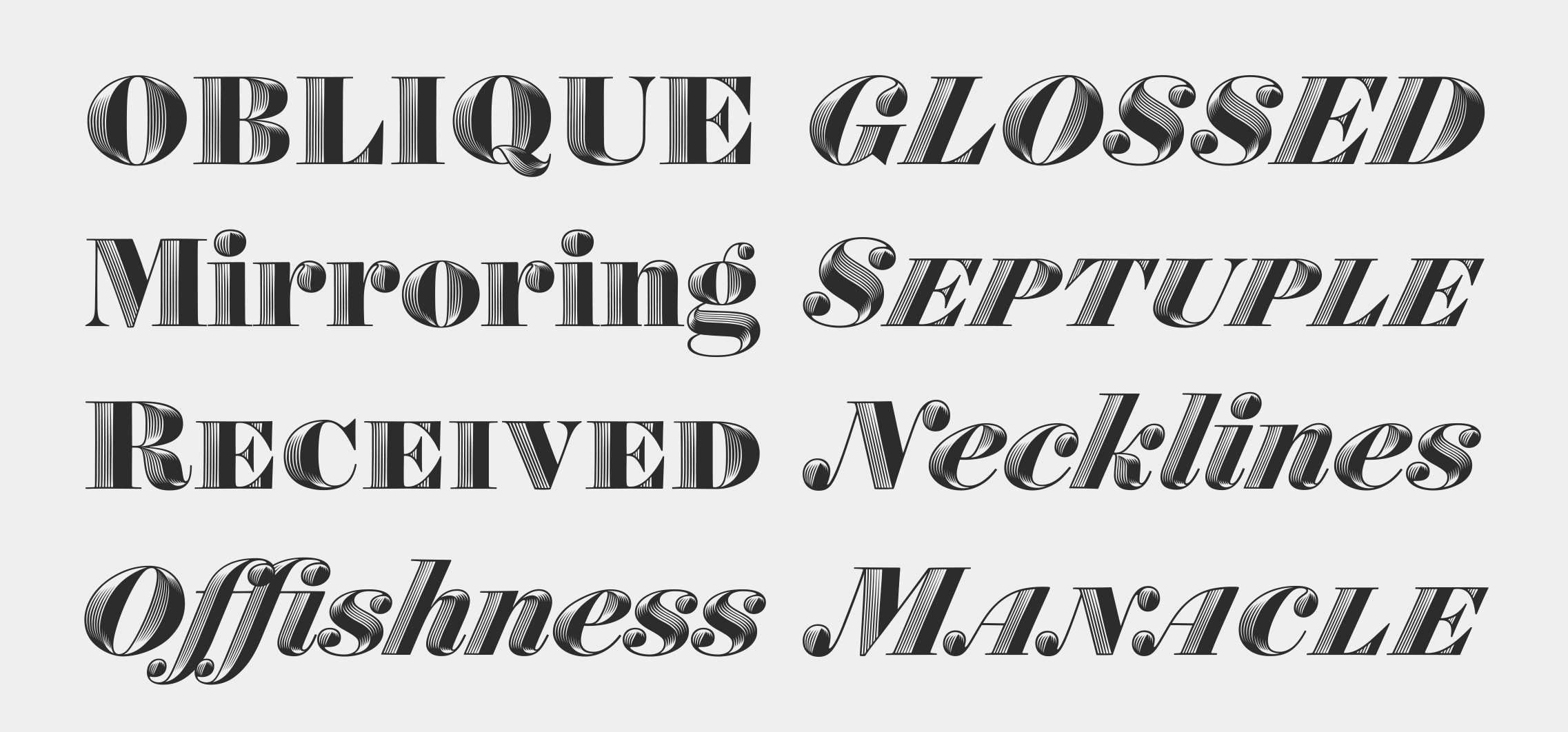
The Knox typeface was designed by Jonathan Hoefler in 1993. A decorative adaptation of Hoefler’s Acropolis typeface (1992), Knox is a dimensional letter of a style that first appeared in the early nineteenth century. Its pattern of facets and shadings was inspired by the ‘16-Line Pica Octagon’ wood type appearing in George Nesbitt’s type specimen of 1838. A ‘chromatic’ typeface, Knox includes the two styles Background and Highlight, designed to be set in different colors and superimposed in register.
Advance copies of Knox were circulated under the working title Acropolis Shaded.
Knox is available from the Hoefler&Co website, typography.com.
Landmark
Designed by
Jonathan Hoefler and Tobias Frere-Jones
With contributions from
Sara Soskolne, Erin McLaughlin
Special thanks to Michael Bierut
The Landmark typeface was designed by Jonathan Hoefler and Tobias Frere-Jones in 1999. A commission from Pentagram, Landmark was created as the signature typeface of Lever House, Gordon Bunshaft’s watershed skyscraper at 390 Park Avenue. Building on the eight extant letterforms that once appeared on the building’s original facade, Landmark expands to a repertoire of hundreds of characters, across four different styles that evoke the play of light, shadow, and perspective on architectural lettering.
Advance copies of Landmark were circulated under the working title Lever Sans.
Landmark is available from the Hoefler&Co website, typography.com.
Leviathan
Designed by
Jonathan Hoefler
With contributions from
Eric Siry
Special thanks to Gail Anderson
The Leviathan typeface was designed by Jonathan Hoefler in 1992. Leviathan is the sans serif member of The Proteus Project, a typographic theme-and-variations in different nineteenth century styles. Like the earliest sans serif poster types, Leviathan presents as a slab serif typeface denuded of ornamentation; unlike these early faces, it includes a companion italic, whose cursive motif adds a welcome brightness to the dark gothic style. Leviathan was created for Rolling Stone, in whose pages the typeface first appeared in 1993.
Advance copies of Leviathan were circulated under the working title Ziggurat Sans.
Leviathan is available from the Hoefler&Co website, typography.com.
Mercury
Designed by
Jonathan Hoefler
With contributions from
Jesse Ragan
Special thanks to Robert Priest
The Mercury typeface was designed by Jonathan Hoefler in 1996. A loose adaptation of the sparkling baroque typefaces of Johann Michael Fleischman (1701-1768), Mercury was an inflection point in Hoefler’s typefaces, in which explicit historical revivals pivoted to more expressive interpretations inspired by historical themes. First appearing in the pages of Esquire in 1997, Mercury is in the permanent collection of the Museum of Modern Art in New York.
Advance copies of Mercury Display were circulated under the working titles Esquire and Esquire Display.
Mercury Display is available from the Hoefler&Co website, typography.com.
Mercury Text
Designed by
Jonathan Hoefler and Tobias Frere-Jones
Based on
Mercury by Hoefler&Co.
With contributions from
Jesse Ragan; Sara Soskolne
Special thanks to Alex Isley
The Mercury Text typeface was designed by Jonathan Hoefler and Tobias Frere-Jones in 2000, as a text-size counterpart to Hoefler’s Mercury Display of 1996. A loose adaptation of the sparkling baroque typefaces of Johann Michael Fleischman (1701-1768), Mercury was an inflection point in Hoefler’s typefaces, in which explicit historical revivals pivoted to more expressive interpretations inspired by historical themes. First appearing in the pages of Esquire in 2000, and expanded into a larger family of typefaces for the New Times newspaper chain, Mercury Text is in the permanent collection of the Museum of Modern Art in New York.
Advance copies of Mercury Text were circulated under the working titles Esquire Text, Mercury News, and Alternative.
Mercury Text is available from the Hoefler&Co website, typography.com.
Nitro & Turbo
Designed by
Tobias Frere-Jones and Jonathan Hoefler
With contributions from
Jesse Ragan; Sara Soskolne, Erin McLaughlin, Andy Clymer
Special thanks to Michael Bierut
The Nitro typeface was designed by Tobias Frere-Jones and Jonathan Hoefler in 2001. Originally part of a commission for the New York Jets football team, Nitro is an aggressively-sloped ‘superitalic,’ which in 2008 was supplemented by the left-leaning (or ‘backslanted’) Turbo typeface. Nitro and Turbo form an unconventional type family that contains two italics, but no roman.
Advance copies of Nitro were circulated under the working title Jets Bold.
Nitro and Turbo are available from the Hoefler&Co website, typography.com.
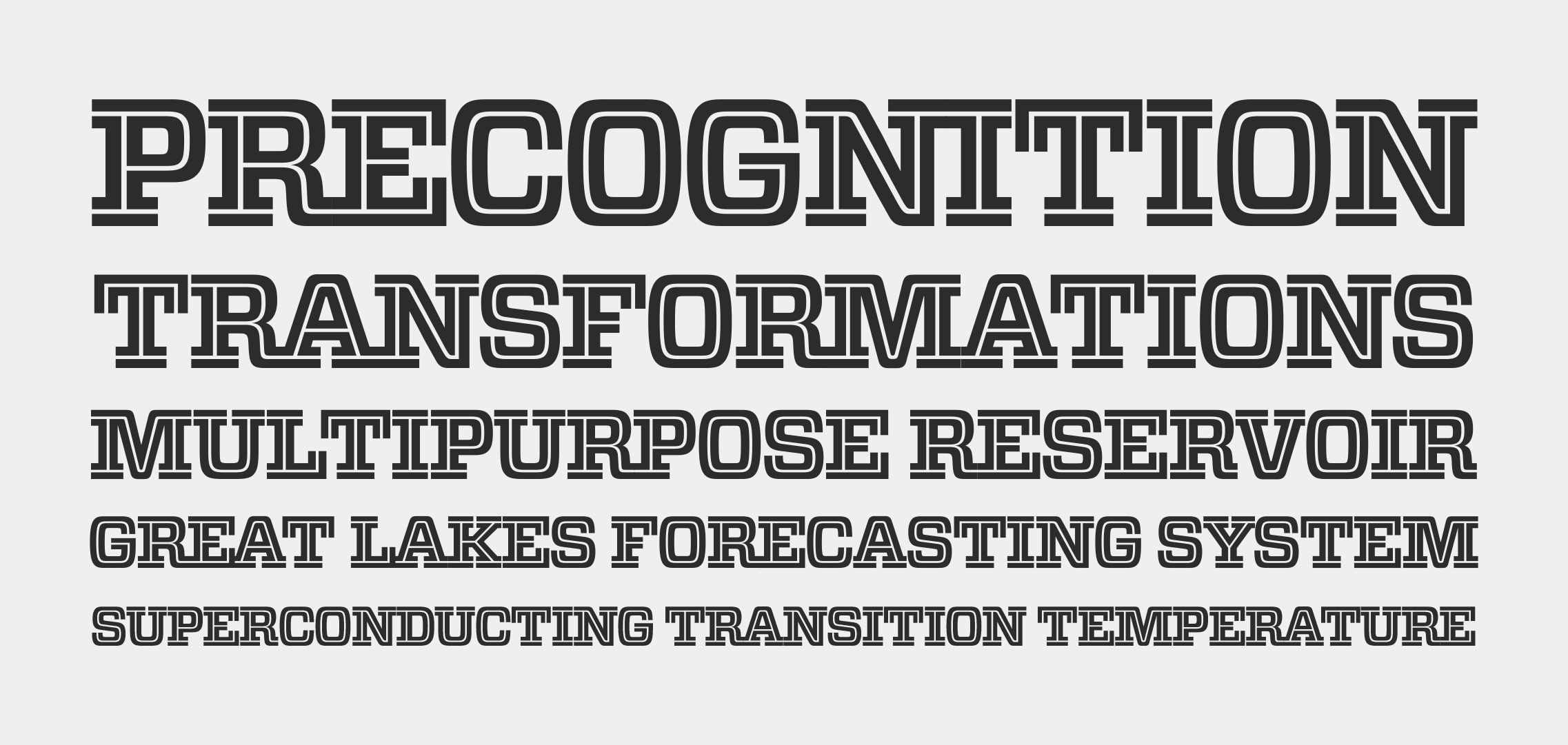
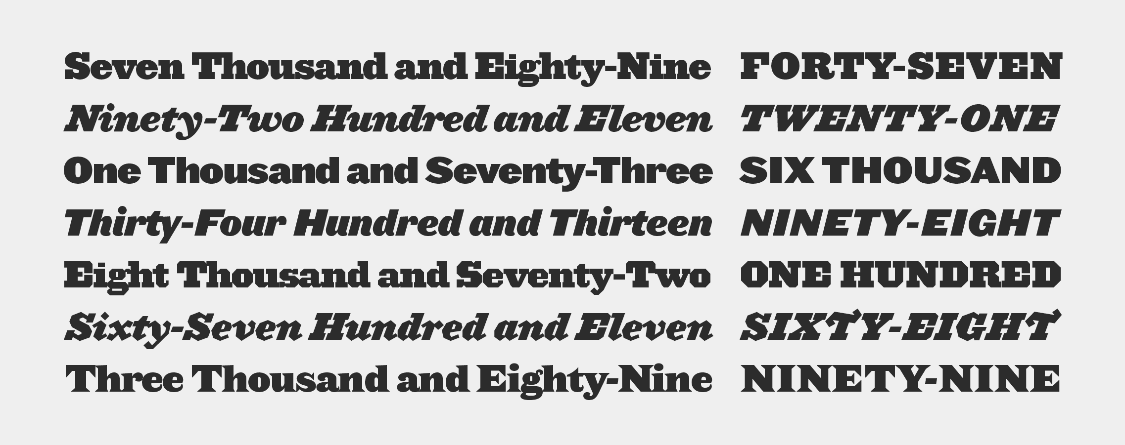
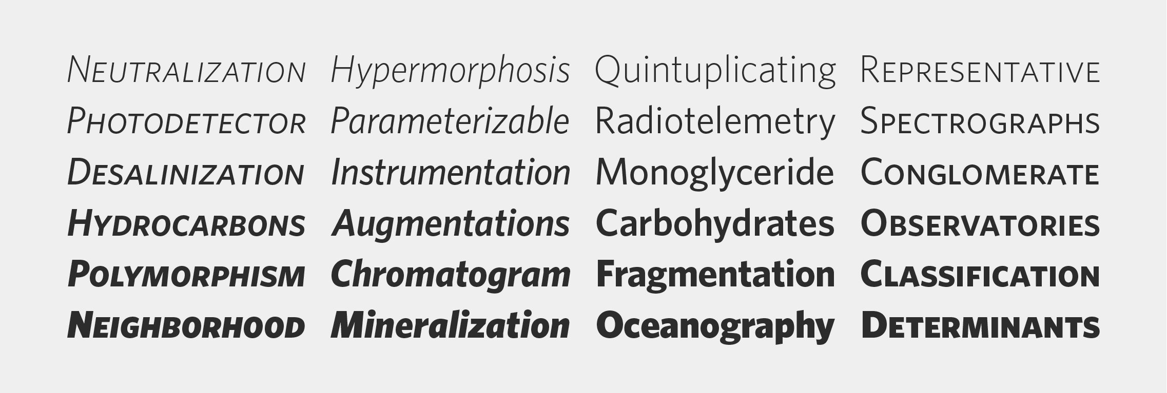
Numbers
Designed by
Jonathan Hoefler and Tobias Frere-Jones
With contributions from
Kevin Dresser; Sara Soskolne
Special thanks to Kit Hinrichs
Deuce, Dividend, Greenback, Indicia, Premium, and Prospekt by Jonathan Hoefler; Bayside, Claimcheck, Delancey, Depot, Redbird, Revenue, Strasse, Trafalgar, and Valuta by Tobias Frere-Jones with Jonathan Hoefler.
‘Numbers’ is a collection of typefaces designed by Jonathan Hoefler and Tobias Frere-Jones, which first appeared in the Pentagram Calendar of 2006. An unusually diverse type family containing sixteen formally unrelated styles, Numbers draws inspiration from a range of visual traditions unconnected with printing types, evoking the recognizable lettering of everyday objects such as playing cards, gasoline pumps, and banknotes.
Dedicated to
Walter S. H. Hamady
The Numbers collection is available from the Hoefler&Co website, typography.com.
The Obsidian typeface was designed by Andy Clymer with Jonathan Hoefler in 2015. Like the Surveyor typeface upon which it is based, Obsidian was inspired by mapmaking, celebrating the fanciful engraved legends that once adorned maps produced through copperplate engraving. Obsidian spans two genres, combining the handmade qualities of English Vernacular lettering with the robust proportions of ‘fat face’ poster types, two innovations in large-size lettering from the early years of the Industrial Revolution. Obsidian was recognized by an Innovation by Design award in 2015.
Obsidian is available from the Hoefler&Co website, typography.com.
Operator
Designed by
Andy Clymer with Jonathan Hoefler
With contributions from
Jordan Bell, Troy Leinster
The Operator typeface was designed by Andy Clymer with Jonathan Hoefler in 2016. A highly personal exploration of the ‘monospace’ aesthetic, in which all letterforms are designed to share a common width, Operator draws inspiration from a range of fixed-width technologies including typewriters and vinyl tape embossers. The family includes both the fixed-width Operator Mono, designed for writing code, and the natural-width Operator that relaxes the rules while preserving the style.
Operator is available from the Hoefler&Co website, typography.com.
Parliament
Designed by
Jonathan Hoefler
With contributions from
Andy Clymer, Sara Soskolne, Troy Leinster, Colin M. Ford, Jordan Bell
Special thanks to James Mosley and Nigel Roche
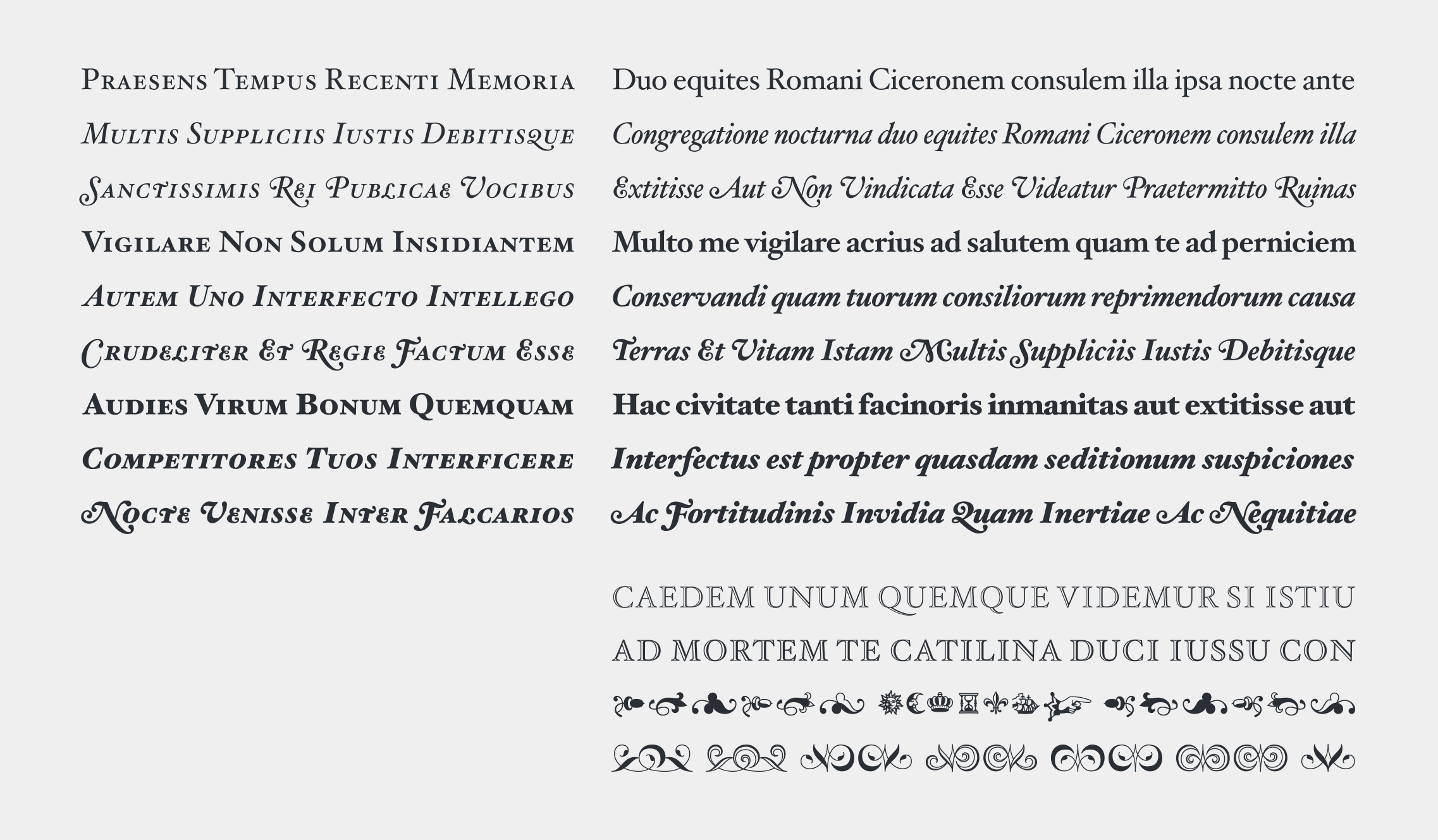
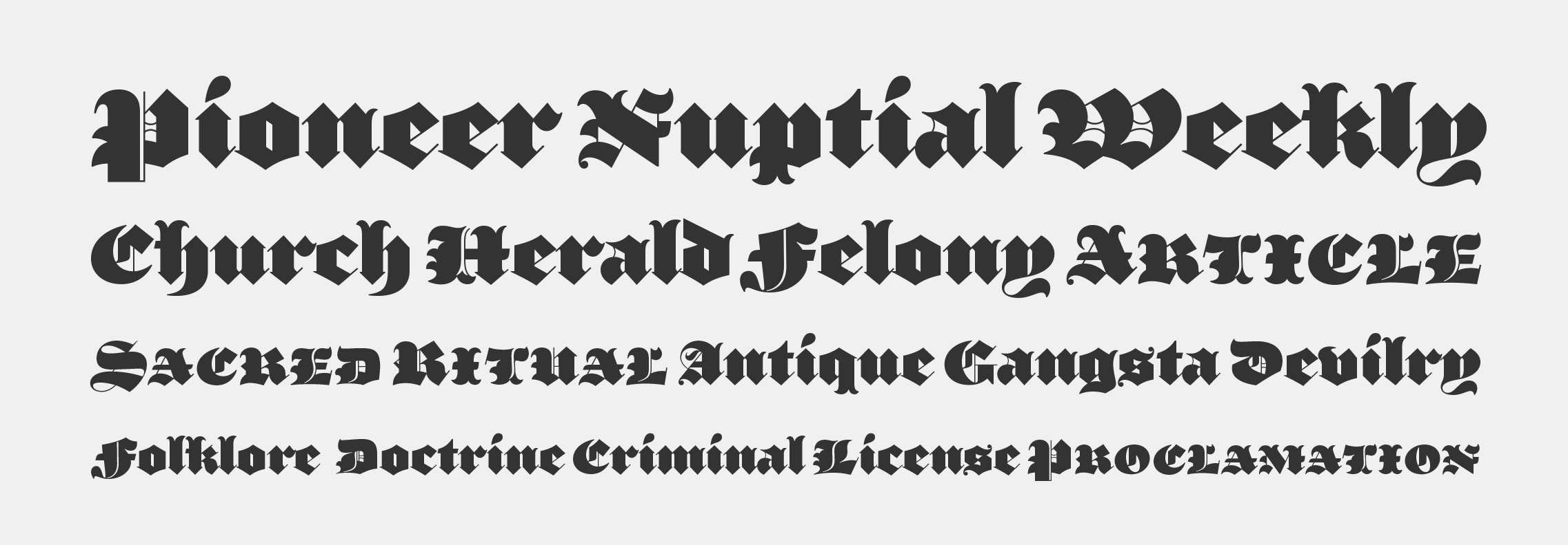
The Parliament typeface was designed by Jonathan Hoefler beginning in 1995. A burlesque typeface in the Regency Blackletter style, Parliament was inspired by the ‘Four-line Pica Black No. 1’ typeface of William Caslon Jr (1821), whose enigmatic design for the letters E, G, I, N, V and Y hinted at a broader ambition to modernize the arcane shapes of the gothic alphabet’s capital letters. Parliament completes this project for the first time by including two sets of alphabets, one archaic and one modern, along with a third set of ‘small caps’ that restores to the blackletter the versatility of Roman type. Parliament was first used for the 1998 ATypI Conference in Lyon, and was published by Hoefler&Co (Monotype) in 2022.
Advance copies of Parliament were circulated under the working title Kapellmeister.
Parliament is available from the Hoefler&Co website, typography.com.

Peristyle
Designed by
Jonathan Hoefler
With contributions from
Troy Leinster, Sara Soskolne, Andy Clymer, Colin M. Ford, Graham Weber
The Peristyle typeface was designed by Jonathan Hoefler in 2017. A family of tall, high contrast sans serifs, Peristyle nods to the soaring typefaces that grew up around the modern skyscraper such as Imre Reiner’s Corvinus (1935), Morris Fuller Benton’s Empire (1938), and Robert Hunter Middleton’s Radiant (1940).
Peristyle is available from the Hoefler&Co website, typography.com.
The Proteus Project
Designed by
Jonathan Hoefler
Special thanks to Gail Anderson
The Proteus Project is set of four type families designed by Jonathan Hoefler beginning in 1991. A theme-and-variations that expands on different typographic styles that evolved during the English Regency (1811–1820), the Proteus Project includes the slab-serif (or ‘egyptian’) Ziggurat, the sans serif (or ‘gothic’) Leviathan, the wedge-serif (or ‘latin’) Saracen, and the chamfered (or ‘grecian’) Acropolis.
Advance copies of Leviathan were circulated under the working title Ziggurat Sans.
The Proteus Project is available from the Hoefler&Co website, typography.com.
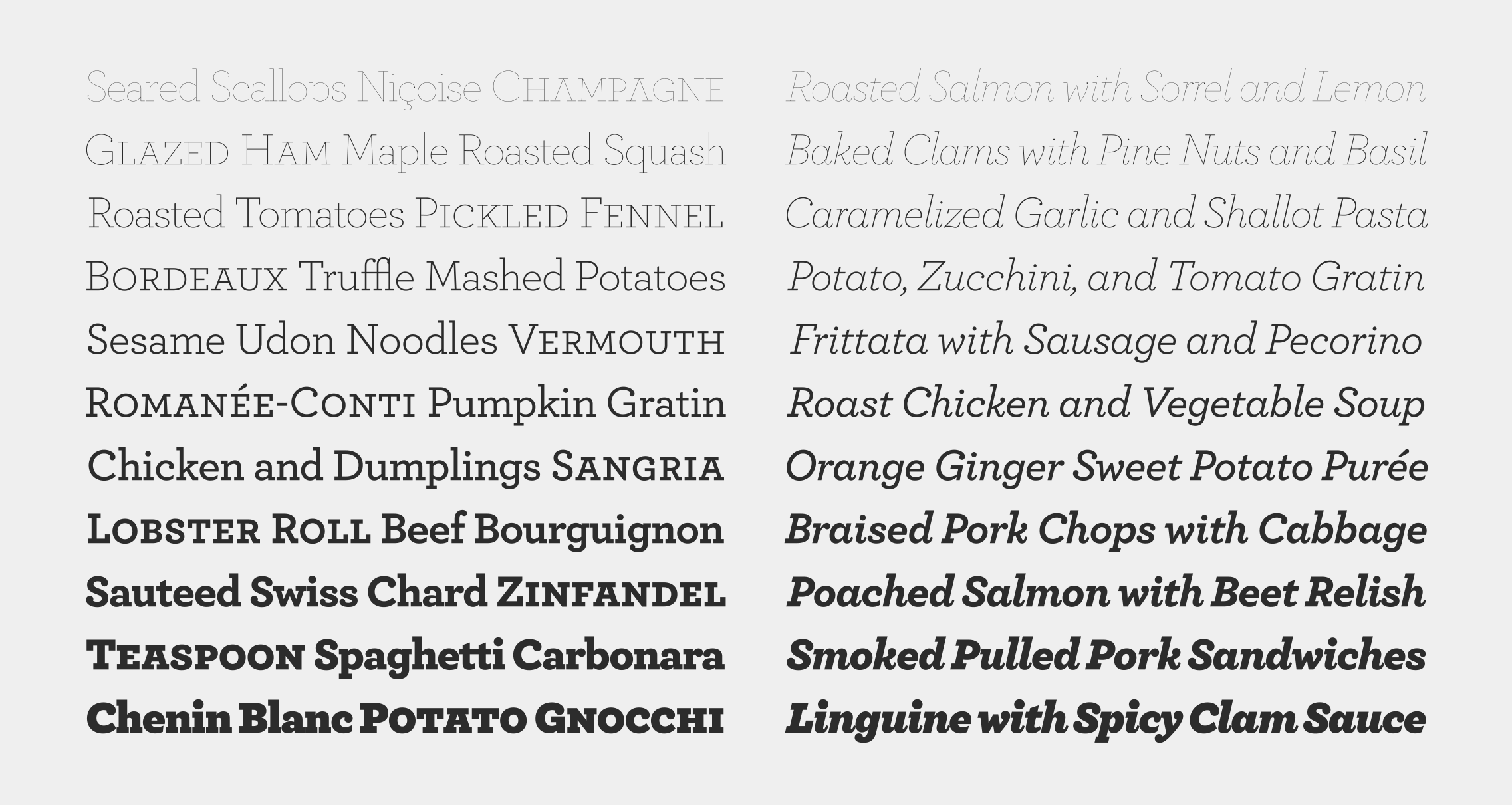
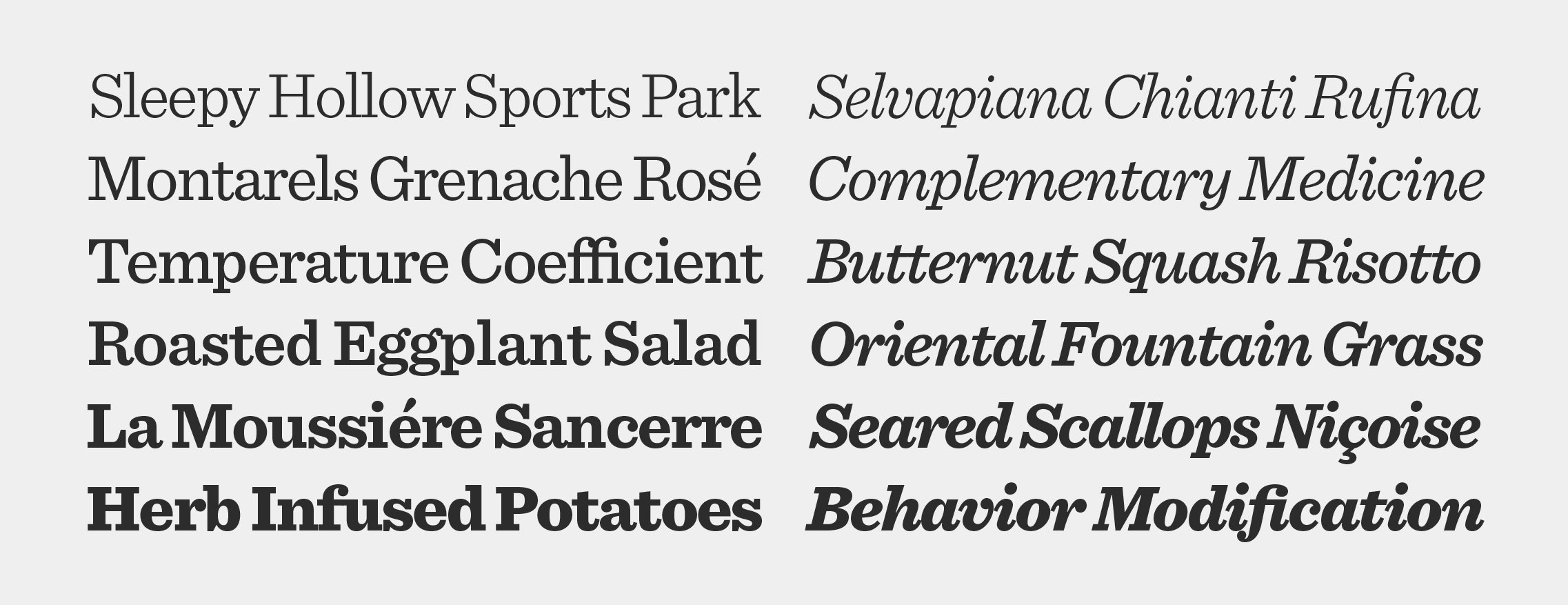
Quarto
Designed by
Sara Soskolne with Jonathan Hoefler
With contributions from
Tobias Frere-Jones
Special thanks to Robert Priest
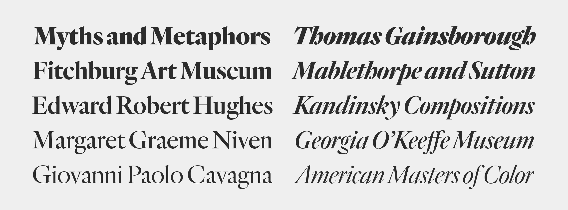
The Quarto typeface was designed by Sara Soskolne with Jonathan Hoefler in 2007. Inspired by the work of Hendrik van den Keere (1540-1580), the Flemish punchcutter recognized as an exemplar of the Dutch Old Style, Quarto includes both an original italic and a range of weights, both typographic innovations unknown in Van den Keere’s time. Quarto was created for Condé Nast Portfolio magazine, in whose pages the typeface first appeared in 2007, and expanded into a larger family of typefaces for publication in 2014.
Advance copies of Quarto were circulated under the working title Caravel.
Quarto is available from the Hoefler&Co website, typography.com.
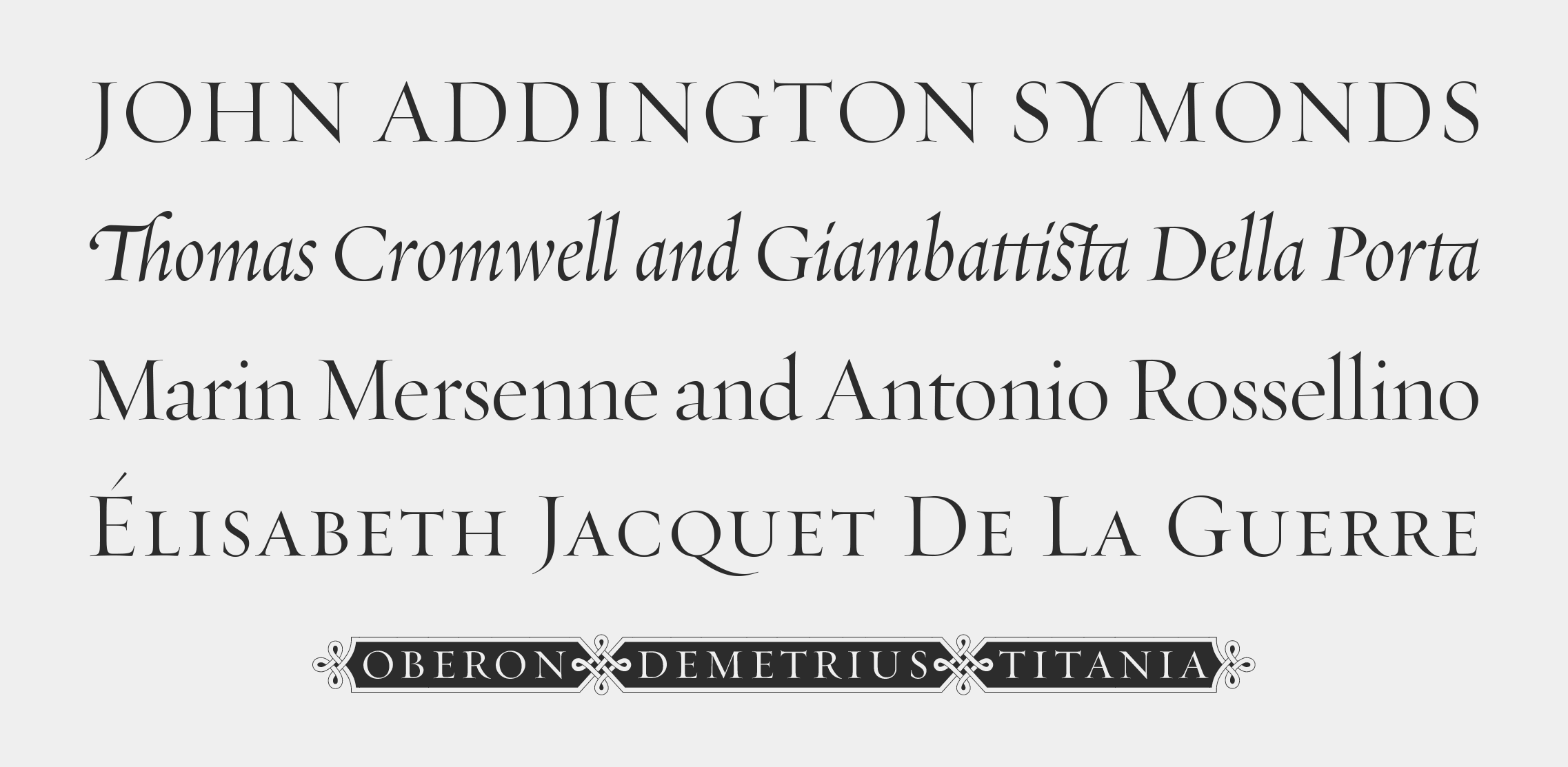
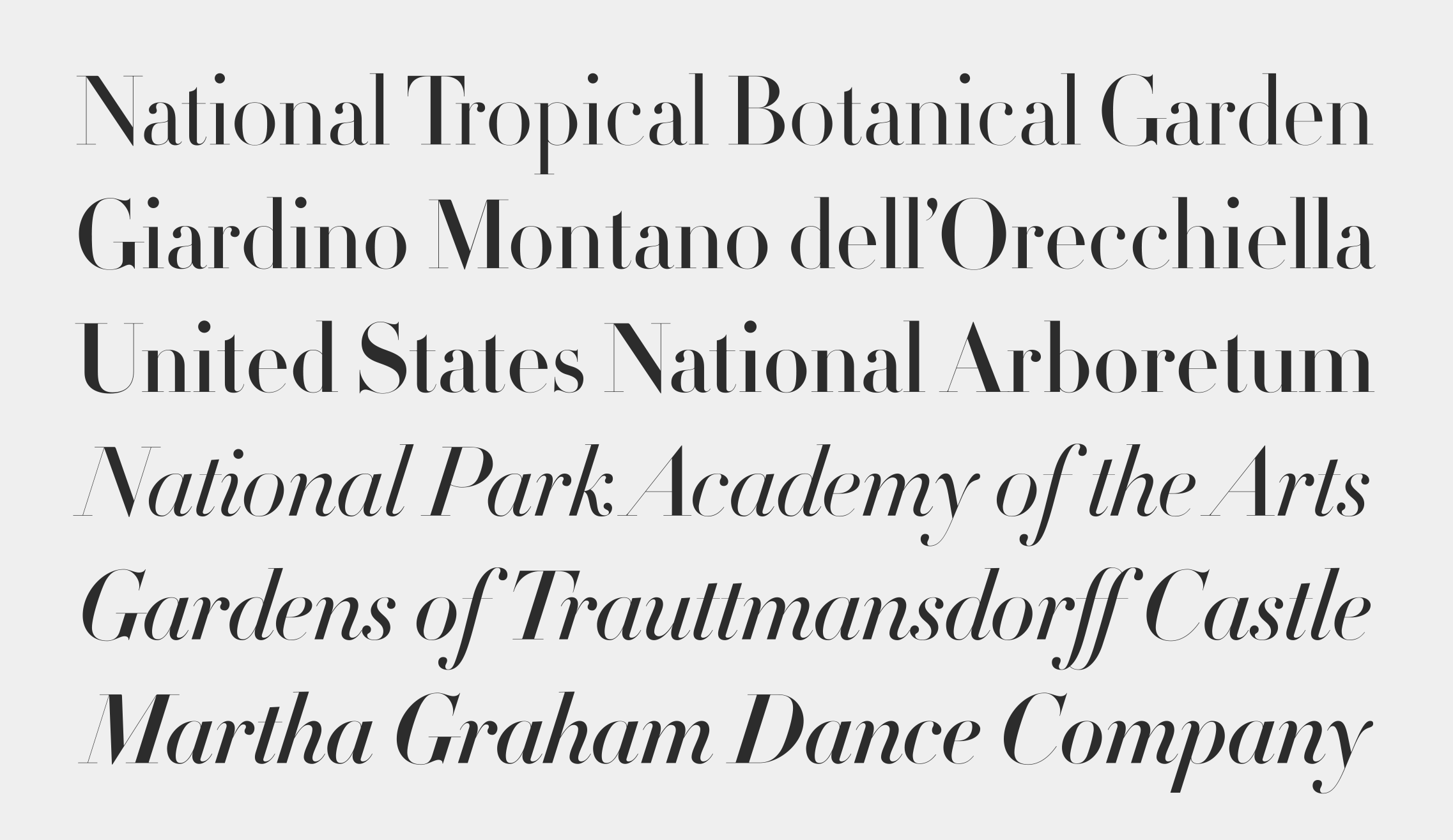
Requiem
Designed by
Jonathan Hoefler
The Requiem typeface was designed by Jonathan Hoefler in 1991. Rooted in the ‘humanist’ style of renaissance Venice, which arose in contrast the dark gothic letters of Gutenberg, Requiem’s capitals are modeled on an alphabet appearing in Il Modo de Temperare le Penne, the 1523 calligraphy manual by writing master Ludovico Vicentino degli Arrighi. The family includes an invented roman lowercase, a ‘chancery italic’ of a contemporaneous style, and separate masters for large, medium, and small sizes. Requiem was commissioned by Travel & Leisure magazine, in whose pages the typeface first appeared in 1993.
Dedicated to
Jerry Kelly
Advance copies of Requiem were circulated under the working titles Aquitaine and Arrighi.
Requiem is available from the Hoefler&Co website, typography.com.
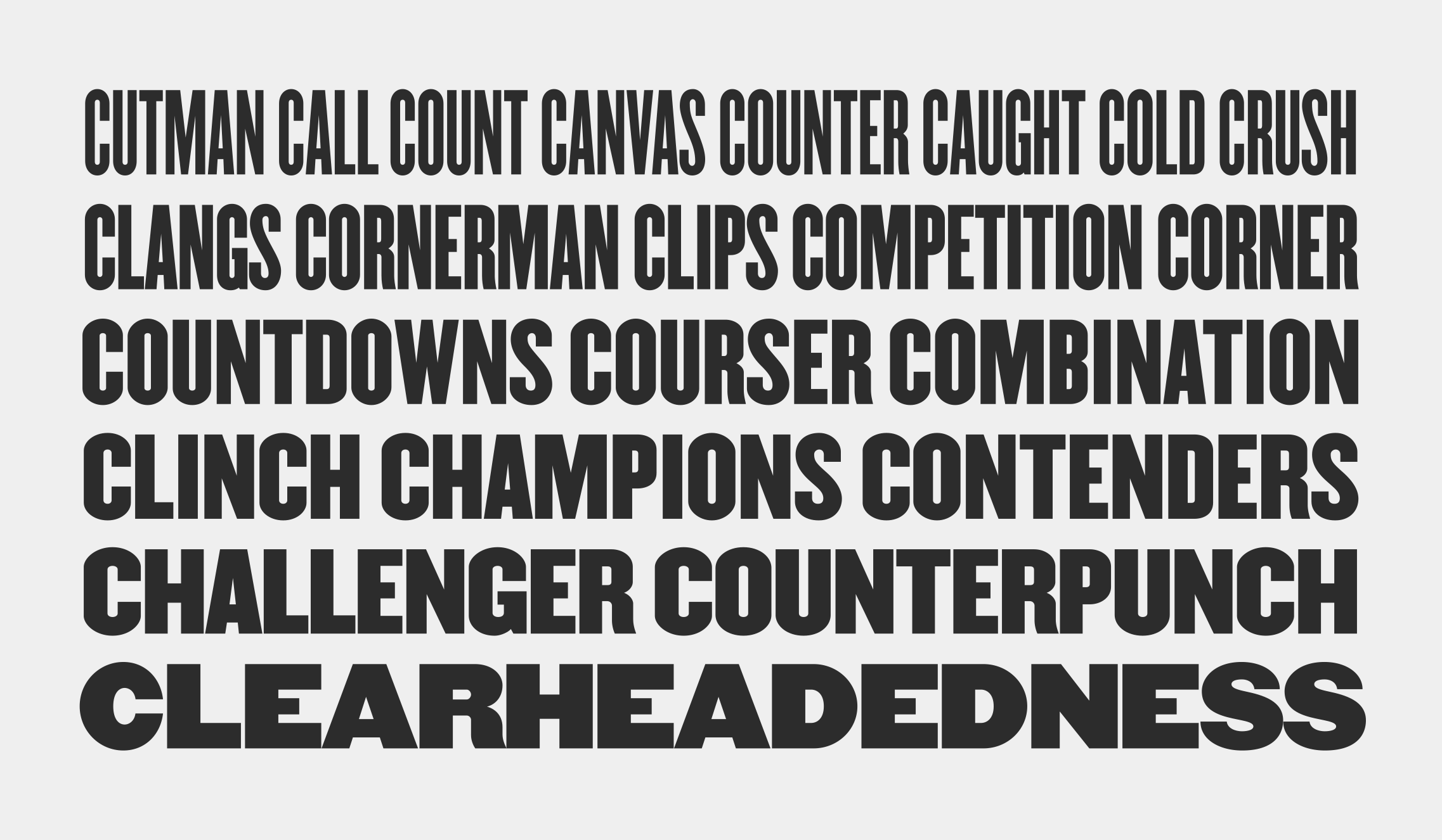
Ringside
Designed by
Jonathan Hoefler and Sara Soskolne
Based on
Knockout by Hoefler&Co.
With contributions from
Andy Clymer, Troy Leinster, Jordan Bell
The Ringside typeface was designed by Jonathan Hoefler and Sara Soskolne in 2016. A reimagining of Hoefler’s earlier Knockout family (1994), Ringside extends this celebration of American vernacular printing into an even broader family of typefaces for small sizes, with variations for both print and screen. An unusually large family, with eight weights across six distinct widths, Ringside first appeared on January 20, 2017, when the outgoing President and First Lady launched the website for The Office of Barack and Michelle Obama.
Dedicated to
Paula Scher
Advance copies of Ringside were circulated under the working title Knockout Text.
Ringside is available from the Hoefler&Co website, typography.com.
Sagittarius
Designed by
Jonathan Hoefler
Based on
Peristyle by Hoefler&Co.
With contributions from
Sara Soskolne, Colin M. Ford
The Sagittarius typeface was designed by Jonathan Hoefler in 2021. A decorative adaptation of Hoefler’s Peristyle typeface (2017), Sagittarius’s rounded corners and streamlined shapes recall the digital aesthetic of the first alphabets designed for machine reading, a style that survives as a cheeky Space Age invocation of futurism. Sagittarius was created for The Historical Dictionary of Science Fiction, where it first appeared in 2021.
Sagittarius is available from the Hoefler&Co website, typography.com.
Saracen
Designed by
Jonathan Hoefler
With contributions from
Eric Siry
Special thanks to Gail Anderson
The Saracen typeface was designed by Jonathan Hoefler in 1992. Saracen is a design in the ‘latin’ style, characterized by wedge-shaped serifs, a genus of type that emerged in the mid-nineteenth century. A part of The Proteus Project, the typographic theme-and-variations based on related Regency styles, Saracen was created for Rolling Stone, in whose pages the typeface first appeared in 1993.
Saracen is available from the Hoefler&Co website, typography.com.
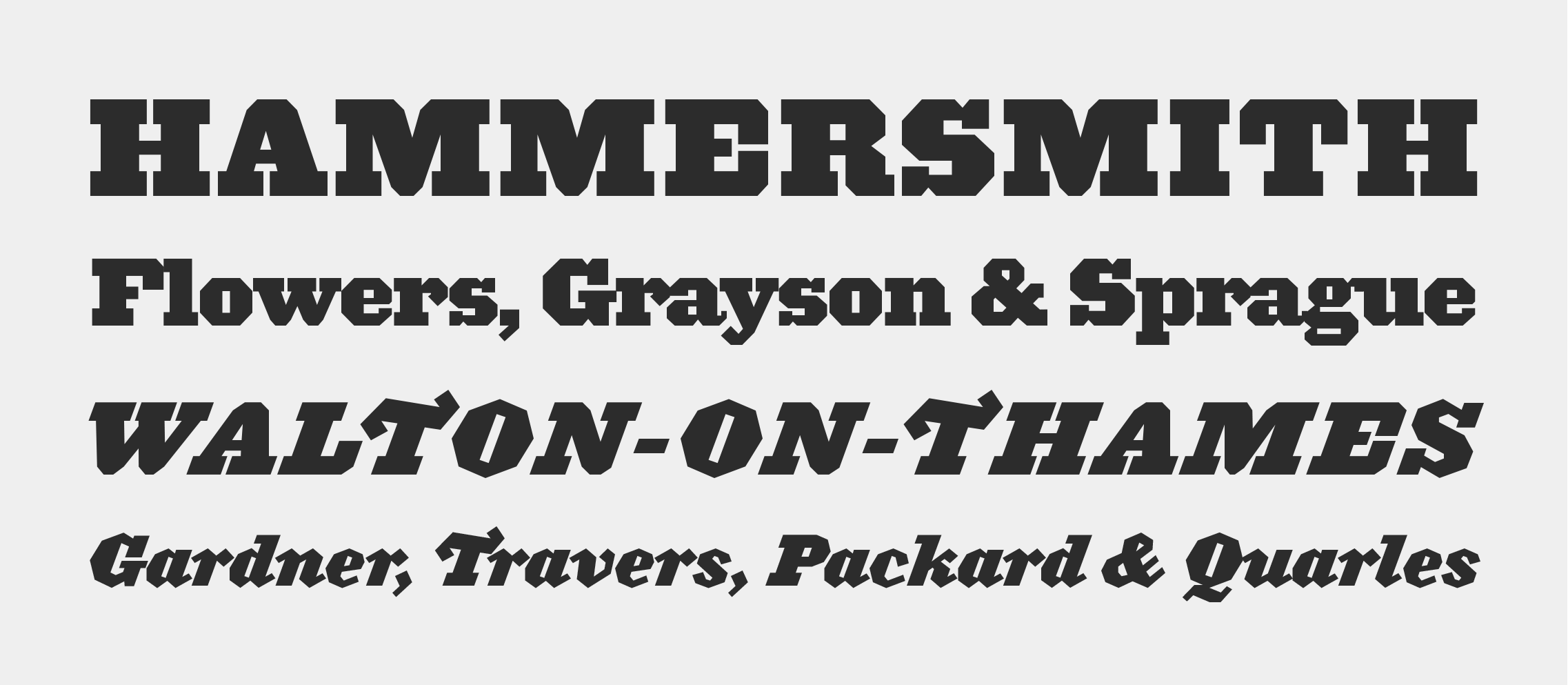
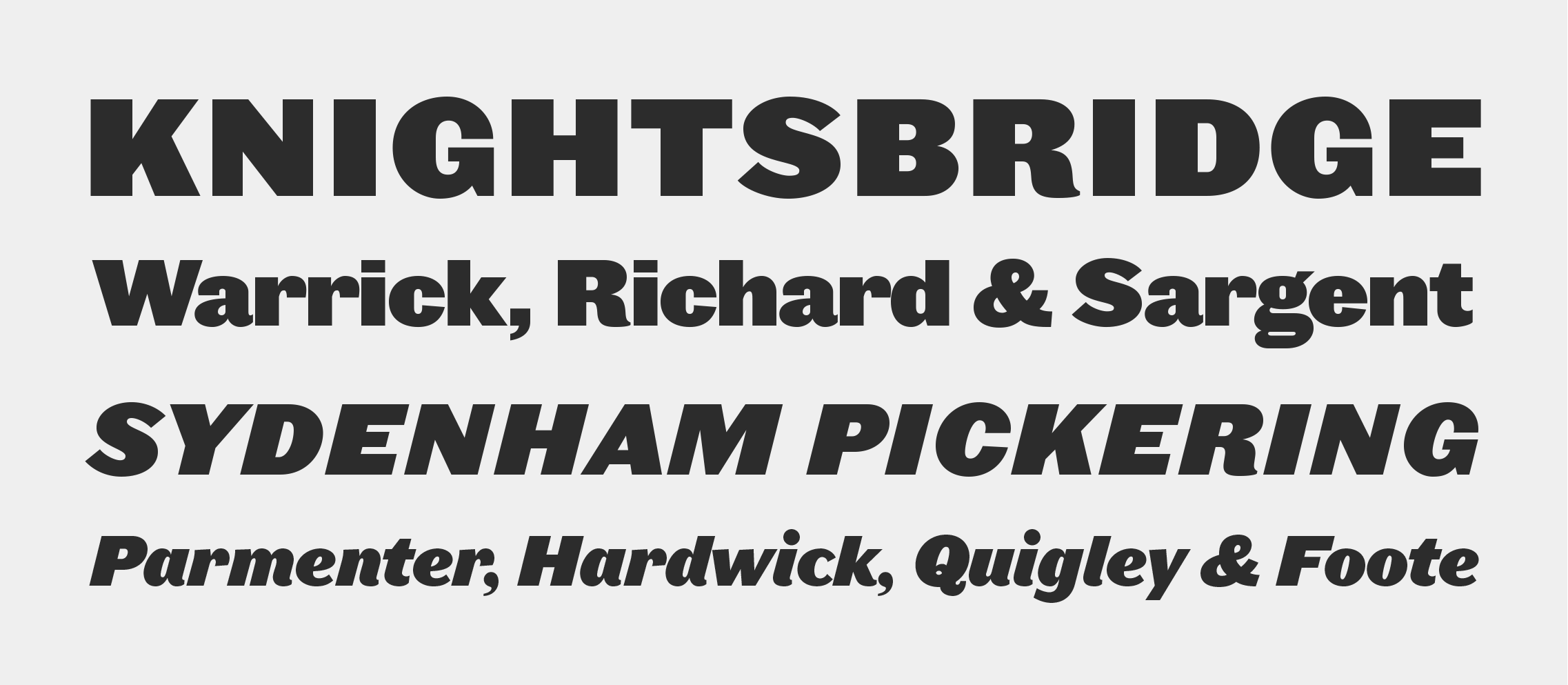
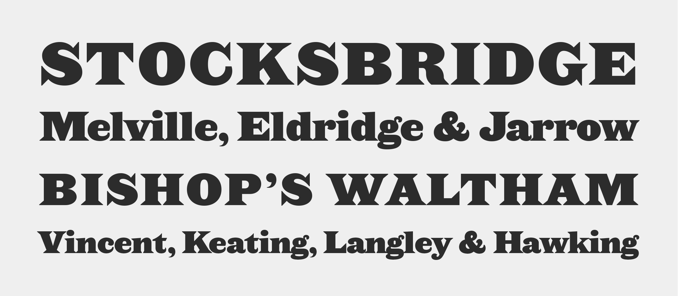
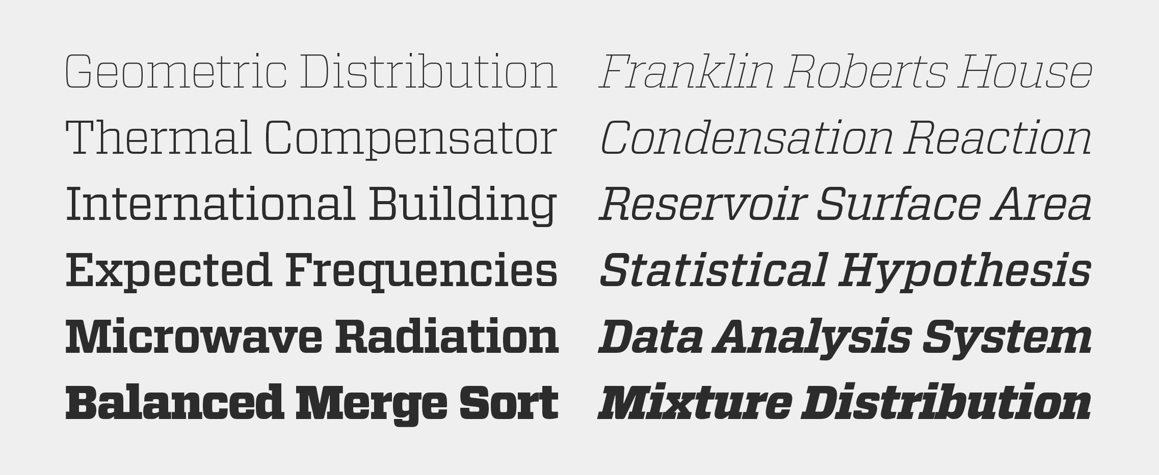
Sentinel
Designed by
Jonathan Hoefler
With contributions from
Tobias Frere-Jones, Jesse Ragan; Sara Soskolne, Ksenya Samarskaya, Colin M. Ford; Aoife Mooney
Additional material by
Sara Soskolne
Special thanks to Scott Dadich
The Sentinel typeface was designed by Jonathan Hoefler in 2004. In the early nineteenth century, typefounders seeking novelty invented a freakish new category of typefaces with extreme weight, heightened contrast between thick and thin strokes, and stocky, unbracketed serifs. This style, which became known as ‘antique,’ would rise to prominence in the decades ahead, when these faces were paired with lighter typefaces in order to signal emphasis: they became the world’s first ‘boldface’ types. Sentinel updates and expands the antique genre to include both romans and italics, and a set of ornaments in period style. Created for Texas Monthly, in whose pages the typeface first appeared in 2004, and first published in 2009, the Sentinel family was expanded in 2020 to include a broader character set, and two fonts of ornaments.
Sentinel is available from the Hoefler&Co website, typography.com.
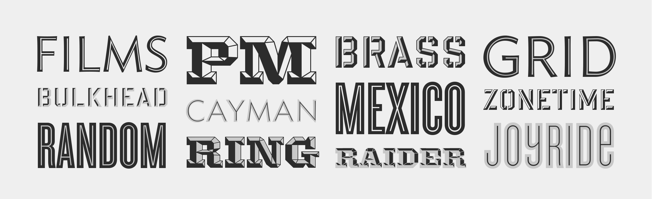
Shades
Designed by
Jonathan Hoefler
‘Shades’ is a collection of four typefaces designed by Jonathan Hoefler and published in 2004. Each a ‘chromatic’ typeface, provided as a pair of layers that can be superimposed in different colors, Shades includes a faceted typeface in the ‘grecian’ style named Knox (1993), the dimensionalized stencil typeface Giant (1996), the inline Topaz (1997), and the condensed inline Cyclone (1999).
The Shades collection is available from the Hoefler&Co website, typography.com.
Surveyor
Designed by
Jonathan Hoefler and Tobias Frere-Jones
With contributions from
Jesse Ragan; Andy Clymer, Sara Soskolne, Aoife Mooney
Special thanks to Gael Towey and Barbara de Wilde
The Surveyor typeface was designed by Jonathan Hoefler and Tobias Frere-Jones in 2001. It is modeled on a style of engraved lettering first used by British mapmakers in the early nineteenth century, notable for its intensely sloped and flowing italic. Known to signpainters as the ‘stump style,’ these letterforms are representative of a movement in lettering known as the English Vernacular, which before Surveyor went unrepresented in typography. Surveyor was created for Martha Stewart Living, in whose pages the typeface first appeared in 2002.
Dedicated to
James Mosley
Surveyor is available from the Hoefler&Co website, typography.com.
The Topaz typeface was designed by Jonathan Hoefler in 1997. A decorative variation of Hoefler’s Ideal Sans typeface (1991), Topaz is an inline typeface that unusually dislocates its white and black contours, to create an energetic rhythm of thin and thick strokes. A ‘chromatic’ typeface, Topaz includes the two styles Background and Inline, designed to be set in different colors and superimposed in register.
Topaz is available from the Hoefler&Co website, typography.com.
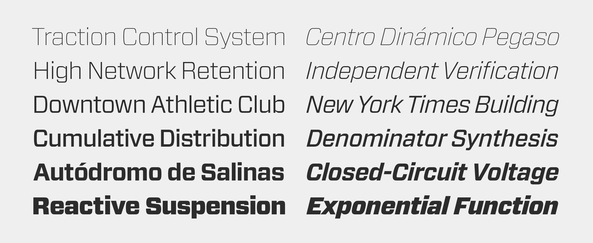
Tungsten
Designed by
Tobias Frere-Jones with Jonathan Hoefler
With contributions from
Sara Soskolne, Erin McLaughlin, Aoife Mooney
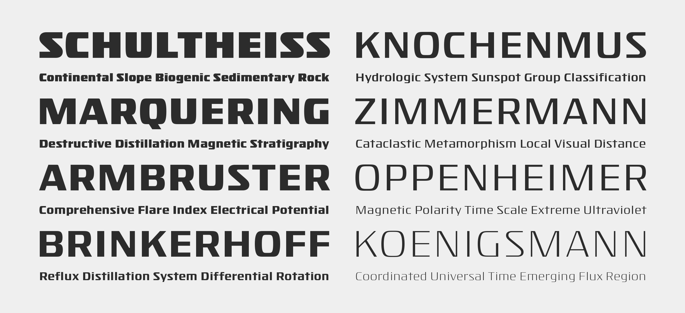
The Tungsten typeface was designed by Tobias Frere-Jones with Jonathan Hoefler in 2003. A family of compact, modular sans serifs, Tungsten works in a style colorfully known to sign painters as ‘gaspipe lettering.’ First appearing on the Bravo television network in 2004, Tungsten’s four weights were expanded into a broader set of thirty-two styles in 2012.
Tungsten is available from the Hoefler&Co website, typography.com.
Tungsten Rounded
Designed by
Tobias Frere-Jones with Jonathan Hoefler
Based on
Tungsten by Hoefler&Co.
With contributions from
Aoife Mooney
Special thanks to Scott Dadich and Claudia de Almeida
The Tungsten Rounded typeface was designed by Tobias Frere-Jones with Jonathan Hoefler in 2013. An adaptation of their Tungsten typeface (2004), Tungsten Rounded adds soft exterior corners to the modular sans serif style colorfully known to sign painters as ‘gaspipe lettering.’ Tungsten Rounded was created for Wired magazine in whose pages the typeface first appeared in 2013.
Tungsten Rounded is available from the Hoefler&Co website, typography.com.
Verlag
Designed by
Jonathan Hoefler
With contributions from
Kevin Dresser; Tobias Frere-Jones, Joshua Darden; Sara Soskolne, Ksenya Samarskaya
Special thanks to Abbott Miller
The Verlag typeface was designed by Jonathan Hoefler in 1995. A commission from the Solomon R. Guggenheim Museum, Verlag was designed as a reply to the iconic lettering on the facade of Frank Lloyd Wright’s 1959 masterwork at 1071 Fifth Avenue. A sans serif in the ‘geometric’ style, characterized by Euclidean proportions and a monolinear appearance, Verlag features the small lowercase and tall ascenders that were characteristic of the geometric typefaces associated with early Modernism.
Advance copies of Verlag were circulated under the working title Guggenheim.
Verlag is available from the Hoefler&Co website, typography.com.
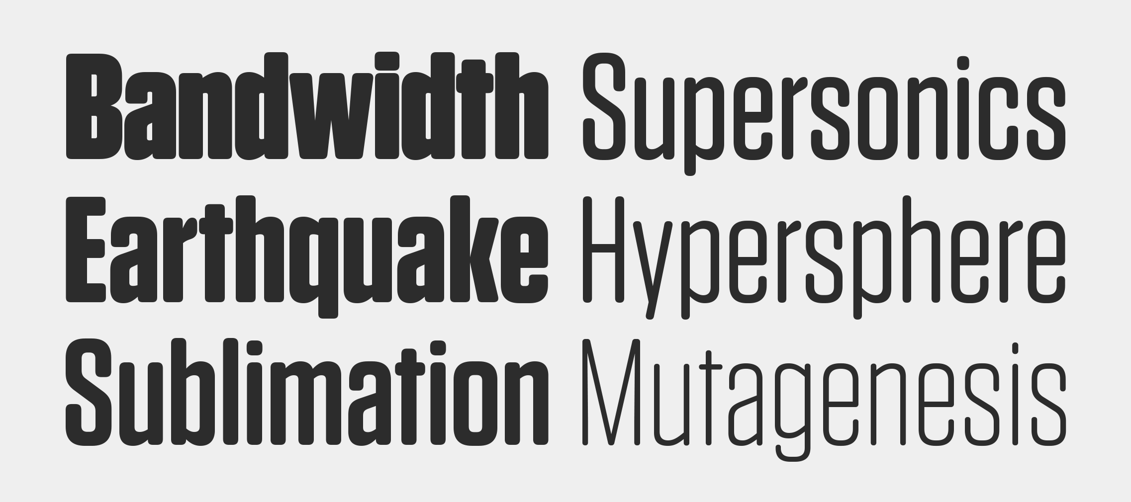
Vitesse
Designed by
Jonathan Hoefler
With contributions from
Tobias Frere-Jones, Andy Clymer
Special thanks to John Korpics, Scott Dadich
The Vitesse typeface was designed by Jonathan Hoefler in 2000. Unlike ‘geometric’ slab serifs based on the circle, or ‘antique’ ones based on the ellipse, the central motif of the Vitesse typeface is a soft-cornered barrel shape that affords opportunities for both long straightaways and quick turns. Initially a commission from Esquire, in whose pages the typeface first appeared in 2000, Vitesse was expanded into a larger family for Wired magazine in 2006, and supplemented by a companion sans serif, Forza.
Advance copies of Vitesse were circulated under the working titles Strada and Esquire Slab.
Vitesse is available from the Hoefler&Co website, typography.com.
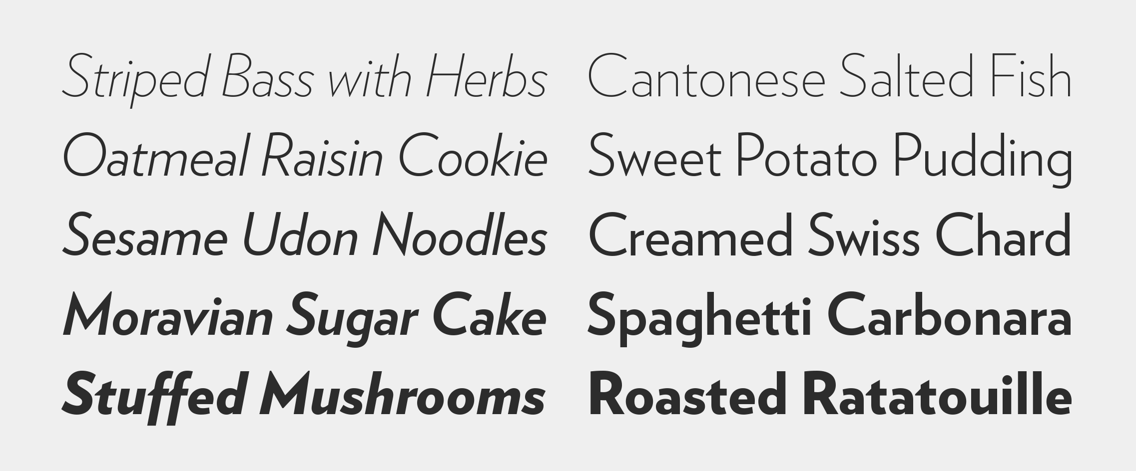
Whitney
Designed by
Tobias Frere-Jones
With contributions from
Jonathan Hoefler, Jesse Ragan, Joshua Darden
Additional material by
Andy Clymer, Ksenya Samarskaya, Erin McLaughlin, Aoife Mooney, Malou Verlomme, Colin M. Ford; Sara Soskolne, Troy Leinster
Special thanks to Gerry Leonidas, Maxim Zhukov, and Ilya Ruderman
The Whitney typeface was designed by Tobias Frere-Jones in 1996, and redeveloped in collaboration with Jonathan Hoefler beginning in 2000. A commission from the Whitney Museum of American Art, Whitney is a sans serif in the ‘humanist’ style, with letterforms shaped by kinesthesia rather than pure geometry. Designed to satisfy the opposing requirements of museum publications (for spatial economy) and facility signage (for clarity at a distance), Whitney uses compact, energetic, and open letterforms to remain engaging and legible at any size. The nine degree angle, a recurring motif in the typeface, echoes the design of the Whitney Museum’s original home at 945 Madison Avenue, designed in 1966 by Marcel Breuer.
Advance copies of Whitney were circulated under the working title Whitney Sans.
Whitney is available from the Hoefler&Co website, typography.com.
Ziggurat
Designed by
Jonathan Hoefler
Special thanks to Gail Anderson
The Ziggurat typeface was designed by Jonathan Hoefler in 1991. Ziggurat is inspired by the dark slab serif poster types of the English Regency (1811–1820), when typography’s focus first shifted from conservative book faces to the novel styles that would serve advertising. Because the first slab serifs were coeval with a fad for antiquity, they came to be known as ‘egyptians,’ one of many arbitrary period names that has survived into modern typography, such as ‘latin’ and ‘gothic.’ Ziggurat is the cornerstone of The Proteus Project, a typographic theme-and-variations created for Rolling Stone, in whose pages the typeface first appeared in 1991.
Ziggurat is available from the Hoefler&Co website, typography.com.