The Documentary
The Netflix original documentary series Abstract: The Art of Design devoted an episode to Jonathan Hoefler and his work. Instead of merely sitting for a profile, Hoefler collaborated to create a one-hour documentary about the craft itself, to introduce viewers to the fascinating phenomena that shape our modern alphabets. Now streaming in 190 countries and dubbed into thirty languages, the episode that introduced the world to typeface design has been nominated for a Primetime Emmy Award.

Images: Netflix
‘Rather than a profile,’ said Hoefler, ‘I wanted to be part of a documentary about typeface design itself.’ His episode of Abstract does both, using thirty years of Hoefler’s typefaces to introduce viewers to the craft, while inviting us along for the ride while he creates two original typefaces. Much of the episode is devoted to the hands-on work of designing a typeface: shaping and refining an idea, conducting research, assembling a prototype, troubleshooting problems, and collaborating with colleagues to see things through from development to deployment.
‘The world wasn’t born the way it is, it was created by people like Jonathan.’
Willie Geist

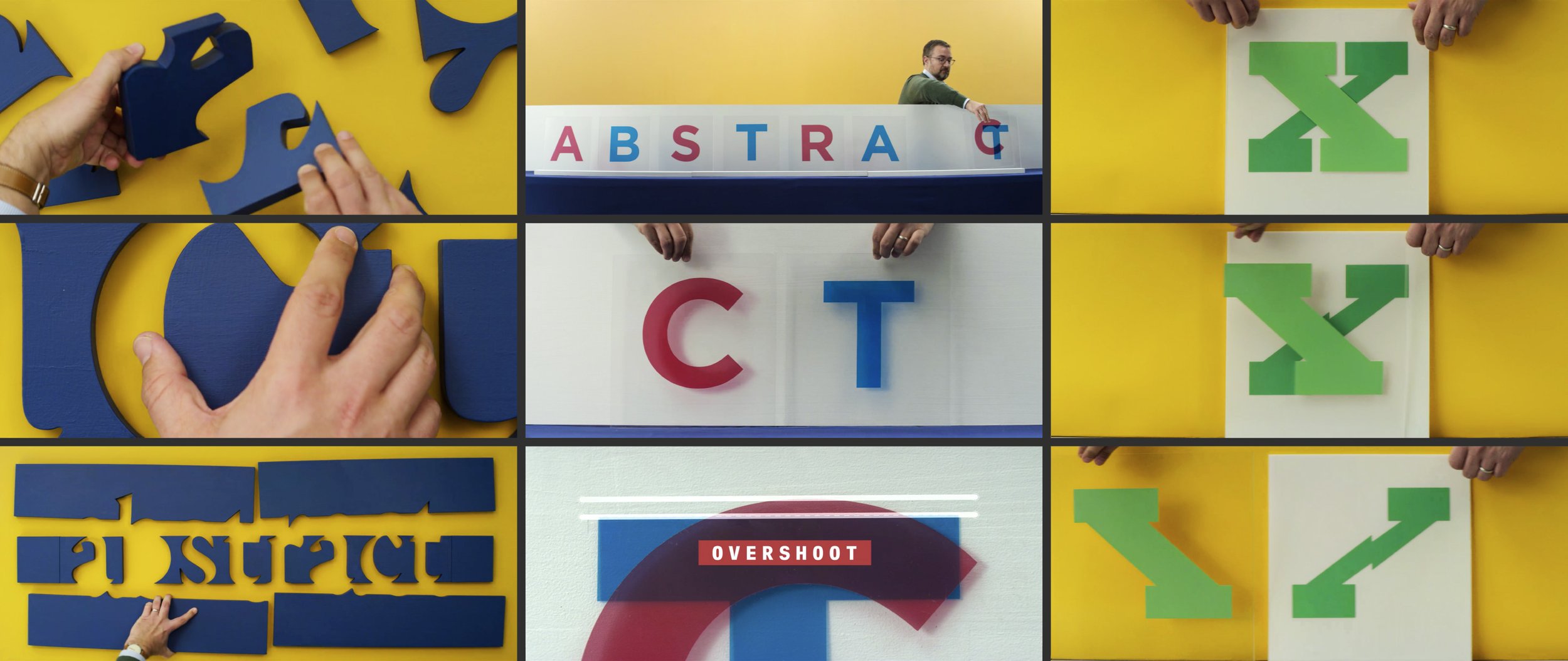
Hoefler’s storyboards demonstrating typographic principles, for the episode’s These Are Letters! segments.
Sharing Insights
Hoefler and Director Brian Oakes agreed that even typography’s more esoteric concepts could be brought to life for an engaged audience, and that practical effects, not digital ones, would make this ‘as astonishing as close-up magic.’ Together, they created a series of segments called These Are Letters!, storyboarded by Hoefler and directed by Oakes, in which physical props are manipulated on camera to demonstrate typographic principles. Their colorful classroom of plywood and plexiglas introduces typographic concepts such as fit, spacing, kerning, and ligature substitution, and the many optical illusions that type designers avoid — or employ — in the service of legibility.

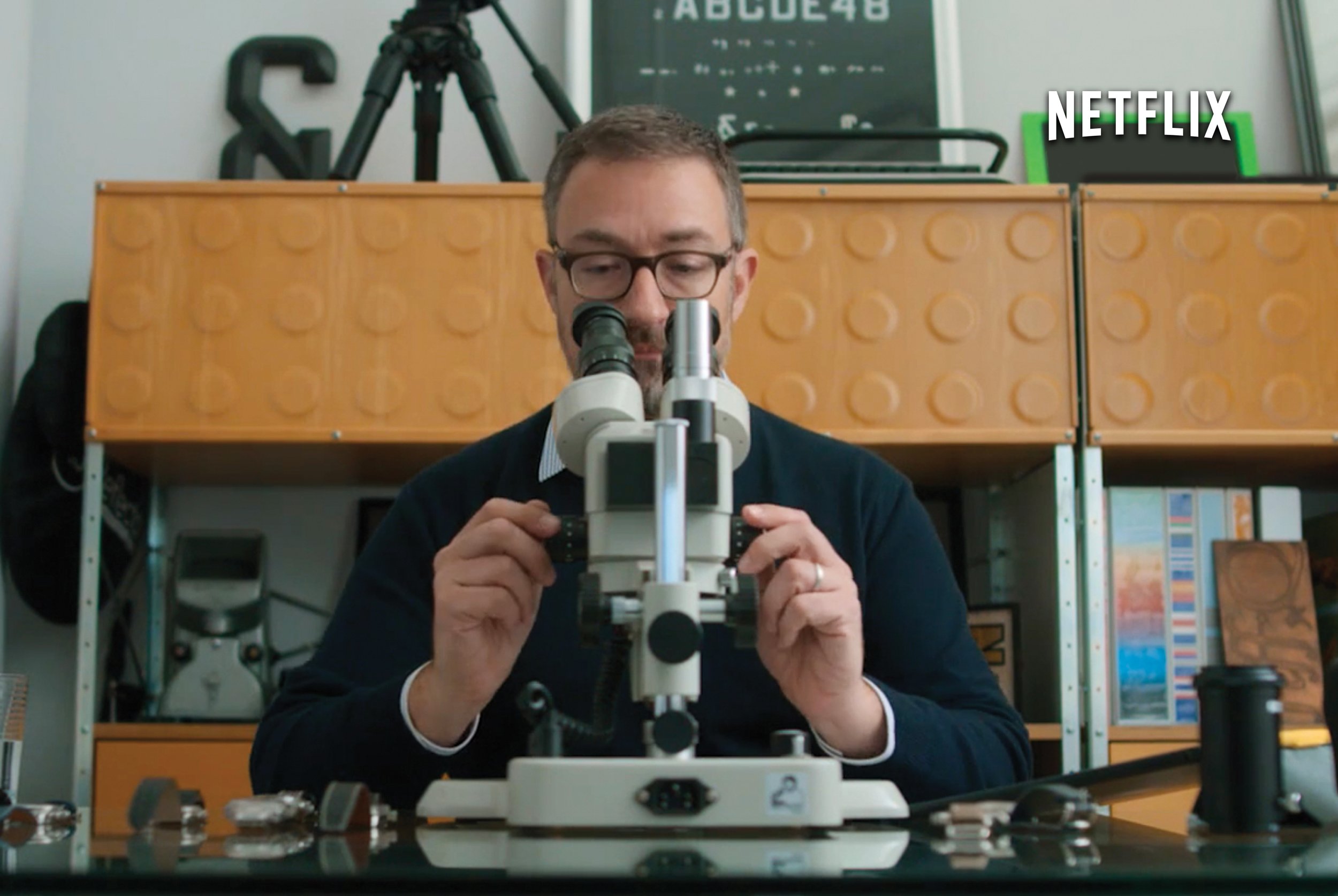
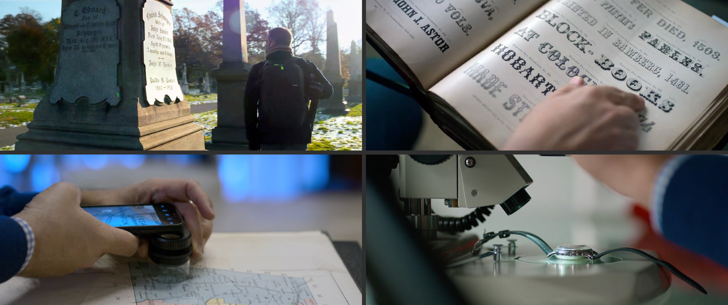
Fieldwork. The episode follows the development of two new typefaces, Decimal and Parliament, giving viewers a glimpse of the many different kinds of research that inform type design. For the Decimal typeface, inspired by the lettering on wristwatches, viewers get a close-up look at primary sources, captured directly through the lens of a stereoscopic microscope. For Parliament, a visit to Green-Wood Cemetery involved a survey of inscriptional lettering — and captured a genuine, unscripted discovery on camera. Both projects involved research with secondary sources, one in Hoefler’s own reference library, the other at the map room of the New York Public Library, guided by the curator of one of the library’s most distinctive special collections.
Collaboration
‘Great directors are collaborative, not autocratic,’ observes Hoefler, an approach that echoes in his own work as a typeface designer. ‘Directors go into a project with what they hope is a clear vision, they entrust parts of it to people they respect and admire, they hold their ideas gently (eliciting input at every turn), and when outcomes are uncertain, they take the responsibility for making the call.’ Abstract not only documents Hoefler’s work drawing typefaces, it reveals his collaborative relationship with the product designers, marketing creatives, technologists, and businesspeople at his studio, who together shepherd a typeface from idea to completion.
In Times Square, Hoefler’s sketchbooks are adapted into a montage for the video billboard announcing Abstract Season 2. Animation by Anthony Zazzi. Photo: Godfrey Dadich Partners

Abstract: The Art of Design
Episode 14: Jonathan Hoefler, Typeface Designer
Executive Producers
Scott Dadich, Morgan Neville, and Dave O’Connor
Directed by
Brian Oakes
Producer
Sam LaCroix
Director of Photography
Clair Popkin
Producer, Graphics & Animation
Paula Chowles
Supervising Story Producer
Lauren Budabin
Music Composed by
Timo Elliston and Brian Jones
Designer/Animator
Anthony Zazzi
further reading:
Twenty-five things I learned making the Netflix documentary Abstract.


