things i’ve learned
Making a Type Documentary
Twenty-five things I learned making the Netflix documentary Abstract, including what to wear to a graveyard, when to bring up your favorite sci-fi podcast, and how to avoid being detained by armed agents of the Treasury Department.
1. The most trivial parts take the most work.
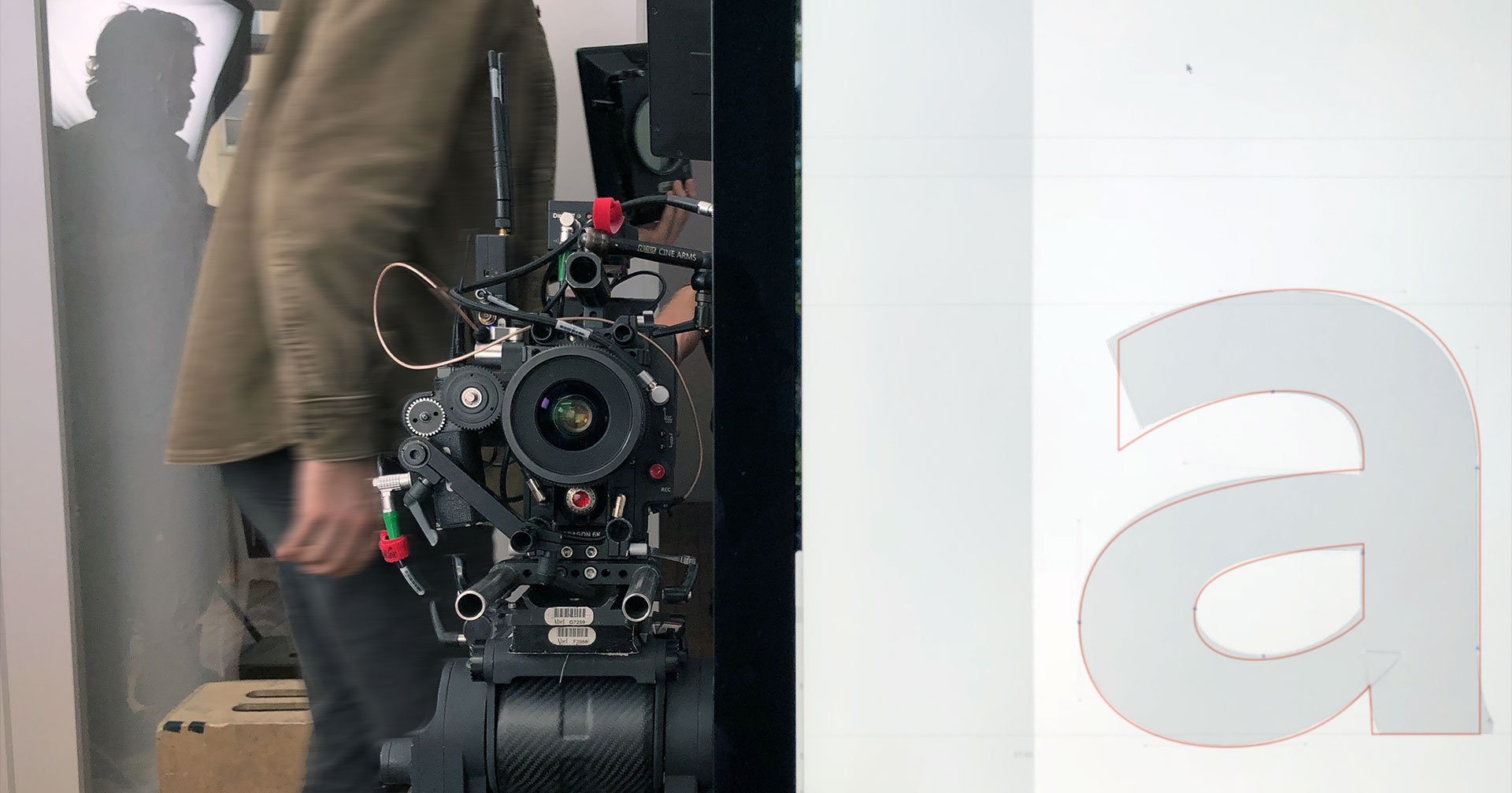
One of the most elaborate setups of the entire episode was the eleven second shot of me walking up Astor Place, which appears under narration during the opening credits. It took sixteen takes to get this right. As a typeface designer, I found this reassuringly familiar, thinking about the disproportionate effort that goes into drawing the rare bird §, compared with the everyday E.
2. Producers are skilled diplomats.
Security guards don’t like television cameras, and they’re trained to move quickly. Twice, outside of midtown office buildings, I watched producer Sam LaCroix mollify some aggressive and twitchy enforcers in red jackets, who would have none of our nonsense about a font documentary or whatever. Each time, Sam’s calm and unhurried explanation was effective, insofar as it gave the crew enough time to surreptitiously get the shot.
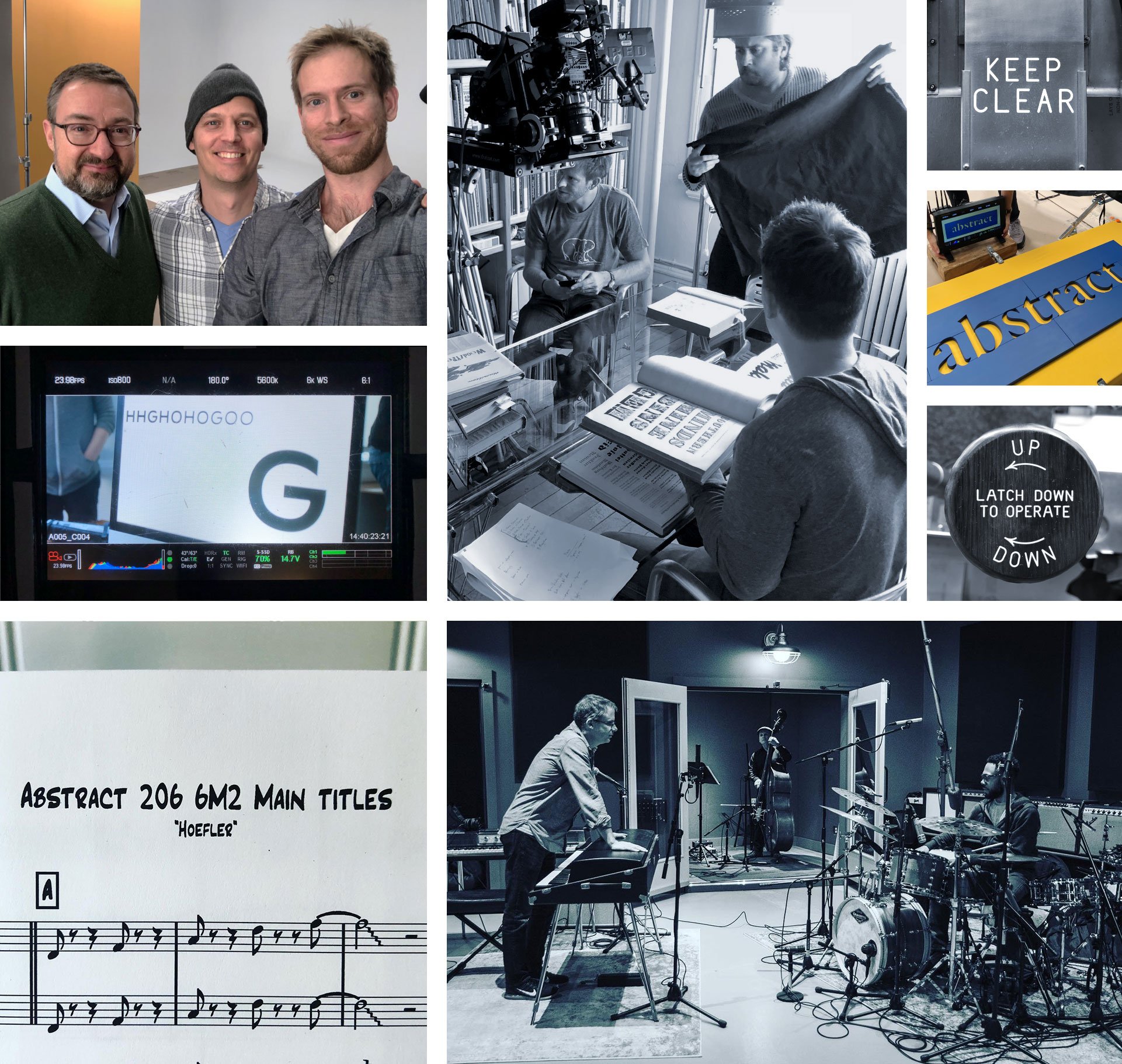
Reviewing storyboards with director Brian Oakes. Photo: Clair Popkin
3. Focus engenders respect.
Most reporting about typeface design devotes all of its energy to explaining graphic design, leaving little room for typography, and almost none for the actual typeface designer. I’m grateful that director Brian Oakes had the confidence to assume that anyone tuning in would already know what typography was, even if only in broad strokes, so we could use our episode to focus on shading in the details. I find myself yearning for this kind of respect in other kinds of reporting, and grateful whenever I encounter it.
4. Even treasured memories are rarely enlightening.
An early inquiry about whether I still had my high school yearbook helped clarify something up front: that what I wanted was less a biography, and more a documentary about typeface design that I could help create, and in which my work would be featured. I’m indebted to executive producers Scott Dadich and Dave ‘Doc’ O’Connor for letting me so stubbornly argue this position, and for advocating it to the Netflix brass. As a result, we all got to spend more time on optical illusions and gothic alphabets, and less time on my regrettable senior year haircut. A win for everyone.
Director of Photography Clair Popkin prepares to capture a wristwatch that helped inspired the Decimal typeface.
5. You don’t get to see the episode until it airs.
Netflix takes the position that a biography should not be influenced by the wishes of its subject. I collaborated with the producers, director, and crew to create material for the episode, but had no control over its final outcome. With the episode now behind me, I can wholeheartedly commend their absolute adherence to the standards of journalism over entertainment, but it made for an anxious year: not because I ever doubted the team, but because the material was complex, and the process often opaque. How many of us would trust even our parents or our closest friends to accurately portray the nuances of what we do?
6. Designers regularly take leaps of faith.
Taking part in a documentary means submitting yourself to a series of unordered vignettes that can seem disconnected, unpredictable, and rambling. You steel yourself with the hope that these will someday make sense in the hands of an able editor (who, it turns out, you’ll never meet.) Flying blind gave me a renewed appreciation for everyone who’s ever trusted me to design a new typeface: having approved a handful of test characters, my clients have had to wait patiently while my team and I proceeded to draw the remaining five thousand glyphs, reassured only by my track record, their own optimism, and our mutual rapport.
7. Filmmaking is arduous.
The day starts at 5:30 each morning, and wraps up thirteen hours later. It was taxing in every way, and I wasn’t even one of the many people carrying a flight case full of heavy and expensive equipment.
Shooting began at 5:30 every morning, lending the empty Green-Wood Cemetery an especially gothic air.
8. Great designers share.
Biographies of creative people are notorious for slipping into the shopworn pattern of lionizing The Great Man, a lazy cliché that shouldn’t have survived into even the last century. In talking to Brian about my work at Hoefler&Co, and how it’s always a group effort, I was concerned that recounting an accurate story about teamwork might grate against a biography that was templated for a single subject. But he was confident that we could present things as they truly are, because…
9. Great directors are collaborative, not autocratic.
Directors go into a project with what they hope is a clear vision, they entrust parts of it to people they respect and admire, they hold their ideas gently (eliciting input at every turn), and when outcomes are uncertain, they take the responsibility for making the call. I was enormously encouraged to see Brian working with his colleagues the way I work with mine. On our first day of shooting, I watched him rethink an entire sequence because sound recordist Brad Bergbom had concerns about how to mic the shot, and the resolution benefitted from the perspectives of director of photography Clair Popkin, and first assistant camera Graham Deneen, and even some suggestions from me, before Brian called the play.
Some of my Abstract co-stars: H&Co typeface designers Sara Soskolne, Colin M. Ford, Jordan Bell, and Troy Leinster. Image: Netflix
10. Know for next time: study the shot list.
The thing you wear to the first shoot on the first day will be the outfit you’re stuck with for the entire project, so that continuity can be maintained should an editor need to splice in footage from a different day. If shooting begins on the slushy hills of Green-Wood Cemetery, you’ll end up presenting yourself to viewers in 190 countries not wearing the English hand-lasted brogues that you bought for the occasion, but rather the muddy Timberlands that you keep in your car.
11. Expect friendly fire.
When you’re shooting on city streets, curious onlookers have no compunction about walking right into frame, and asking you, right to your face, while the cameras right behind you are rolling, if you’re making a movie. This is how we lost many of those sixteen takes on Astor Place.
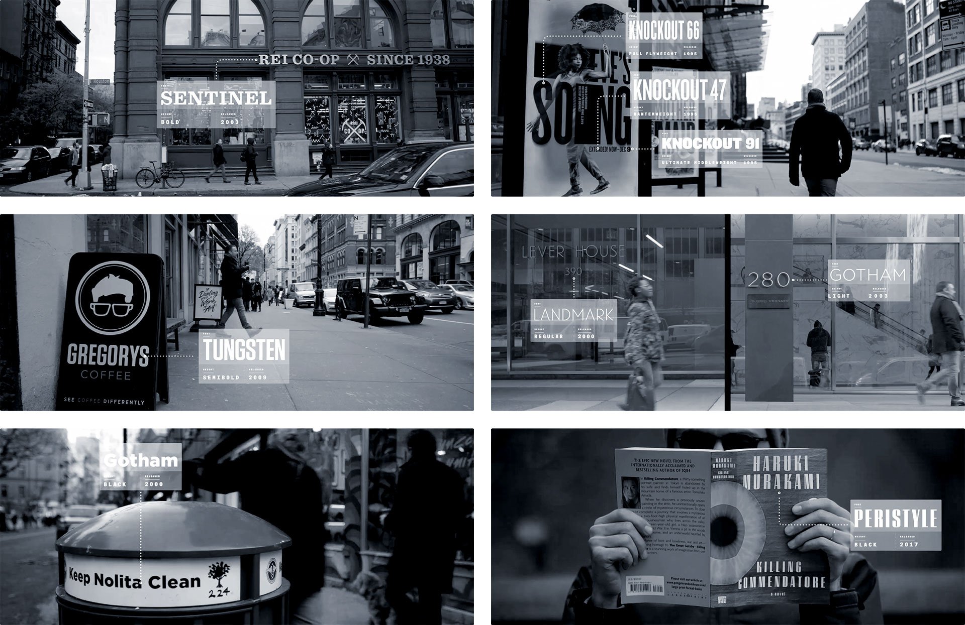
To establish early the ubiquity of type around us, the episode opens with a tour of H&Co typefaces on the street. In the three weeks between scouting and shooting, more than half of our finds vanished, while dozens more emerged: billboards, shop windows, pop-up stores and newsstands are a fickle typographic index. Images: Netflix
12. Trained actors have skills that civilians don’t.
Most of the takes were ruined not by pedestrians, but by me, because I couldn’t process my instructions about how to accommodate the steadicam operator and his fifty pounds of gear. ‘Walk slowly at first,’ I was told, ‘so he can swing around you. And then speed up. But don’t change your pace, because of the music.’ I found myself thinking about my actor friends, who in their college years always seemed to be either coming back from or heading off to a ‘movement class.’ I was never really clear what went on in these classes, but I gather it has something to do with how to get shots like this in one take rather than sixteen.
13. Lighten up.
In an early discussion about how we’d demonstrate the way large and small fonts differ, I brought up my favorite sight gag from the movie Top Secret!, and the possibility of using a lens called a ‘split diopter’ which I’d learned about from an equally beloved source, an irreverent but kindhearted Star Trek: TNG podcast called The Greatest Generation. More than just a chance to goof off with the director and DP over YouTube clips, our conversation helped set the tone for the episode, serving as a reminder that thoughtful critique doesn’t need to be deadly earnest, and that respectfulness doesn’t require taking yourself too seriously. I personally find design both meaningful and fun, don’t you?
1. The scene in Top Secret! that rivals Citizen Kane for its masterful use of foreshortening. 2. The split diopter lens: it worked! 3. Director Brian Oakes after figuring out how to turn an accident on set into a solution for a thorny shot.
14. Storytelling needs editing, not embellishment.
Anyone hoping to document typeface design learns quickly that behind this wonderful visual art are almost no visuals worth capturing. A typeface designer at work looks like a programmer or an accountant: we sit motionless before monitors, we tap at our keyboards, we confer with colleagues about esoteric problems that are invisible at a distance, we make our rounds to the laser printer. Most creative work is like this, which is why I suspect so many depictions of the creative process are so steroidally enhanced with theatrics: actual work is replaced with staged demonstrations, and ordinary challenges are whipped into existential crises. Everyone associated with Abstract was too smart for these kinds of histrionics, but it still left the question of how to turn what’s essentially quiet office work into compelling television. This is where filmmaking comes in.
15. Allow the storytelling to shape the story.
Director Brian Oakes wisely kept an eye out for actual challenges — in both the design process and the filmmaking — that might precipitate a welcome change of scene. Our trip to the cemetery was prompted not by the development of the Parliament typeface, but by the need to demonstrate how gothic alphabets respond to shadows — and the obelisk we stumbled upon, quite by accident, really did alter the path I’ve decided to follow with the typeface. Our trip to the library was similarly motivated: after designer Sara Soskolne and I reached a dead end regarding the shape of the capital U in the Decimal typeface, it was Brian who prompted me to stretch my legs and let the camera follow. It’s not unlike the way presenting a typeface in a specimen book, or in documentation, has occasionally revealed the need to send a font back to the drawing board. An idea that can’t be elegantly presented might not be fully resolved, and I found filmmaking a valuable crucible for forging such ideas.
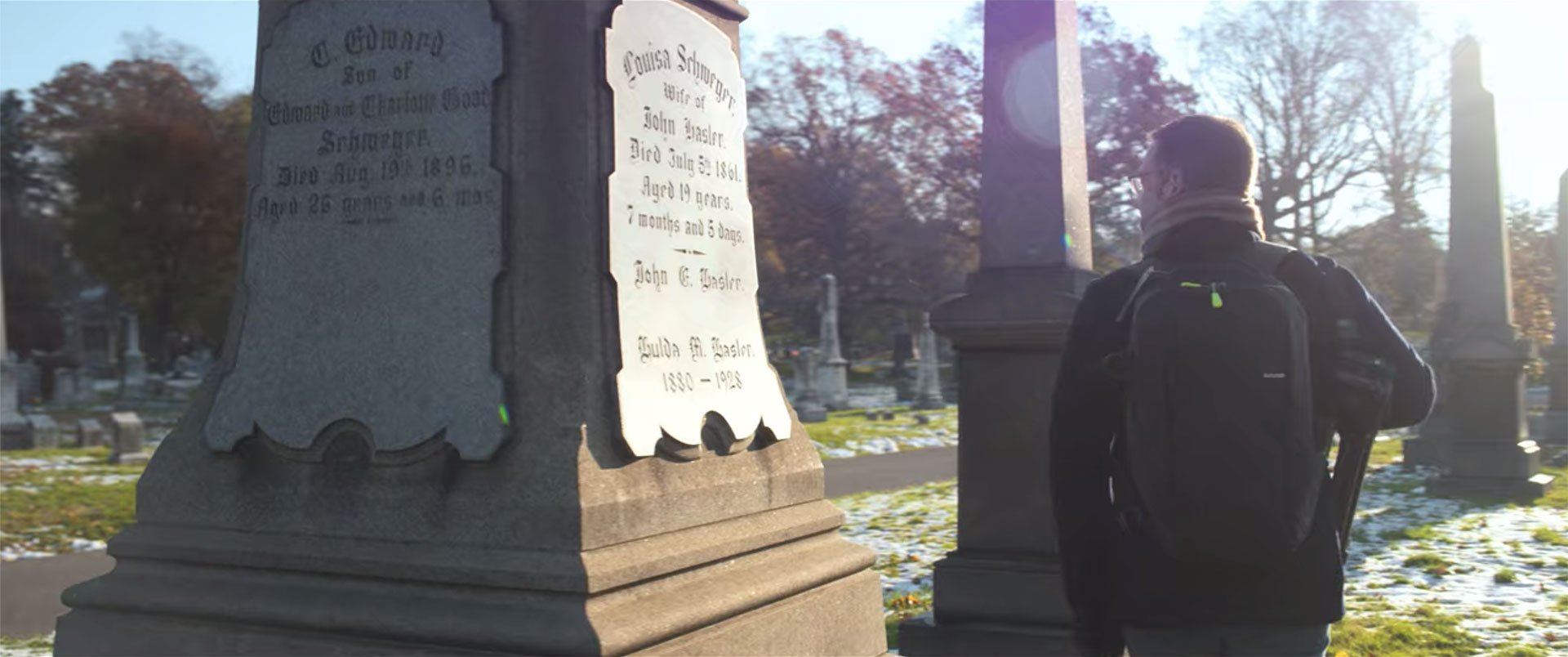
Serendipity during our hunt for illuminated blackletter alphabets! Image: Netflix
16. Librarians are vital.
The map division at the New York Public Library has an extraordinary collection (much of it available online, as spectacular high-resolution scans), but it was curator Ian Fowler and his staff who made the visit meaningful. I’ve spent enough time among special collections to know that the storyboard with a stick-figured JH pulling books from open stacks was never going to happen: we were instead going to consult with the library staff, submit a materials list in advance, and review each item individually. Ian’s knowledge of his subject and his collection turned what could have been idle tourism into a constructive and enjoyable morning, provoking some genuine exploration, and yielding some answers that measurably helped resolve the Decimal typeface. Just as I hope this episode of Abstract helps to explain typeface design, I hope it helps dispel the notion that libraries are repositories of books, and librarians their mere custodians. It’s quite the reverse: it is librarians who are the invaluable resource, and books a mere part of their apparatus. Their insights cannot be googled.
17. Type designers lead the least glamorous lives.
In the first season of Abstract, Nike’s Tinker Hatfield had delivered Michael Jordan for an appearance, and the episode about costume designer Ruth Carter in season two would feature Spike Lee, and Samuel L. Jackson, and Ryan Coogler. I may have done work for Barack Obama, Elizabeth Warren, Robert Redford, and Madonna, but I’ve never met any of them, so cadging a testimonial seemed unlikely. I am however grateful that Ryan Gosling made an appearance in my episode, even if we didn’t get to hang out on set.
Some of the most fleeting shots required the most elaborate rigging, a paradox familiar to type designers who labor over characters that few people ever notice. 1. DP Clair Popkin and 1st AC Graham Deneen balance a Red digital camera atop the stereoscopic microscope custom built for H&Co. In the background, producer Sam LaCroix and gaffer Jack Foster are already discussing the next setup. 2. A charitable taxicab driver allows three of us to squeeze in with our gear, to collect some footage of a drive through Manhattan; from the front seat, director Brian Oakes watches on a wireless monitor. 3. Reviewing These Are Letters! under the worrisome Rig of Damocles, whose distance from the subject helps minimize lens distortions. 4. A monitor is arranged to flop the image, like a mirror, to help me see what I’m doing while manipulating props from behind. 5. Some of the many monitors on set: the director’s, mine, and the one used by the 1st AC for pulling focus. 6. Setting up for the episode’s most intricate shot, in which the camera needed to roll 70° clockwise, while dollying back from the action, on a set of tracks laid by the crew.
18. Practical effects are compelling.
We spent a lot of time thinking about how to best illustrate different typographic illusions, and assumed at first that we’d make quick work of this with animation. But at some point we realized that only physical objects are unimpeachably honest, and manipulating them on camera might be as beguiling and astonishing as close-up magic. The tangible world remains more credible than the digital one.
19. Filmmaking has a lot of D-I-Y.
For one of those segments, I designed a set of wooden props that were fabricated by the director himself. In another segment, we needed someone to serve as my hand double, and one of the show’s executive producers stepped up to fill the role. Everyone’s gumption, and everyone’s lack of pretense, really reminded me of home.
Doing the Lucy-and-Harpo bit with EP Doc O’Connor, who is not doing the Lucy-and-Harpo bit back. Doc delivered an uncredited cameo as my hand twin in one of the three These Are Letters! segments.
20. Documentarians are frugal.
We are grateful to the unnamed big box store whose generous return policy made possible a surprising number of this episode’s lightly-used props and costumes.
21. Dress in layers.
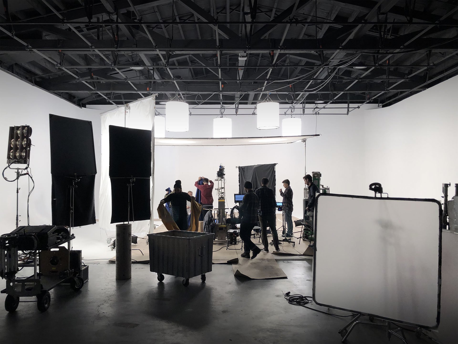
On that early December morning, I hadn’t expected the soundstage in Dumbo to be unheated, especially given the open loading dock that admitted every fierce and freezing wind off the East River. But then I also hadn’t expected that lighting the set would require bridging ten circuit breakers to deliver 38,000 watts of illumination (I counted), effectively turning the room into a giant tanning booth.
22. Nobody notices most of it, but everyone feels everything.
I’m speaking of filmmaking, but I could just as easily mean typography. Color grading gives raw footage a mood and a point of view; foley work sells the action that microphones didn’t capture. And then there’s the soundtrack. There was a time when I aspired to write film scores, and I’ve been quoted as saying that ‘typography is the soundtrack of writing.’ But I don’t think I fully appreciated the invisibility of this art until watching the final edit, being asked what I thought of the soundtrack, and realizing that I hadn’t noticed it at all. It’s been a profound joy to spend time with the score in the past few months, and to get to know composers Timo Elliston and Brian Jones — and to really savor the work of percussionist Jerome Jennings, whose explosive opening fanfare and poignant shuffle during the closing credits capture the mood of the episode with absolute and total perfection. (If you leave feeling energized, and that the creative journey continues, that might be as much Jennings’ doing as mine.) But I just didn’t notice at the time. It simply felt right. Like good type.
23. These aren’t the droids you’re looking for.
The most extraordinary thing I saw during the project was producer Sam LaCroix persuading the entire construction crew of a downtown skyscraper to take a twenty minute break so we could record clean audio in my office.
Steadicam team Michael Hauer and Chris Wairegi timing their slalom through Astor Place commuters; 1st AC Graham Deneen setting up outside the Public Theatre. Photos: Clair Popkin
24. Sound recordists carry gear worthy of 007.
Speaking purely hypothetically here: If you are a loudmouth out-of-town dad, stepping out of the Public Theatre to call home during intermission, and you learn that your tween daughter has gotten her eyebrow pierced, and right before Thanksgiving no less, and you react colorfully and at great length, you might be interested to know that sound recordists generally carry a highly directional microphone called a ‘shotgun mic’ which is very effective at localizing sound at a distance, even across a busy urban thoroughfare. I’m just saying that you never really know if the tape is rolling, and also that DJs have to get their kooky samples from somewhere.
25. Check yourself before you wreck yourself.
During a lunch break in the public atrium of a building on Madison Avenue, I went off in search of a restroom, reflexively turning off the lapel mic that I wore throughout the production. Someone directed me to an escalator, which I noticed was flanked by two nypd officers, uncharacteristically kitted out in body armor and assault rifles. Only as I descended into the basement, with its aggressive onrush of gold and crimson decor, and gold and more gold, and the best gold, believe me, did I realize that we were in the back of Trump Tower. Downstairs, two Treasury agents were checking IDs and x-raying bags, and were unfailingly polite in asking me to please open my coat. Weren’t we all surprised to find that underneath, I was wrapped in wires that led down to a blinking radio transmitter in my pocket. Best to avoid doing this, if you can. —JH
