Publications

Type Specimen No. 11
Hoefler, Jonathan. Typefaces by Hoefler&Co.: Catalog of Typefaces, No. 11, subtitled ‘New and Recent Typefaces by Hoefler&Co., Eleventh Edition.’ The Hoefler Type Foundry, Inc. (dba Hoefler&Co), New York, [September] 2019. 7½" × 9½". 48 pages: (3), 4–47, (1). Notch bound in matte laminated card stock, printed two colors; front and rear covers feature a collage of fragments of type specimens using Hoefler typefaces. Interior printed black plus three spot colors. Written and illustrated by Jonathan Hoefler, designed by Jonathan Hoefler with Brian Hennings. Printed in British Columbia, Canada. isbn 0 578 56880 2
The first Hoefler type specimen at this trim size, and therefore featuring entirely new artwork. A return to writing in this catalog, including Hoefler’s notes on the design of the Decimal, Surveyor, Ringside, Inkwell, Operator, and Ideal Sans families, which appear in a type specimen for the first time, as do the Isotope, Landmark, Obsidian, Peristyle, Peristyle Stencil, Quarto, and Tungsten families. The endpapers are a dramatic redevelopment of the ‘ladder’ design that Hoefler introduced in the company’s first type specimen, expanded here from the original library of thirty typefaces to a palette of more than one thousand. 55,000 copies printed.

Type Specimen No. 10
Hoefler, Jonathan. New Typefaces: Hoefler & Frere-Jones Catalog of Typefaces, No. 10. The Hoefler Type Foundry, Inc. (dba Hoefler & Frere-Jones), [May] 2009. 8½" × 4¾" oblong, 9/32" thick. 104 pages: (7), 8–103, (1). Notch bound in gloss laminated card stock with folding flaps, printed four-color (stochastic), illustrated with Hoefler’s ‘patchwork’ composition of typefaces. Inside covers beneath flaps illustrate a set of forty-eight suggested font pairings. Interior printed black plus two spot colors. Pages 19 and 69 are trimmed short to demonstrate how the ‘grades’ of the Mercury Text and Chronicle Text typefaces compare. Written and illustrated by Jonathan Hoefler, designed by Jonathan Hoefler with Brian Hennings. Printed in Long Island City, ny. isbn 0 615 28500 7
Follows the trim size and grids of Catalog No. 9. This is the first printed type specimen to include the Archer, Chronicle, Gotham Extra Narrow, Gotham Narrow and Sentinel typefaces; additionally includes htf Didot, Gotham, Gotham Condensed, Gotham Rounded, Hoefler Text, Hoefler Titling, Knockout, Mercury Display, Mercury Text, Numbers, The Proteus Project, Requiem, Shades, Verlag, Verlag Compressed, Verlag Condensed, Whitney, Whitney Condensed, and Whitney Index. Originally printed in an edition of 25,000, but owing to an error in bindery, few copies were considered acceptable and the bulk of the run was pulped, making this an exceedingly scarce type specimen.

Type Specimen No. 9
Hoefler, Jonathan. New Typefaces by Hoefler & Frere-Jones. The Hoefler Type Foundry, Inc. (dba Hoefler & Frere-Jones), New York, n.d., (but July 2006.) 8½" × 4¾" oblong, 3/16" thick. 60 pages: (3), 4–59, (1). Notch bound in gloss laminated card stock printed four-color (stochastic), illustrated with Hoefler’s signature ‘patchwork’-style type collage. Interior printed black plus two spot colors. Written, designed, and illustrated by Jonathan Hoefler. Printed in Long Island City, ny.
The first Hoefler type specimen at this trim size, therefore including entirely new artwork. Catalog No. 9 is the first printed type specimen to include the Mercury Display, Mercury Text, Numbers, Verlag, Verlag Compressed, Verlag Condensed, Whitney, and Whitney Condensed typefaces; additionally includes Gotham, Gotham Condensed, Hoefler Text, Hoefler Titling, htf Didot, Knockout, Leviathan, Requiem, Shades, and Ziggurat. 20,000 copies printed.

Type Specimen No. 8
Hoefler, Jonathan. New Typefaces. The Hoefler Type Foundry, Inc. (dba Hoefler & Frere-Jones), New York, [April] 2004. 8½" × 11". 64 pages: (1), 2–63, (1). Saddle stitched with matte card stock cover printed in three colors, illustrated with a collage of letterform parts abstracted from the Shades typefaces that debut in this specimen. Outer signature printed two colors, remainder black only. Written, designed, and illustrated by Jonathan Hoefler. Printed in Woodbridge, va.
The largest Hoefler type specimen to date, and the final one at this trim size, Catalog No. 8 introduced the h&fj name and branding. Opens with the announcement that ‘in celebration of our ongoing collaboration’ with designer Tobias Frere-Jones, who came to work for the studio in 1999, ‘the company will enter its sixteenth year as Hoefler & Frere-Jones.’ Catalog No. 8 is the first printed type specimen to feature Shades, the company’s first collection of two-color ‘chromatic’ typefaces, to which eight interior pages are devoted. Additionally featured are the Gotham, Gotham Condensed, Hoefler Titling, Hoefler Text, Knockout, and Requiem type families. 80,000 copies printed.
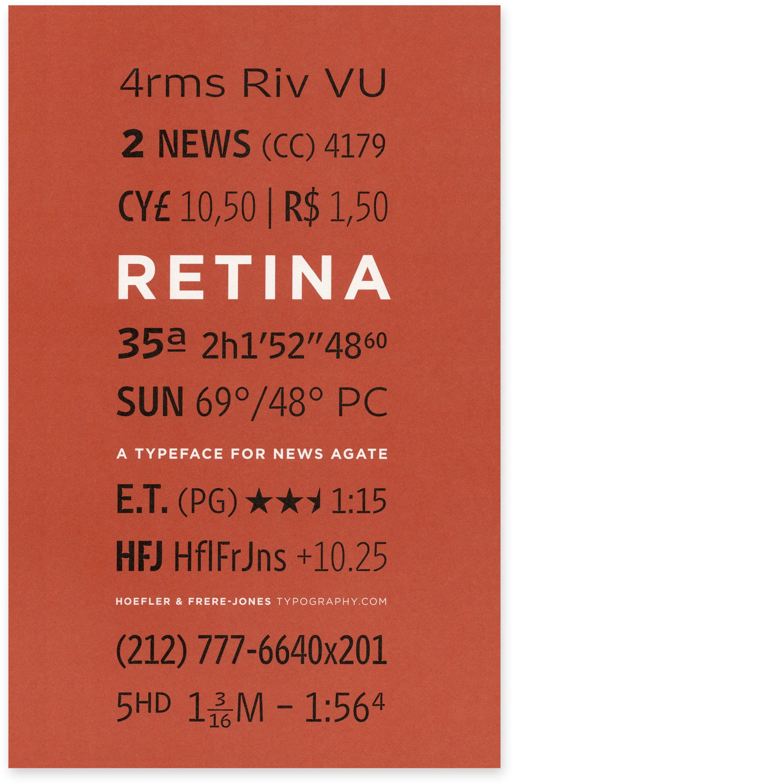
Retina
Hoefler, Jonathan. Retina: A Typeface for News Agate. The Hoefler Type Foundry, Inc. (dba Hoefler & Frere-Jones), New York, n.d., (but August 2003). 5½" × 8". 12 pages, unpaginated. Saddle stitched with matte card stock cover printed in two colors, illustrated with fragments of ‘agate’ content rendered in the Retina typefaces. Interior printed black plus two spot colors. Written, designed, and illustrated by Jonathan Hoefler. Printed in Woodbridge, va.
Produced for distribution at a conference, this miniature type specimen is devoted to the Retina typeface, designed for The Wall Street Journal in 2001 by Tobias Frere-Jones at htf. The interior consists primarily of sample applications demonstrating how a newspaper might use these miniature typefaces for information-heavy content such as financial data, weather reports, classified ads, and sports and entertainment listings. The accompanying commentary is set in the company’s Mercury Text and Whitney Index typefaces. 5,000 copies printed.
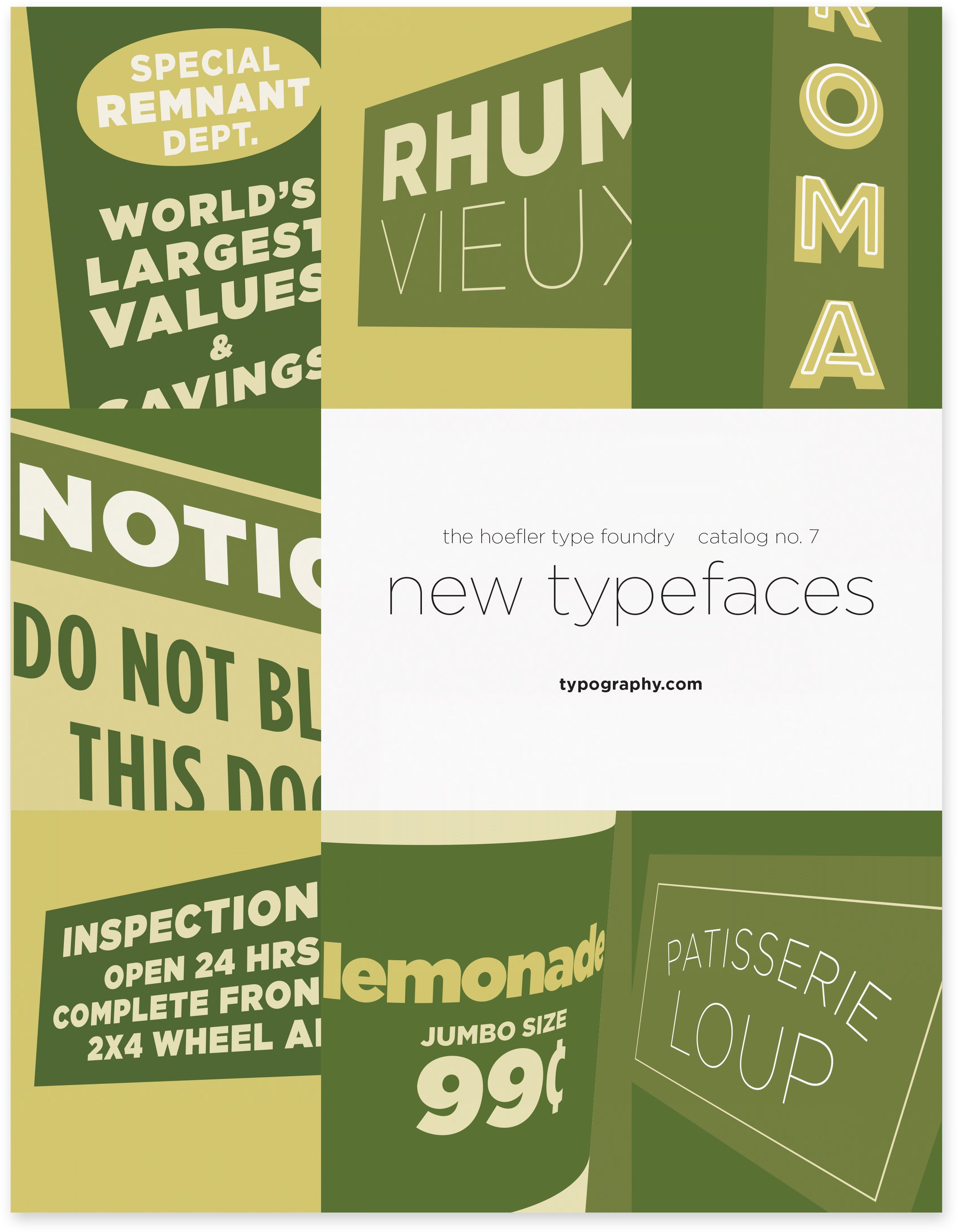
Type Specimen No. 7
Hoefler, Jonathan. The Hoefler Type Foundry Catalog No. 7: New Typefaces. The Hoefler Type Foundry, Inc., New York, April 2003. 8½" × 11". 48 pages including covers: (3), 4–46, (2). Saddle stitched with matte card stock cover printed in three colors, illustrated with a collage of artifacts designed using the new styles of Gotham premiering in this edition. Outer signature printed two colors, remainder black only. Written, designed, and illustrated by Jonathan Hoefler. Printed in Woodbridge, va.
The successor to Hoefler’s sixth type specimen, which introduced Gotham, this seventh edition introduced the ‘Gotham 2’ collection, containing the peripherally heavier and lighter weights of Gotham. A total of 23 pages are devoted to presenting this enlarged Gotham family, the remainder of the book displaying the Hoefler Text, Hoefler Titling, Knockout, and Requiem families. The Knockout spread on pp. 34–35 does not appear in the prior specimen. 55,000 copies printed.

Type Specimen No. 6
Hoefler, Jonathan. Sixth Edition Catalogue of Types: New Typefaces. The Hoefler Type Foundry, Inc., New York, Summer [June] 2002. 8½" × 11". 32 pages including covers: (1), 4–31, (1). Saddle stitched with self cover printed in three colors, illustrated with a collage of outdoor signs made using the Gotham typeface, which premieres in this edition. Outer signature printed two colors, remainder black only. Written, designed, and illustrated by Jonathan Hoefler. Printed in Woodbridge, va.
The first printed type specimen to present the Gotham family, which had first appeared in the pages of GQ magazine the previous year. After an opening illustration that expands upon the cover art, a total of fifteen pages are devoted to presenting the Gotham family, the remainder of the book displaying the Hoefler Titling and Requiem families, and summaries of Champion Gothic, htf Didot, Historical Allsorts, Hoefler Text, Knockout, and The Proteus Project. The rear cover shows the final iteration of the half-page price list, which with the growth of the htf library was expanded and redesigned as a full page, and relocated to the inside back cover in subsequent catalogs. 60,000 copies printed.

Type Specimen No. 5
Hoefler, Jonathan. Catalogue of Typefaces, Fifth Edition. The Hoefler Type Foundry, Inc., New York, Winter [January] 2002. 8½" × 11". 12 pages including covers: (1), 2–11, (1). Saddle stitched with self cover printed in two colors, illustrated with an abstract design made from the swash capital C of the Hoefler Titling typeface family that premieres in this edition. Pages 9–11 printed two colors, remainder black only. Written, designed, and illustrated by Jonathan Hoefler. Printed in Woodbridge, va.
Recent changes to the price structure of bulk rate mailing led to the creation of this, the company’s shortest and lightest weight specimen since the first edition of 1997. The first to present the Hoefler Titling family, this specimen also includes summaries of the Champion Gothic, htf Didot, Historical Allsorts, Hoefler Text, Knockout, and Proteus Project families. 75,000 copies printed.

Type Specimen No. 4
Hoefler, Jonathan. New Typefaces from The Hoefler Type Foundry. Catalogue of Typefaces Fourth Edition. The Hoefler Type Foundry, Inc., New York, [May] 2000. 8½" × 11". 48 pages including covers: (5), 6–47, (1). Saddle stitched with self cover printed in two colors, illustrated with a periodic table using the Knockout typeface family that premieres in this edition. Interior printed black only. Written, designed, and illustrated by Jonathan Hoefler. Printed in Woodbridge, va.
First type specimen to employ design automation. The fourth edition was the first project to make use of Hoefler’s ‘Ghostwriter’ program, an application created to ease the selection of sample words for type specimens. Traditionally, the nonsensical phrases used to demonstrate typefaces in specimen books were written on the fly, with designers (and before them, compositors) guessing at words and phrases that might fit the allotted measure — an exhausting exercise in divination and compromise. In 1999, Hoefler wrote a program that could analyze massive word lists, measuring each against the proportions of letters in a supplied typeface, in order to generate a ranked list of perfectly-fitted candidates that met specific conditions. From these, he could select words with attractive shapes, welcome associations, or signature characters. The dramatic difference between the old way and the new takes place between pages nine and ten, where slightly awkward stacks of conjured phrases are replaced with tight, sophisticated layouts, in which words have been selected for their ability to perfectly fit the grid. The advantages of the method are apparent by page twelve, where square-edged words, void of ragged edges and awkward kerning pairs, shoulder up against their margins to produce solid and controlled lockups.
The fourth edition was the company’s most substantial type specimen to date (and printed in the largest run), presenting for the first time the Knockout family, to which eighteen pages are devoted. The remainder of the book displays the Champion Gothic, htf Didot, Historical Allsorts, Hoefler Text, Proteus Project, and Requiem families, as well as the offbeat typefaces Gestalt and Fetish, which appear in print for the last time before being withdrawn from the library in 2017. This is the last type specimen to include an order form, which in subsequent issues was replaced by a price list, and a pointer to the company’s website, typography.com. 110,000 copies printed.

Type Specimen No. 3
Hoefler, Jonathan. Catalogue of Types, Third Edition. The Hoefler Type Foundry, Inc., New York, n.d. (but January 1999.) 8½" × 11". 28 pages including covers: (4), 5–27, (1). Saddle stitched with self cover printed in two colors, illustrated using the Requiem Ornaments typefaces that premiere in this edition. Interior printed black only. Written, designed, and illustrated by Jonathan Hoefler. Printed in Woodbridge, va.
The first type specimen to present the Requiem family, to which five pages are devoted, the remainder of the book displays the Champion Gothic, htf Didot, Fetish No. 338, Gestalt, Historical Allsorts, Hoefler Text, and Proteus Project families. Published prior to the company’s online storefront, this catalog includes a fanciful two-color order form as its back cover.

Type Specimen No. 2
Hoefler, Jonathan. Catalogue of Typefaces № 2. The Hoefler Type Foundry, Inc., New York, n.d. (but November 1997.) 8½" × 11". 24 pages including covers: (4), 5–23, (1). Saddle stitched with self cover printed in two colors, illustrated with the ‘ladder’ design showing the entire htf library extant. Interior printed black only. Written, designed, and illustrated by Jonathan Hoefler. Printed in Woodbridge, va.
The first htf type specimen in color, this second edition introduced the Hoefler Text family of fonts. While these fonts were already bundled with the Macintosh operating system in Apple’s TrueType format, the company arranged permission to produce its own edition of the typefaces in the prevailing PostScript format, for which it would include unpublished material such as a Bold weight, and the style Hoefler Text Engraved No. 2. Five pages of this specimen are devoted to these fonts, detailing many of their advanced features that were not common in digital fonts of the period, including multiple figure sets, fractions, coordinating scientific symbols, three sets of ligatures (termed ‘standard, quaint, and archaic’), extended monetary symbols, case-sensitive punctuation, swash capitals, alternates, and italic small caps. The remainder of the book displays the Champion Gothic, htf Didot, Fetish No. 338, Gestalt, Historical Allsorts, and Proteus Project families. The fanciful order form on the back cover, a burlesque of information graphics, is one of the more widely reproduced pieces of htf ephemera from this period.

Type Specimen No. 1
Hoefler, Jonathan. The Hoefler Type Foundry: Catalogue of Typefaces No. 1. The Hoefler Type Foundry, Inc., New York, n.d. (but April 1997.) 8½" × 11". 12 pages including covers: (1), 2–11, (1). Saddle stitched with self cover, illustrated with the first incidence in a type specimen of Hoefler’s signature ‘ladder’ arrangement of typefaces, over which is superimposed a border of arabesque ornaments. Written, designed, and illustrated by Jonathan Hoefler. Printed in Woodbridge, va.
While htf had previously produced capabilities brochures in the style of type specimens, this is the company’s first true type specimen in the traditional sense, intended as a catalog of products for sale. It features a price list and order form, as well as contact details, listing for the first time the url of the company’s website, typography.com. The mailing indicia on the back cover, which includes a bulk rate permit number, identifies this as a mass mailing intended for a large audience.
The arabesque pattern on the cover is constructed from characters in the Hoefler Text Fleurons typeface, although this typeface was not yet among the company’s retail offerings: it would be introduced later that year, in Catalog No. 2. Also appearing in this catalog — and in the next eight catalogs, as well — is the Book weight of the Ideal Sans typeface, used to caption the specimens at 4½ point, a typeface that would not be readied for sale for another fourteen years. Vigilant readers may note a few Ideal Sans glyphs used in this specimen that were omitted from the fonts’ final build, which have never been published. This specimen features waterfall-style layouts of all the fonts in the early htf library: the Champion Gothic, htf Didot, Gestalt, Historical Allsorts, and Proteus Project (Ziggurat, Leviathan, Saracen and Acropolis) families, and the single font style Fetish No. 338. This specimen mailed simultaneously with Muse No. 1, below.

Muse No. 1
Hoefler, Jonathan. Muse Number 1: A Specimen Book of the Typeface Didot. The Hoefler Type Foundry, Inc., New York, April 1997. 8½" × 11". 28 pages, (5), vi–xiii, (2), xvi–xxvii, (1). Saddle stitched with coated card stock cover printed in black and silver, interior black only. Written, designed, and illustrated by Jonathan Hoefler. Printed in Woodbridge, va.
This twenty-eight page type specimen devoted to a single font family was unusually lavish for the early years of digital type, but typical of Hoefler’s enthusiasm for both presentation and commentary, and his fondness for the type specimen as an art form. Includes fourteen pages of specimens, in both contemporary and neoclassical styles, along with an essay by the author, ‘Notes on the Design of htf Didot,’ which places the typeface into historical, cultural, and critical contexts. The introduction, a condemnation of ephemeral typefaces that justify unclear thinking or poor draftsmanship as ‘experimental,’ declares instead that ‘typography has always been experimental,’ establishing one of the tenets of Hoefler’s career as a typeface designer. Features the ‘Muse’ logo designed with Hoefler’s unpublished ‘Fetish Royale’ typeface, and trace appearances of the Ideal Sans typeface that appears in the contemporaneous Catalogue No. 1. The first and last issue of what was envisioned as a periodical to accompany font releases, Muse was supplanted by the company’s website, which became Hoefler’s preferred platform for publishing type specimens, documentation, and essays.